
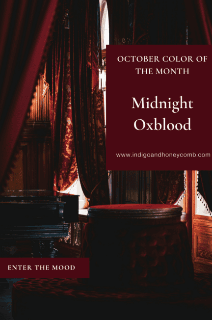
The Midnight Oxblood color is where Fall 2026 begins to feel unmistakably darker. Deep, saturated and unmistakably red, Midnight Oxblood (#4A0913) is the October 2026 Color of the Month and the deeper, moodier counterpart to September’s Weathered Lilac. It isn’t quite burgundy, it isn’t plum and it certainly isn’t the bright red we associate with the holidays. Instead, it is a blackened, complex red with enough depth to make a room feel intimate, dramatic and distinctly autumnal.
If September was about easing into fall, October is where we enter the mood. That shift is at the heart of The Art of Fall, Indigo & Honeycomb’s Fall 2026 series. September’s chapter, The Soft Landing, introduced Weathered Lilac as an unexpected neutral that gently carried us from summer into autumn. Now, with October’s Enter the Mood, the palette becomes deeper and more theatrical. Midnight Oxblood doesn’t quietly suggest that fall has arrived. It knows.
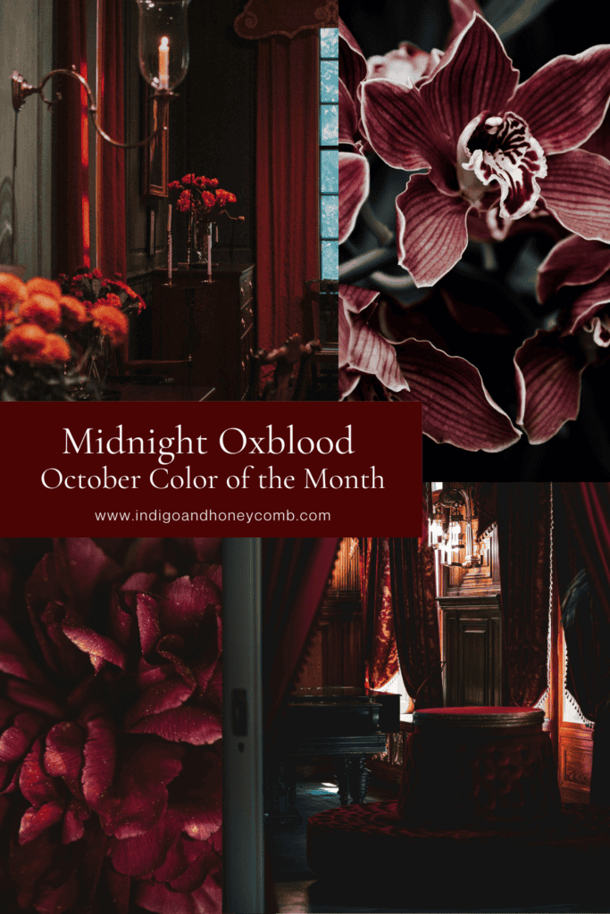
Meet Midnight Oxblood (#4A0913)
Midnight Oxblood is a deep red that has been pushed into shadow. Its surface reads dark enough to approach black in certain lighting, but the red remains unmistakable, particularly when the color is placed beside true black, charcoal or cool neutrals.
That distinction is important because very dark reds can easily become confused with other members of the wine-red family. Midnight Oxblood has some of the richness associated with burgundy, but it carries more visual weight and a stronger red presence. It is deeper and more blackened than a conventional burgundy, while remaining redder than a smoky plum.
In natural daylight, #4A0913 can reveal its red character more clearly. In low evening light, it becomes moodier and more mysterious, which is exactly what makes it so compelling for interiors. The color changes with its surroundings rather than sitting passively in the background. That ability to shift is part of its appeal. Midnight Oxblood isn’t a flat dark red. It is a color that becomes more expressive as the light changes.
Oxblood vs. Burgundy: What’s the Difference?
The distinction between oxblood and burgundy can be surprisingly difficult because the two colors occupy neighboring territory. Both are deep reds, both can contain brown or wine-like undertones, and both have long associations with leather, textiles and traditional interiors. The easiest way to understand the difference is to think about depth and temperature.
Burgundy generally feels more wine-like. Depending on the particular shade, it can lean toward purple, brown or a slightly brighter red. Oxblood tends to feel darker, earthier and more substantial. It is often described as a blackened red, which captures something important about the way the color behaves.
Midnight Oxblood takes that idea even further. At #4A0913, the color is intentionally darkened while retaining a strong red core. That gives it more drama than the muted oxblood used as an accent in September’s Weathered Lilac palette. The distinction is subtle, but it matters. Midnight Oxblood is not simply another name for burgundy. That is also what makes it worthwhile as an October Color of the Month. The color deserves to be understood on its own rather than treated as a seasonal variation of a familiar red.
Why Oxblood Feels So Right for October
Color has an emotional vocabulary, and deep reds have always carried a particular kind of intensity. Red can be energetic and bright, but when it becomes darker and more saturated, its character changes. It begins to feel intimate, enveloping and dramatic.
That makes Midnight Oxblood particularly appropriate for October, when the visual language of fall naturally becomes more atmospheric. The days are shorter, evening light arrives earlier and interiors begin to shift toward warmth and enclosure.
There is also a connection to the broader Fall 2026 movement toward richer, more complex color. Chocolate brown, bottle green, smoky violet, deep navy and oxblood are replacing the idea that fall needs to be represented by a predictable combination of pumpkin orange, rust and mustard. Midnight Oxblood takes that evolution one step further. It doesn’t simply say fall. It suggests the part of fall that happens after sunset.
From Vamp Romantic to the Color of the Month
Midnight Oxblood also arrives at exactly the right moment in The Art of Fall. Earlier in the series, Vamp Romantic Comes Home explored the darker side of fall decorating through burgundy, oxblood, plum, blackened florals, velvet, antique brass, dark wood and candlelight. There, oxblood was part of a larger mood.
For October’s Color of the Month, we’re narrowing the focus. Midnight Oxblood gets to be the subject rather than one element of the story. That makes the color easier to understand and more useful to live with. The question is no longer simply whether deep red is trending. It becomes: What can this particular red do in a room? The answer is quite a lot.
Midnight Oxblood can make a large room feel more intimate, give a small space jewel-box intensity, add richness to neutral furniture or provide a dramatic counterpoint to lighter colors. It can feel traditional with walnut and brass, modern with cream and black, romantic with velvet and florals or earthy with leather, stone and natural wood. Its personality changes according to what surrounds it.
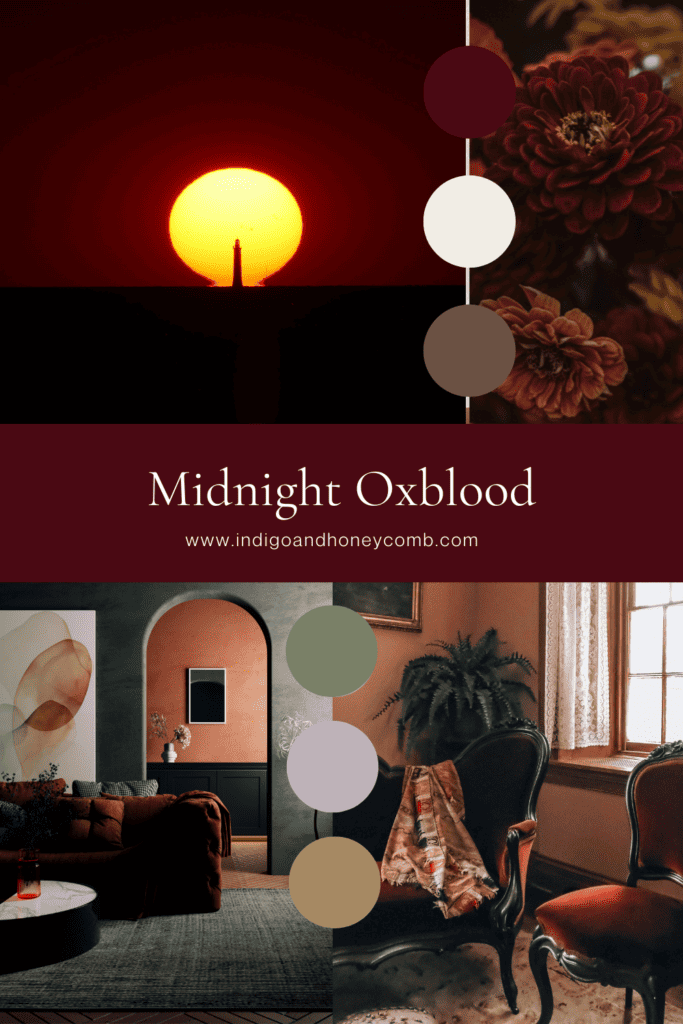
The Midnight Oxblood Palette
Midnight Oxblood becomes particularly interesting when it is allowed to interact with colors rather than stand alone.
- Midnight Oxblood #4A0913 is the anchor: deep, saturated and red at its core.
- Warm Ivory #F2EDE4 provides the lightest counterpoint. Against ivory, the red becomes richer and more visible without losing its depth.
- Cocoa Brown #6B5144 brings warmth and connects the oxblood to natural wood, leather and the deeper neutrals of fall.
- Smoky Olive #7A8067 introduces an organic quality. The muted green keeps the red from becoming too formal and creates a sophisticated connection to nature.
- Weathered Lilac #BFB1BB provides the unexpected contrast. September’s soft, smoky neutral becomes more dramatic beside Midnight Oxblood, creating a direct color bridge between the first two chapters of The Art of Fall.
- Aged Brass #A58A62 supplies the glow. Its warm metallic quality catches light against the deep red and keeps the palette from feeling overly dark.
Together, these colors create a fall palette that feels layered rather than literal. There is red, but there is also softness, earthiness, warmth and light. That is what keeps Midnight Oxblood from becoming simply a dark room.
What Makes Midnight Oxblood Different in Different Light?
One of the most important things to understand about a color this deep is that light changes everything. In bright natural daylight, Midnight Oxblood reveals more of its red character. Near a south-facing window, it may appear warmer and more expressive, while cooler daylight can emphasize its darker side. As the afternoon fades, the color becomes deeper. Under warm artificial light, the red can become richer and more enveloping, which makes it particularly effective in dining rooms, bedrooms and living spaces designed for evening use.
This is why a paint chip or digital color swatch can never tell the entire story. A color as dark as #4A0913 needs to be viewed in the actual room, at different times of day and alongside the materials that will surround it.
The same principle applies to textiles and furnishings. Velvet absorbs and reflects light differently from linen. A glossy ceramic will show the color differently from a matte painted wall. Leather develops its own variation. Midnight Oxblood isn’t simply a hexadecimal value; it is a color that changes through material and light.
Where Midnight Oxblood Works Best
A deep red like Midnight Oxblood can be surprisingly versatile, particularly when it is used intentionally.
Dining Rooms
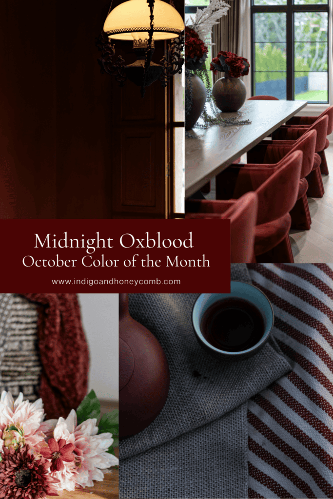
The dining room may be one of the most natural places for this color. Deep red has an inherent connection to evening gatherings, candlelight and hospitality. Midnight Oxblood walls can create an intimate backdrop for a dining table, particularly when paired with warm ivory upholstery, walnut, aged brass and soft lighting.
If painting the room feels too dramatic, bring in the color through dining chairs, textiles, artwork, ceramics or a dark floral arrangement. Even a small amount can change the atmosphere.
Bedrooms
In a bedroom, Midnight Oxblood becomes softer and more enveloping. Layer it with cream bedding, warm wood and natural textiles to prevent the room from becoming too heavy. A velvet bench, accent pillow or upholstered headboard can introduce the color without requiring it to dominate.
This is one place where the depth of the color becomes an advantage. Rather than making the room feel energetic, the darker red can create a cocooning environment that feels especially appropriate as the evenings become longer.
Libraries and Studies
Midnight Oxblood has an obvious relationship with rooms devoted to reading, writing and collecting. Against bookshelves, dark wood, leather and antique brass, the color can feel almost architectural.
This is also where its connection to the darker romantic interiors explored earlier in the year becomes particularly strong. The result can feel literary without becoming overly themed.
Powder Rooms
A small room is often the perfect place to experiment with a color that feels too dramatic for the main living spaces. Midnight Oxblood can turn a powder room into a jewel box, particularly when paired with warm metal hardware, a vintage-inspired mirror and a stone or wood vanity. Because the room is small and often used for shorter periods, it can support a stronger color story without overwhelming the rest of the home.
Front Doors
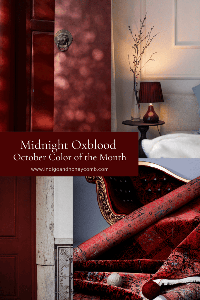
If you’re not ready to bring Midnight Oxblood indoors, consider the front door. A deep red door can create a strong focal point against warm ivory, beige, stone or natural wood. The effect can feel traditional without being predictable, particularly when the surrounding exterior palette is restrained.
Five Ways to Use Midnight Oxblood Without Repainting the Room
One of the easiest ways to introduce a color this dramatic is through textiles. A velvet pillow, wool throw or pair of linen curtains can bring Midnight Oxblood into a neutral room while allowing you to see how the color behaves before making a larger commitment.
Artwork offers another opportunity. A painting, botanical print or abstract piece containing deep red can establish a relationship between Midnight Oxblood and the other colors already present in the room. Rather than matching the art to the room, let the artwork become the bridge between different tones.
Ceramics and glass are particularly effective because they introduce the color with variation. A deep red vase or bowl can look almost black from one angle and richly red from another, giving the color some of the movement it naturally has in changing light.
For a more substantial addition, consider an upholstered piece. A dining chair, ottoman, accent chair or bench in oxblood can become a focal point without requiring the permanence of painted walls.
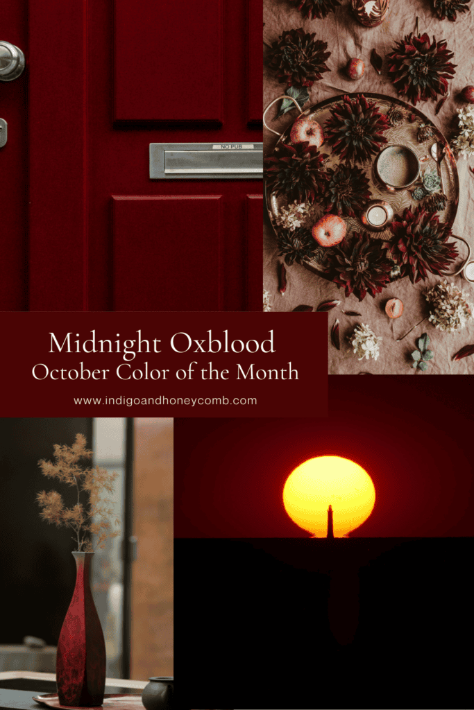
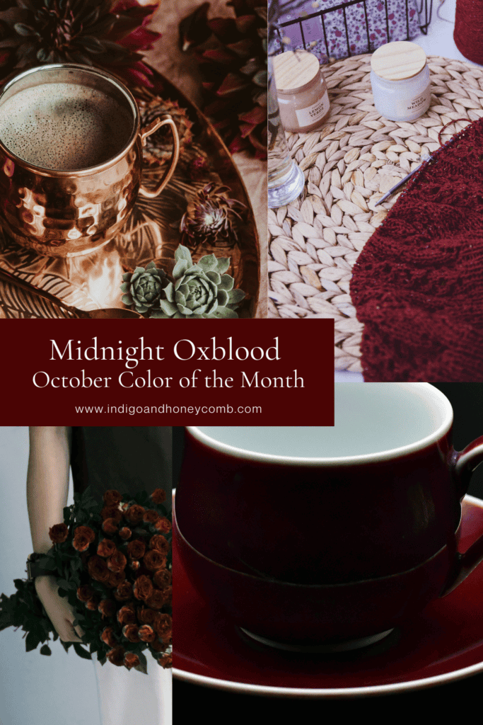
And finally, don’t underestimate flowers. Deep burgundy or oxblood-toned blooms can bring the color into a room naturally, especially when arranged with dark foliage, weathered branches or muted greenery. The arrangement can eventually disappear while the color relationship remains.
Midnight Oxblood and Natural Materials
Deep colors often become easier to live with when they are surrounded by natural materials. Midnight Oxblood is no exception. Walnut and other dark woods emphasize its warmth, while lighter oak can create contrast and keep the palette from becoming too dense. Leather reinforces the color’s traditional associations, particularly in cognac, tobacco or dark brown. Linen softens it. Stone provides a mineral counterpoint, and aged brass introduces warmth and reflection. These combinations also keep the color from feeling overly polished.
That matters because one of the defining characteristics of the Fall 2026 interior story is the movement toward spaces that feel collected rather than manufactured. Midnight Oxblood works beautifully within that idea. It can look as though it has always belonged alongside an old wooden cabinet, a vintage mirror, a worn leather chair or a collection of handmade ceramics. The color becomes part of the story rather than the story itself.
Midnight Oxblood With Weathered Lilac
September’s Weathered Lilac and October’s Midnight Oxblood may initially seem like unlikely companions. One is soft, smoky and almost neutral; the other is deep, saturated and dramatic. That contrast is precisely what makes them work.
Weathered Lilac can soften the intensity of Midnight Oxblood, while the darker red gives the lilac more depth. Together, they create a palette that feels romantic without becoming overly sweet and dramatic without relying entirely on black. This pairing also gives the larger Art of Fall series a visual continuity. September’s color doesn’t disappear when October arrives. Instead, it becomes part of the next chapter. That is the advantage of treating the series as a connected color story rather than fifteen unrelated seasonal posts.
The Color of Fall After Dark
There is a reason deep red continues to appear whenever interiors become more romantic and atmospheric. It has a natural relationship with candlelight, wood, leather, textiles and evening gatherings. It feels historic without necessarily feeling old-fashioned, and dramatic without requiring a room to become theatrical.
Midnight Oxblood takes that familiar territory and pushes it deeper. It is red after the sun goes down. It is velvet, old books, dark flowers, polished wood and brass catching the light. It is the color of a dining room when the candles are lit and the rest of the house has gone quiet. But it doesn’t have to be literal. You don’t need a gothic interior or a room covered in dark red walls to understand what the color can do. Sometimes one chair is enough. Or perhaps it is a vase, a pillow or a painting. And sometimes the entire room simply needs a little more shadow.
Why Midnight Oxblood Belongs in Fall 2026
The most interesting colors of Fall 2026 aren’t necessarily the colors we traditionally associate with autumn. They are the colors that create the emotional experience of the season.
Weathered Lilac gave September a sense of transition. Chocolate brown creates warmth. Bottle green connects interiors to nature. Smoky violet brings romance. Deep navy introduces atmosphere. And now Midnight Oxblood brings the drama. It is the point where the palette stops quietly changing and begins to announce itself.
That makes it the right color for October’s Enter the Mood chapter. It reflects the season’s darker evenings and richer textures, but it also reflects something broader happening in interiors: a growing willingness to embrace color with personality rather than choosing only the safest possible neutral. Midnight Oxblood doesn’t ask to be everywhere. It simply asks to be noticed.
Bring Midnight Oxblood Color Home
You don’t need to make a dramatic change to understand whether Midnight Oxblood belongs in your home. Start with one piece and pay attention to how it behaves. Place a deep red pillow on a cream sofa. Try an oxblood vase against warm ivory walls. Add a dark red chair to a room filled with walnut and brass. Bring in flowers that carry the color. Watch what happens when the afternoon light disappears and the lamps come on.
If the color feels too intense on its own, soften it with linen, warm ivory or Weathered Lilac. If it feels too formal, introduce natural wood, woven textures or muted olive. If you’re ready for drama, let it sit beside blackened florals, velvet and antique brass. The goal isn’t to decorate around a color. It is to understand what the color can do.
And the Midnight Oxblood color can do something that few autumn colors manage quite as well. It can make a room feel warmer without making it brighter, richer without making it heavier and more dramatic without making it feel decorated for a season. September’s Weathered Lilac offered us a soft landing. October’s Midnight Oxblood opens the door after dark.