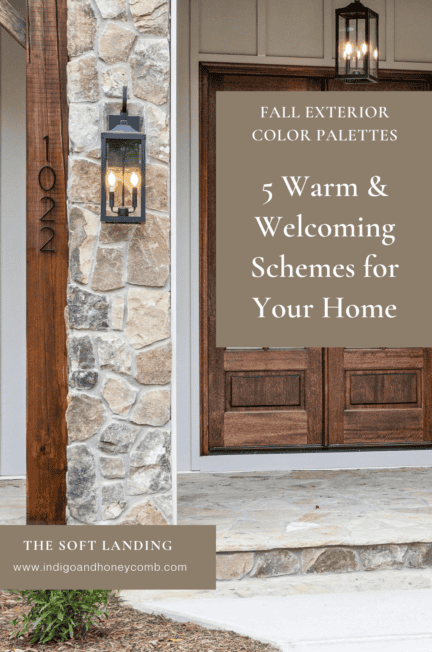
There is something about autumn that makes us look at the outside of a home differently. The light gets warmer, landscaping begins to shift and colors that might have felt too heavy in summer suddenly look completely at home. These fall exterior color palettes take that seasonal feeling as a starting point, using warmer neutrals, earthy greens, deeper browns and softened clay tones to create exteriors that feel welcoming without looking overly seasonal.
This doesn’t mean painting your house orange or decorating the front porch with pumpkins. In fact, some of the most beautiful fall-ready exteriors have very little obvious seasonal decoration at all. The feeling comes from the colors themselves: creamy whites instead of stark whites, mushroom instead of cool gray, olive instead of bright green and weathered wood instead of glossy finishes.
That shift is part of a larger change happening in exterior color. After years of cool white and gray dominating residential exteriors, warmer neutrals are becoming increasingly visible. Beige and other warm, earthy neutrals are gaining attention as homeowners look for colors that feel more connected to natural materials and surrounding landscapes. Rather than treating gray and white as the default foundation, today’s exterior palettes are making room for colors with more warmth and complexity.
For fall, that creates an especially interesting opportunity. A warmer exterior can feel seasonal now while remaining completely relevant through winter, spring and summer. The goal isn’t to make your house look like fall. It is to choose an exterior palette that feels grounded, welcoming and connected to the landscape.
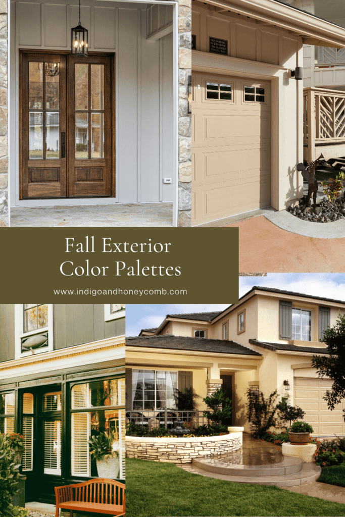
Why Warm Exterior Colors Feel Right for Fall
Color behaves differently outside than it does inside. Natural daylight changes throughout the day, surrounding landscaping reflects color back onto the facade and materials such as stone, brick, wood and metal can dramatically alter how a paint color is perceived.
That is one reason warmer exterior colors are so effective in autumn. Creamy whites, mushroom neutrals, olive greens and brown-based tones tend to work with the natural environment rather than competing with it. They can pick up the warmth of late-afternoon sunlight, complement changing foliage and make architectural details feel more substantial.
There is also a practical design advantage to choosing a more nuanced neutral. A warm beige or mushroom shade can provide the versatility of a neutral while bringing considerably more character than a basic white or cool gray. Paired with darker trim, natural wood or a deep green door, it can create an exterior that feels intentional without being overly coordinated.
The five fall exterior color palettes below take that approach in different directions, from traditional and heritage-inspired to relaxed California warmth.
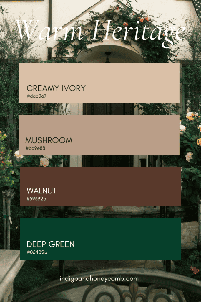
1. Warm Heritage
Creamy Ivory • Mushroom • Walnut • Deep Green
Warm Heritage is the palette for a home that looks as though it has always belonged where it stands. It draws from traditional architecture, natural materials and the quiet richness of historic homes without requiring a period-style house.
Creamy ivory provides the foundation, offering the brightness of a traditional light exterior without the starkness of pure white. Mushroom introduces a soft, earthy middle tone, while walnut adds depth through doors, shutters, garage doors or architectural accents. Deep green provides the final layer, particularly well suited to a front door, shutters or trim.
The combination works especially well on Colonial, Craftsman, Tudor, cottage and traditional homes, but the underlying principle is more universal: warm the lightest color, deepen the architectural accents and let nature supply the contrast.
For a more restrained version, keep the house creamy ivory with mushroom trim and a walnut front door. If the architecture can support more color, bring in deep green through the door, shutters or selected trim. The result is an exterior that feels established and welcoming rather than newly decorated.
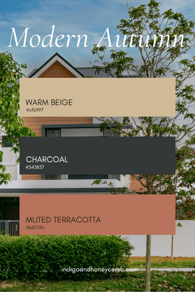
2. Modern Autumn
Warm Beige • Charcoal • Muted Terracotta
Modern Autumn takes the idea of a warm neutral and gives it a more contemporary expression. The palette is simpler and more graphic than Warm Heritage, making it particularly effective on modern, transitional and streamlined homes.
Warm beige replaces the cooler gray that has dominated many contemporary exteriors, creating a softer backdrop for the architecture. Charcoal provides contrast around windows, doors or other architectural details, while muted terracotta introduces just enough warmth to keep the palette from becoming monochromatic.
Terracotta is especially interesting here because it doesn’t have to read as a traditional orange. A softened, clay-based terracotta can feel remarkably sophisticated when surrounded by beige and charcoal. It can appear on a front door, porch ceiling, planter, garage door or other smaller architectural element.
This is a good example of how a fall-inspired palette can remain modern. The colors reference autumn without relying on obvious autumn symbolism.
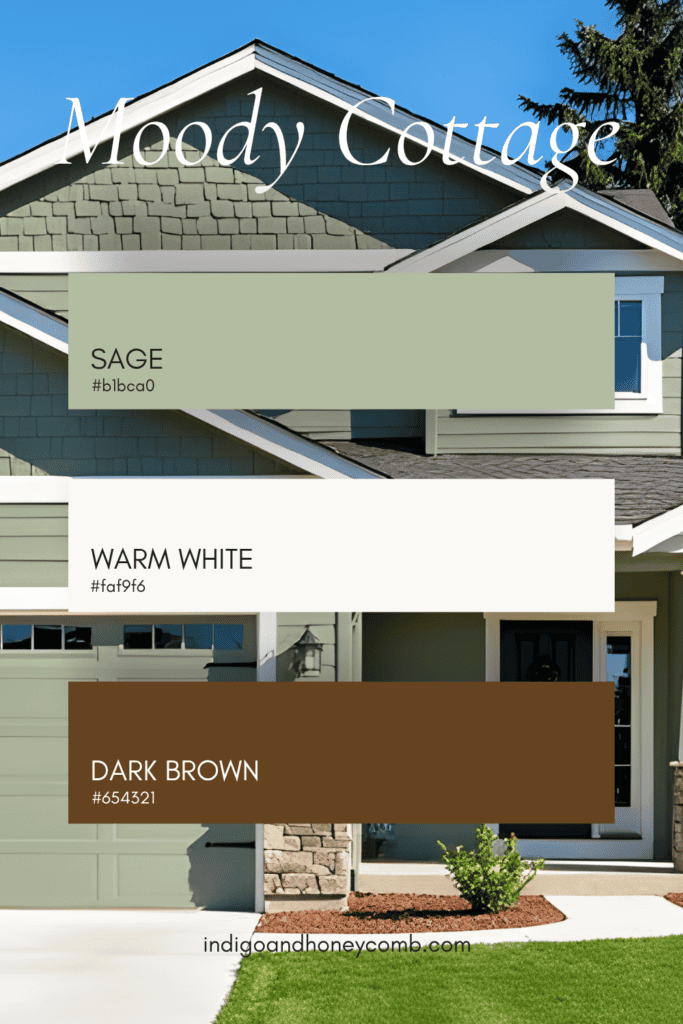
3. Moody Cottage
Sage • Warm White • Dark Brown
If the Warm Heritage palette feels traditional, Moody Cottage feels a little more relaxed. It takes the familiar combination of green and cream and deepens it with brown, creating an exterior that feels connected to gardens, wooded landscapes and natural materials.
Sage works beautifully as a siding color because its gray undertones keep it from becoming overly bright. Warm White provides the architectural contrast, particularly around windows, trim and porches, while dark brown anchors the palette through doors, shutters, beams or other substantial elements.
The palette is particularly effective for cottages, Craftsman homes, English-inspired architecture and houses surrounded by mature landscaping. It also works beautifully when the existing architecture includes natural stone or weathered wood.
What makes this combination feel current is restraint. Rather than introducing several competing accent colors, let the sage and cream establish the structure and allow dark brown to provide the depth. The result is softer than a black-and-white exterior and richer than a conventional green-and-white combination.
4. Romantic Traditional
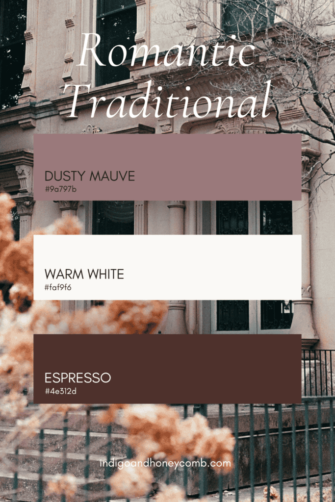
Dusty Mauve • Warm White • Espresso
Fall color doesn’t have to be limited to brown, green and terracotta. Romantic Traditional brings one of the season’s softer colors outdoors, pairing dusty mauve with warm white and espresso for an exterior that feels unexpected without becoming overly sweet.
Dusty mauve works particularly well when it has enough gray or brown in its formulation to keep it subdued. Think weathered rather than pastel. Against warm white trim, the color becomes quietly distinctive, while espresso provides the darker architectural anchor.
This palette could be especially beautiful on a cottage, traditional bungalow or older home where the architecture already has some visual softness. It can also work as an accent strategy rather than a full-house color scheme. A warm white exterior with a dusty mauve front door and espresso accents can bring the palette into a home without requiring a dramatic commitment.
There is also a natural connection here to September’s Weathered Lilac. Both colors demonstrate how muted purple-family tones can function as sophisticated neutrals when they are softened and surrounded by warmer materials. The trick is to avoid anything too sugary. Keep the mauve dusty, the white warm and the brown deep.
5. California Autumn
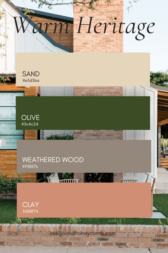
Sand • Olive • Weathered Wood • Clay
California Autumn may be the most relaxed palette of the five fall exterior color palettes, drawing directly from the colors of the landscape rather than traditional fall foliage.
Sand creates a sun-warmed neutral foundation. Olive adds an organic green that works naturally with drought-tolerant landscaping and mature trees. Weathered wood introduces texture and age, while clay provides a subtle connection to terracotta, tile and the warm mineral tones found throughout the California landscape.
This palette is particularly effective because none of the colors needs to be perfectly matched. In fact, slight variation is part of its appeal. A weathered wood gate, clay planter, olive front door and sandy stucco can work together precisely because they feel collected rather than manufactured as a single matching set.
California Autumn is also a reminder that fall doesn’t look the same everywhere. In warmer climates, autumn may be less about changing leaves and more about the shift in sunlight, dry grasses, warm earth and the gradual movement toward a quieter landscape. The palette captures that transition without trying to imitate an East Coast autumn.
How to Choose the Right Fall Exterior Color Palette
Choosing a fall exterior color palette should begin with the house itself rather than a trend. Architecture, roofing, stone, brick, existing hardscape and landscaping all become part of the color story, whether you intentionally include them or not.
Start by identifying the elements that are staying. If the roof is charcoal, for example, a warm beige or creamy ivory may create a more cohesive relationship than another cool gray. If the home has red brick, look toward warm whites, mushroom, olive and deeper brown rather than trying to introduce a completely unrelated color family.
The surrounding landscape matters just as much. A house surrounded by mature trees may support deeper green and brown tones beautifully, while a bright coastal setting may call for sand, warm white and weathered wood. The best exterior palette doesn’t fight its surroundings. It makes the existing landscape feel more intentional.
And don’t overlook the front door. On many homes, the door is the easiest place to introduce a stronger color without committing to an entirely new exterior. Deep green, oxblood, espresso, muted terracotta or even a subdued plum can become a focal point while the larger facade remains relatively neutral.
The Return of the Warm Neutral
The larger story behind these fall exterior color palettes isn’t really about fall. It is about the changing role of the neutral exterior. For years, cool whites and grays offered homeowners a clean, contemporary foundation. Those colors are not disappearing, but the growing interest in warmer neutrals reflects a desire for homes to feel less stark and more connected to their surroundings.
Beige is particularly interesting because it has changed considerably from the beige of previous decades. Today’s warmer neutrals can have undertones of mushroom, sand, clay, stone, linen or caramel, giving them considerably more complexity than a flat tan.
That makes them useful far beyond a single season. A warm beige exterior can feel welcoming in October, sunwashed in July and grounded in January. The same is true of olive, mushroom, creamy white and natural wood. In other words, the best fall exterior color palette may not look particularly “fall” at all. It simply feels warmer.
Don’t Forget the Materials
Paint is only one part of an exterior color story. The materials surrounding it can make a significant difference in how the palette feels. Natural wood adds warmth and variation. Stone introduces mineral tones that can connect several colors together. Metal hardware can bring either contrast or continuity depending on the finish. Brick contributes its own permanent color relationship, while landscaping provides constantly changing greens and seasonal texture.
This is why a successful exterior palette rarely comes down to choosing three paint chips and calling it finished. The most convincing combinations account for everything that already exists around the house.
A creamy ivory facade beside natural walnut will feel very different from the same ivory beside black-painted trim. Olive next to weathered wood has a different character from olive next to bright white. Context is what turns a group of colors into a home.
How to Make an Exterior Feel Warmer Without Repainting the House
If a full exterior repaint isn’t on the list, there are still several ways to move the color story toward fall. Start with the front door. A deeper, warmer color can create a surprisingly significant change, particularly when paired with updated hardware. From there, consider planters, outdoor textiles, a new doormat, lighting finishes or natural wood accents.
Landscape can also become part of the palette. Grasses, olive-toned foliage, deep green shrubs and plants with muted or burgundy leaves can reinforce the colors already present on the house.
The goal is not to decorate the exterior for fall in the traditional sense. It is to emphasize the warmer colors that are already beginning to make sense as the season changes.
The Indigo & Honeycomb Approach to Fall Curb Appeal
At Indigo & Honeycomb, color is never really about choosing a single “right” shade. It is about relationships. A color becomes more interesting when you understand what surrounds it, how light changes it and which materials allow it to make sense. That is especially true outdoors.
The five fall exterior color palettes in this story are less about copying a particular look and more about finding a direction. Warm Heritage is grounded and established. Modern Autumn is clean and contemporary. Moody Cottage is organic and relaxed. Romantic Traditional is softer and more unexpected. California Autumn is sun-warmed, natural and distinctly tied to place.
Each one can be adapted to the architecture and landscape of the home rather than treated as a formula. And that is ultimately what makes a good exterior palette feel timeless. It doesn’t announce the season. It simply makes the house feel like it belongs there.
A Warmer Welcome
Fall has a way of reminding us that home begins before you walk through the front door. The colors of the facade, the front door, the landscape and the materials surrounding the house all contribute to that first impression.
This season, instead of reaching for obvious autumn colors, consider looking at warmth a little differently. Trade stark white for creamy ivory. Consider mushroom instead of cool gray. Try olive where you might normally choose black. Let weathered wood, clay and natural stone become part of the palette. The result can be subtle, but that is part of its appeal.
A welcoming exterior doesn’t need to announce itself. Sometimes the most inviting house on the street is simply the one whose colors feel a little warmer when the afternoon light begins to fade.