
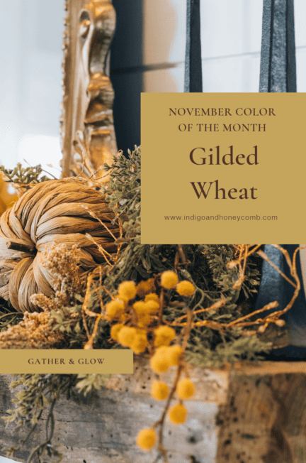
The Color of Gathering
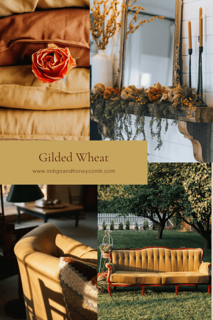
Gilded Wheat (#C5A45B) is a warm, muted golden straw color that captures the softer side of autumn. Neither a bright harvest yellow nor a deep amber, it has an aged, sunlit quality that feels both grounded and quietly luminous. As November settles in and the season turns toward gathering, Gilded Wheat offers a welcome change of pace. A color that brings warmth into a room without making it feel heavy. It is a natural choice for this month’s new theme, Gather & Glow, where the focus shifts to the beauty of a welcoming home, the warmth of familiar surroundings, and the small details that make a space feel ready for the season.
From The Soft Landing to Gather & Glow
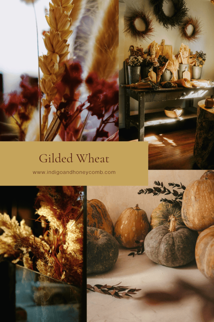
Over the past two months, our fall color story has followed the changing mood of the season. September introduced Weathered Lilac, a smoky, softened neutral that marked the transition from summer into fall. Its quiet character reflected The Soft Landing, a moment to slow down, settle in, and begin welcoming the new season without making a dramatic change.
October took a more expressive turn with Midnight Oxblood. A deep, blackened red that brought romance and atmosphere into the home. Under the theme Enter the Mood, we explored richer colors, dramatic contrasts, velvet textures, aged brass, and the appeal of interiors with a little more depth and character.
For November, the palette begins to open up again. Gilded Wheat introduces a lighter, warmer note, moving away from the darker tones of October and toward the feeling of a home filled with natural light, layered textures, and thoughtful details. It is the beginning of Gather & Glow. The final chapter of our fall series, where color becomes less about making a statement and more about creating an atmosphere that invites people to stay awhile.
The Meaning Behind Gilded Wheat
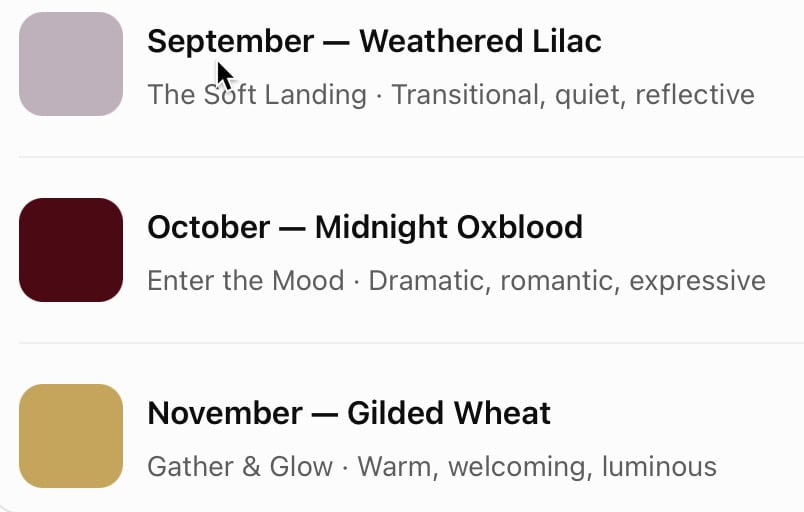
There is something particularly appealing about the color of wheat just before the landscape gives way to winter. It is golden, but not brilliant; warm, but not overly saturated. Its beauty comes from a softened, almost weathered quality, much like the natural materials and aged finishes that make a home feel collected rather than newly decorated.
Gilded Wheat takes its inspiration from this understated golden tone. The word gilded suggests a subtle touch of richness. While wheat brings to mind fields, harvest, natural fibers, and the colors of the changing landscape. Together, they describe a golden neutral that feels familiar and timeless without becoming predictable.
In color psychology, warm yellows are often associated with optimism, comfort, and energy. Gilded Wheat expresses those qualities in a more restrained way. Its muted character makes it easier to live with than a bright yellow, while its golden undertones add a sense of warmth that cooler neutrals sometimes lack. It is a color that can lift a room without demanding attention.
Why Gilded Wheat Feels Right for November
November is a month of transition. The bright, active days of early fall begin to give way to shorter afternoons, cooler evenings, and more time spent indoors. Our homes naturally take on a different role. Dining tables become gathering places, living rooms invite longer conversations, and the small rituals of the season begin to take center stage.
This is where the Gilded Wheat color feels especially appropriate. It has enough warmth to complement the deeper colors of autumn, but enough lightness to keep an interior from feeling overly dark. Rather than introducing another dramatic seasonal shade, it gives us an opportunity to balance the palette and bring a little glow back into the home.
It also connects beautifully with the materials that feel especially right this time of year. Natural linen, warm wood, woven textures, aged brass, handmade ceramics, and softly glowing lighting all share an earthy quality that complements this golden neutral. The result is an interior that feels welcoming and layered, with warmth coming from the relationship between color, texture, and light rather than from seasonal decorations alone.
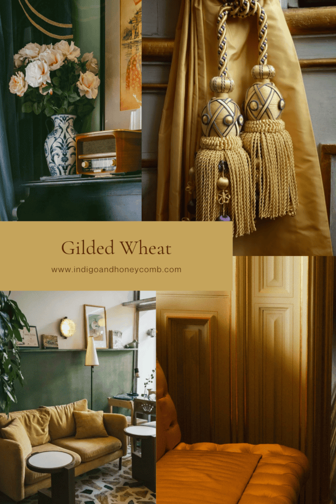
Understanding the Color: Golden Straw, Saffron, Ochre and Antique Gold
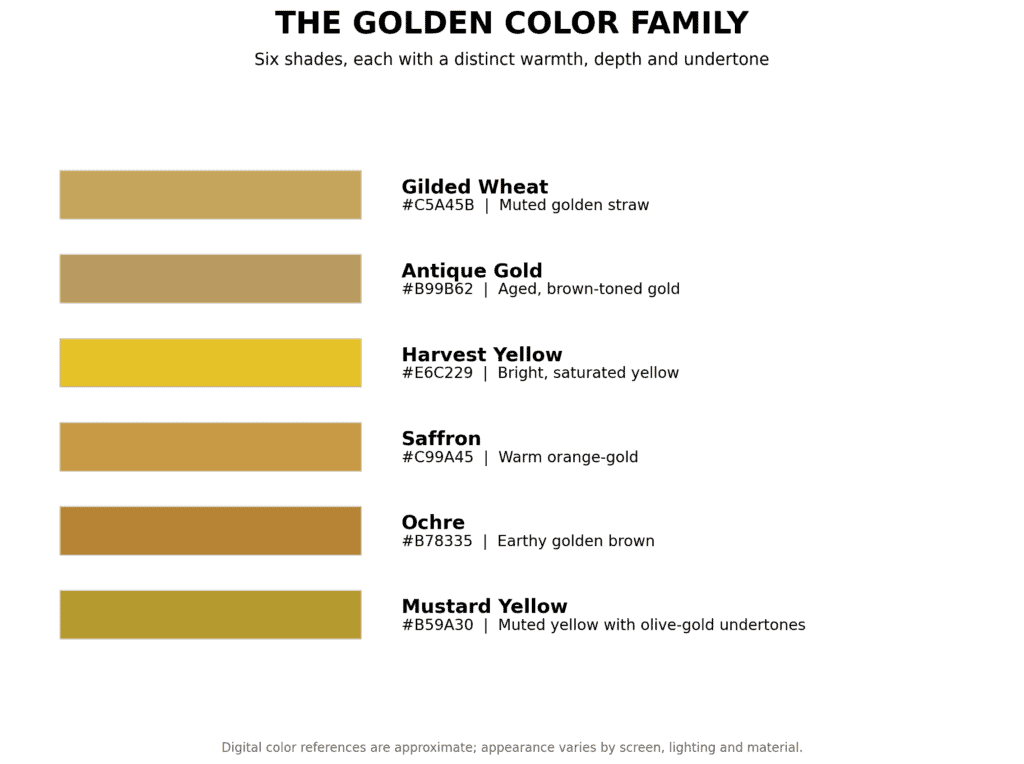
Not all golden yellows are alike, and the distinction matters when choosing a color for the home. Bright harvest yellow tends to be more vivid and energetic, while saffron carries a stronger golden-orange quality. Ochre is earthier and often more brown-toned, with a mineral richness that can feel rustic or historic. Antique gold, on the other hand, usually has a deeper, more subdued quality that recalls aged metal and traditional finishes.
Gilded Wheat sits between golden straw and muted antique gold. It has a recognizable yellow-gold foundation, but its softened, earthy character keeps it from feeling too bright or decorative. This balance is what makes it versatile. It can bring warmth to a neutral room, complement deeper autumn colors, or introduce a subtle golden accent without turning the entire palette toward yellow.
The Gilded Wheat Color Palette
The November palette is designed around warmth, balance, and natural materials. Gilded Wheat is the focal color, but it is the supporting shades that give it depth and make it adaptable to different interiors.
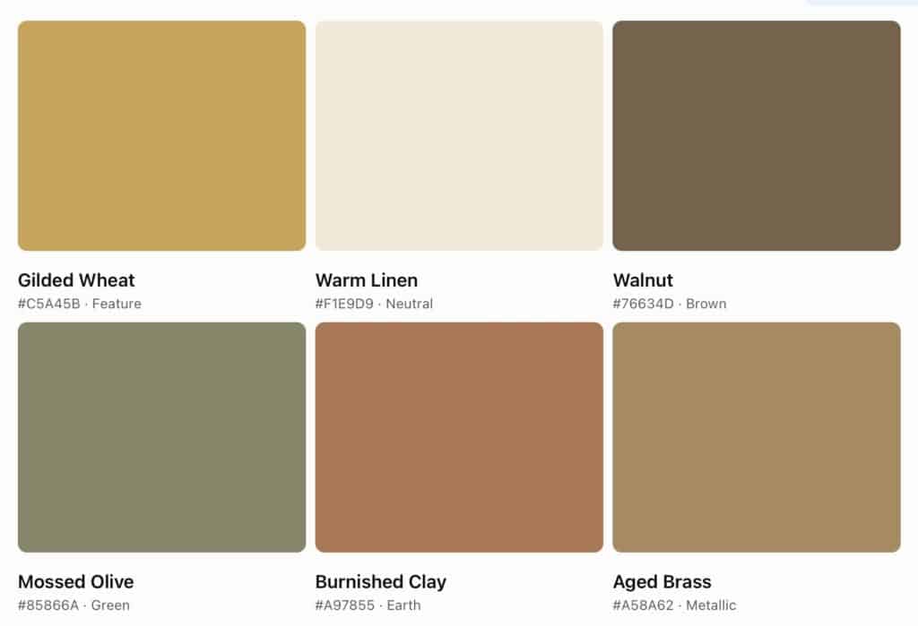
- Gilded Wheat #C5A45B: The grounding golden shade, bringing warmth and a soft glow to the palette.
- Warm Linen #F1E9D9: A creamy neutral that lightens the combination and creates an easy, understated backdrop.
- Walnut #76634D: A rich, natural brown that adds depth and connects the palette to warm wood finishes.
- Mossed Olive #85866A: A muted green that introduces an organic note and keeps the golden tones feeling balanced.
- Burnished Clay #A97855: An earthy, softened terracotta that adds warmth without competing with the gold.
- Aged Brass #A58A62: A subtle metallic companion that reinforces the palette’s collected, timeworn character.
Together, these colors create a warm and welcoming combination that feels distinctly autumnal without relying on the familiar orange-and-brown formula. The palette works particularly well with natural wood, linen upholstery, woven baskets, stone surfaces, and vintage-inspired accessories.
Bringing Gilded Wheat Into the Home
One of the best qualities of this color is that it does not require a major decorating commitment. Because it has the warmth of a golden neutral, it can be introduced through smaller accents or used more generously when the surrounding materials are kept simple. The key is to let its natural warmth complement the room rather than making it the only point of interest.
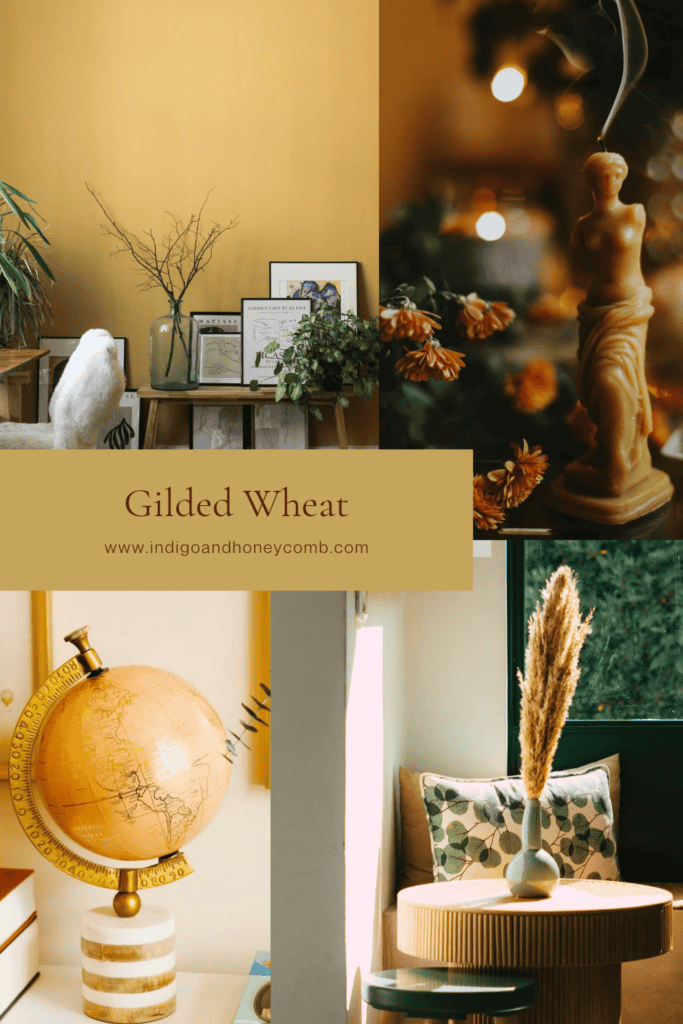
In the living room, Gilded Wheat can bring a welcome lift to a palette of ivory, walnut, and olive. Consider a pair of accent pillows, a textured throw, a ceramic table lamp, or artwork with muted golden tones. Against a warm neutral sofa, the color adds depth without creating a sharp contrast. Paired with dark wood and aged brass, it takes on a more traditional, collected character.
In the dining room, this shade feels particularly appropriate for the Gather & Glow theme. A linen table runner, softly colored ceramics, woven placemats, or a simple arrangement of dried botanicals can introduce the color without making the table feel overly decorated. Gilded Wheat also pairs beautifully with natural wood dining tables and warm metallic finishes, creating a setting that feels considered but relaxed.
In the kitchen, it works well alongside creamy cabinetry, warm stone, walnut accents, and aged brass hardware. It can appear in pottery, serving pieces, textiles, or even a small piece of artwork. The combination of warm whites and muted gold makes a kitchen feel inviting while maintaining a clean, timeless look.
In an entryway, a golden accent can make a subtle first impression. A ceramic vessel, framed artwork, a small upholstered bench, or a warm-toned lamp can introduce the color in a way that feels welcoming rather than seasonal. It is a reminder that the atmosphere of a home begins before anyone reaches the living room.
Five Ways to Use Gilded Wheat Without Redecorating
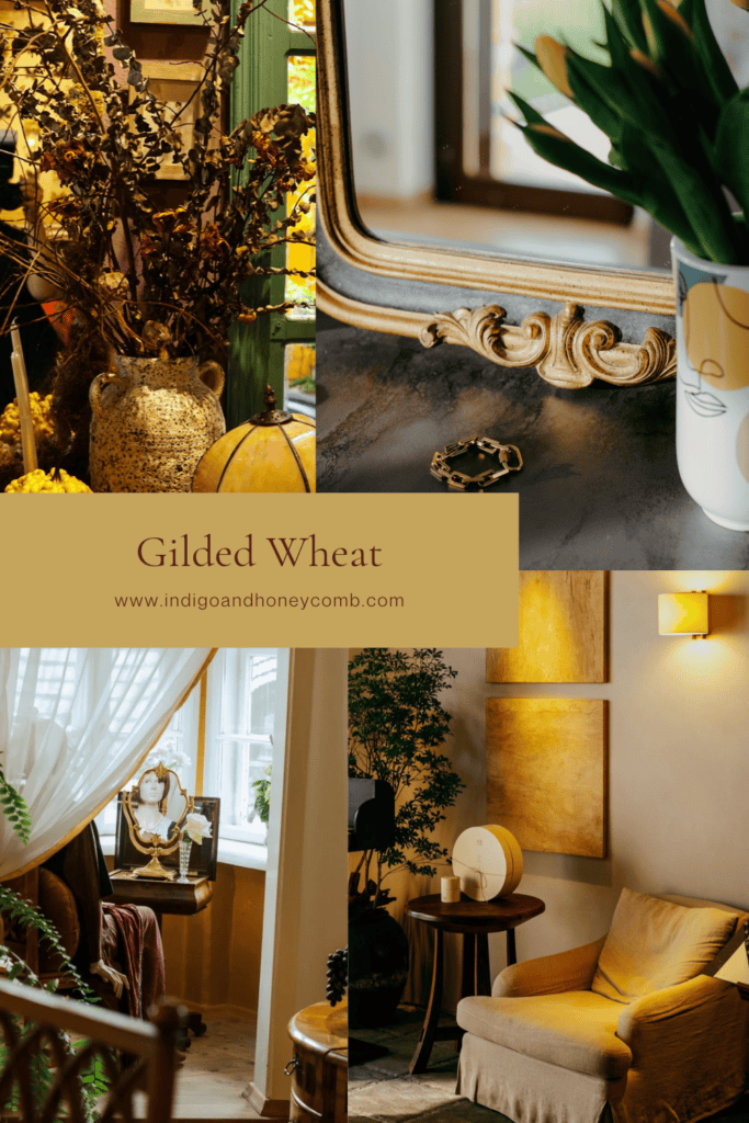
If you are not ready to introduce a new paint color or make a larger investment, start with a few thoughtful details. Textiles are an easy first step. A linen pillow, a woven throw, or a soft accent blanket can bring the shade into a room while adding the texture that makes autumn interiors feel comfortable. Ceramics are another natural fit, especially handmade vessels, bowls, and decorative objects with a matte or slightly irregular finish.
Artwork can also introduce Gilded Wheat in a more nuanced way. Look for landscapes, abstract compositions, or vintage-inspired prints that include muted gold, warm ivory, and earthy brown. For a seasonal touch that doesn’t feel overly themed, dried grasses, branches, and natural botanicals can echo the color’s connection to the landscape. Finally, consider lighting. A warm-shaded table lamp or a softly glowing pendant can bring out the golden undertones in nearby materials, particularly in the late afternoon and evening.
The goal is not to fill a room with gold. It is to use a few carefully chosen accents to create a warmer relationship between the colors and materials already in your home.
What to Pair With Gilded Wheat
Gilded Wheat is especially effective when paired with colors that either soften its warmth or give it a little more depth. Warm ivory and linen create a light, relaxed combination. Walnut and cocoa brown make it feel richer and more grounded. Mossed olive introduces an organic contrast, and burnished clay brings out its autumn character without pushing the palette toward orange.
For a more collected look, bring in aged brass, weathered wood, natural stone, and textured fabrics. These materials share the slightly softened quality that makes Gilded Wheat feel timeless. Avoid pairing it exclusively with other strong golden or orange tones, which can make the palette feel too saturated. A little contrast and plenty of natural texture will give the color room to breathe.
Gather & Glow: A Warmer Way to Welcome the Season
Moving into November, seasonal decorating becomes less about adding more and more about creating a home that feels comfortable, personal, and ready for gathering. The most inviting interiors are rarely the ones filled with the most decorations. They’re the ones where the lighting is warm, the textures are welcoming, the colors work together, and there is room for everyday life to unfold.
That is the spirit behind Gather & Glow. Gilded Wheat gives us a way to bring warmth into the home without returning to the predictable colors of the season. It connects naturally to the beauty of aged materials and earthy finishes, while offering a lighter counterpoint to the dramatic palette of October.
September’s Weathered Lilac invited us to slow down and settle in. October’s Midnight Oxblood encouraged us to embrace a little more drama and atmosphere. Now, November’s Gilded Wheat brings the story full circle, showcasing that the best seasonal interiors are not simply decorated for a moment. They are created to be lived in, shared, and enjoyed. This November, let your home gather a little warmth and glow a little brighter.


Leave a Reply