Sophisticated Pink Paint Colors To Elevate Your Design Style
Sophisticated pink paint colors have quietly redefined their place in modern interiors. Once associated primarily with sweetness or nostalgia, today’s pinks are more nuanced—softened with gray, warmed with brown, or cooled with subtle violet undertones. The result is a palette that feels elevated, livable, and unexpectedly versatile.
In fact, the most elegant pink color palettes for interiors function less like statement hues and more like refined neutrals. From dusty rose to blush taupe, these tones bring warmth without heaviness and color without overwhelm. Whether layered into a minimalist space or woven through a more traditional home, pink has the ability to soften architecture while still maintaining a sense of restraint.
What Are the Most Sophisticated Pink Colors for Interiors?
The most sophisticated pink paint colors are defined by their undertones. Rather than appearing overly bright or sugary, these hues are gently muted—often infused with gray, beige, or mauve—to create depth and balance.
Dusty rose, for example, leans into a subtle earthiness that makes it feel grounded and timeless. Mauve blush introduces a slightly cooler, more tailored effect, while blush taupe bridges the gap between pink and neutral, making it especially versatile across different lighting conditions. Even the softest ballet pinks, when desaturated, can read as calm and architectural rather than decorative.
What unites these shades is their ability to adapt. In natural light, they shift and soften; in shadow, they deepen and become more atmospheric. Because of this, sophisticated pinks work beautifully across a range of interior styles—from modern organic to classic heritage—offering just enough color to create interest while still allowing materials and textures to take the lead.
What Colors Go with Sophisticated Pink?
One of the reasons sophisticated pink paint colors feel so relevant today is their ability to pair effortlessly with a wide range of grounding tones. When styled intentionally, pink becomes less of a focal point and more of a connector within the overall palette.
Warm neutrals like taupe, sand, and soft beige enhance pink’s warmth, creating a layered, tonal look that feels calm and cohesive. For a more nature-inspired palette, olive green and muted sage introduce contrast while maintaining an organic softness. Deeper hues—such as chocolate brown or charcoal—anchor pink and give it a sense of structure, particularly in larger spaces.
For a lighter, more atmospheric approach, soft blues and muted grays can be paired with pink to create a sense of quiet balance. This combination works especially well in bedrooms and living spaces where a softer, more restorative mood is desired. Ultimately, the key is contrast through subtlety—pairing pink with colors that enhance its complexity rather than compete with it.
Sophisticated Pink Color Palettes for Interiors
Sophisticated pink paint colors come to life through thoughtful pairings. When combined with grounding neutrals, earthy tones, or soft contrasts, pink shifts from a standalone color into a fully realized palette—one that feels layered, livable, and deeply considered.
Below are a few refined pink color palettes designed to inspire a range of interior styles, from modern organic to softly traditional. (Tip: Save your favorites for later inspiration.)
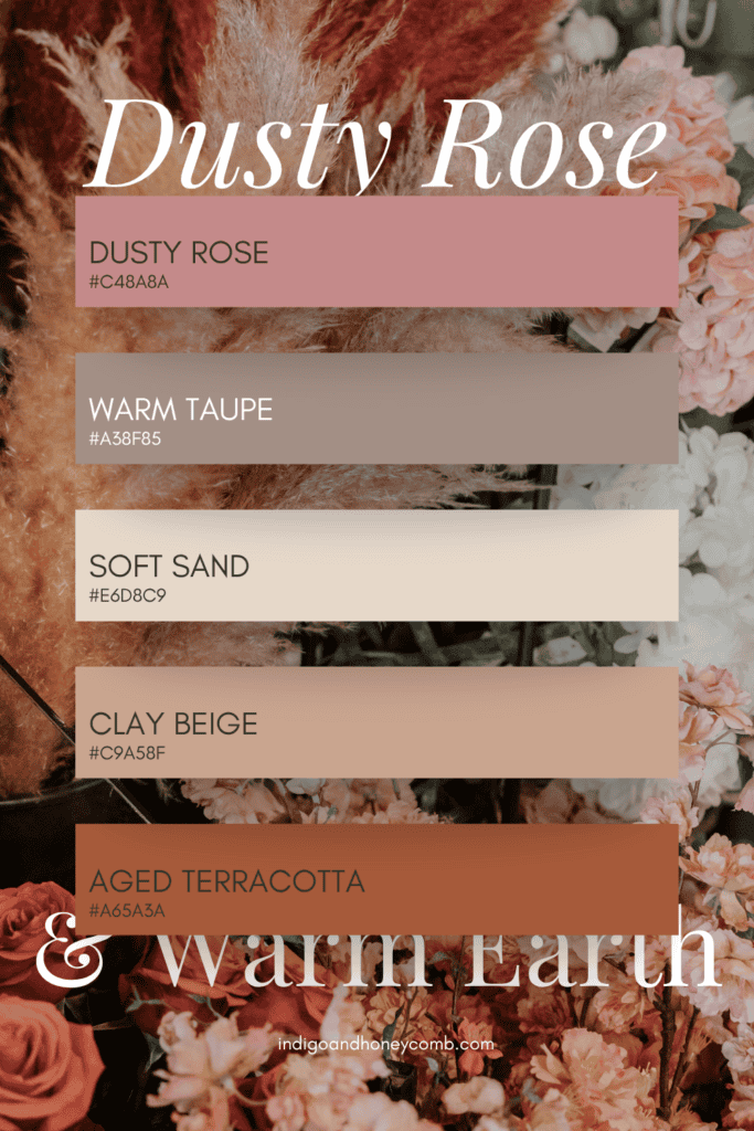
Dusty Rose & Warm Earth
Palette: Dusty Rose · Warm Taupe · Soft Sand · Clay Beige · Aged Terracotta
Grounded and quietly warm, this palette leans into earthy undertones that give pink a sense of depth and permanence. Dusty rose acts as a soft anchor, while layered neutrals and clay tones create a space that feels collected rather than styled. Ideal for living rooms, bedrooms, or anywhere warmth is key.
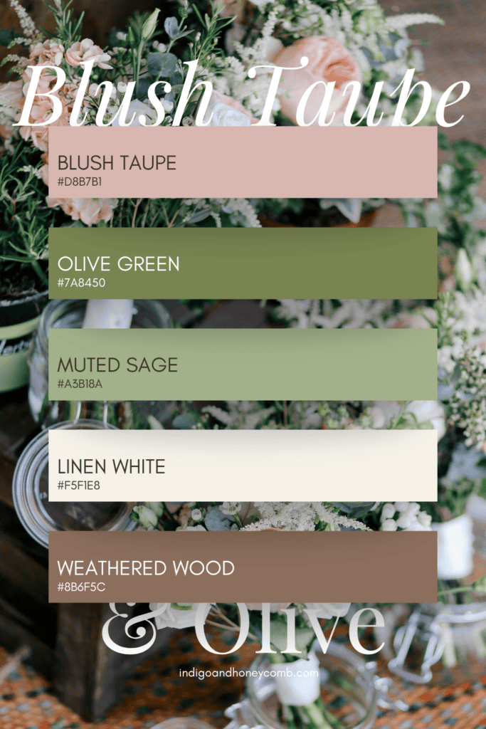
Blush Taupe & Olive
Palette: Blush Taupe · Olive Green · Muted Sage · Linen White · Weathered Wood
This palette draws from nature, pairing pink with soft greens for an organic, balanced look. Blush taupe functions as a near-neutral, allowing olive and sage to introduce contrast without disrupting the calm. Perfect for modern organic interiors or spaces that emphasize natural materials and light.
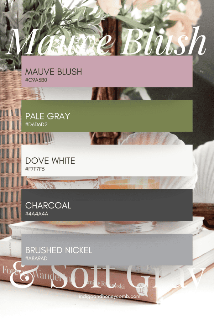
Mauve Blush & Soft Gray
Palette: Mauve Blush · Pale Gray · Dove White · Charcoal · Brushed Nickel
Cooler and more tailored, this palette creates a sense of quiet sophistication. Mauve blush brings subtle color, while layered grays add structure and refinement. This combination works especially well in bedrooms, sitting rooms, or transitional interiors with a more architectural feel.
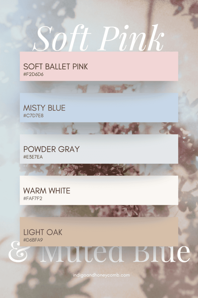
Soft Pink & Muted Blue
Palette: Soft Ballet Pink · Misty Blue · Powder Gray · Warm White · Light Oak
Airy and atmospheric, this palette pairs pink with soft blues for a light, restorative mood. The result is balanced and serene—ideal for bedrooms, bathrooms, or coastal-inspired spaces where a sense of calm is essential.
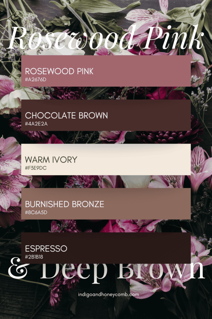
Rosewood Pink & Deep Brown
Palette: Rosewood Pink · Chocolate Brown · Warm Ivory · Burnished Bronze · Espresso
Rich and enveloping, this palette explores the deeper side of pink. Rosewood tones bring warmth and subtle drama, while dark browns ground the palette and add contrast. This is a natural fit for dining rooms, studies, or spaces where you want a more intimate, layered atmosphere.
How to Use These Pink Color Palettes in Your Home
When working with sophisticated pink color palettes, think in terms of balance rather than contrast. Let pink lead in softer applications—walls, upholstery, or textiles—while supporting colors appear through wood tones, finishes, and accent pieces.
Start small if needed. Even introducing one of these palettes through pillows, throws, or artwork can shift the overall mood of a space. Over time, layering additional tones will create a more cohesive and elevated result.
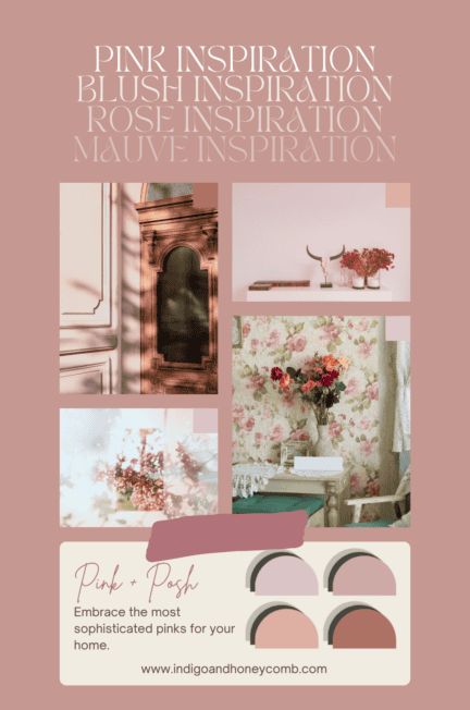
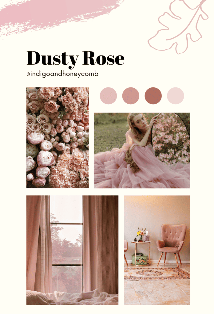
Dusty Rose
Dusty rose is the epitome of understated elegance. This muted pink hue exudes a sense of refinement and sophistication, making it the perfect choice for creating a luxurious atmosphere in any room. Whether used as a wall color, upholstery fabric, or decorative accent, dusty rose adds a subtle touch of warmth and charm that instantly elevates the space.
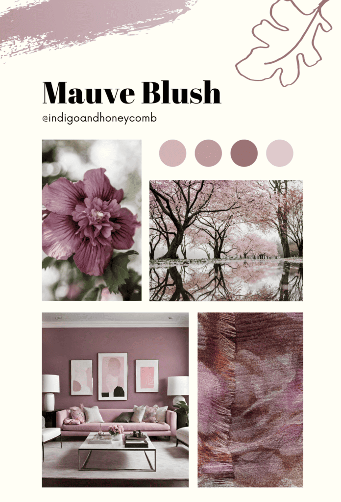
Mauve Blush
Mauve Blush is a sophisticated shade of pink that effortlessly blends elegance with versatility. With its subtle undertones of gray and purple, mauve blush adds a sense of depth and richness to any room. Indeed, when incorporated onto the walls, furniture, or accessories, mauve blush lends a timeless appeal to both traditional and modern interiors, creating a space that feels chic and refined.
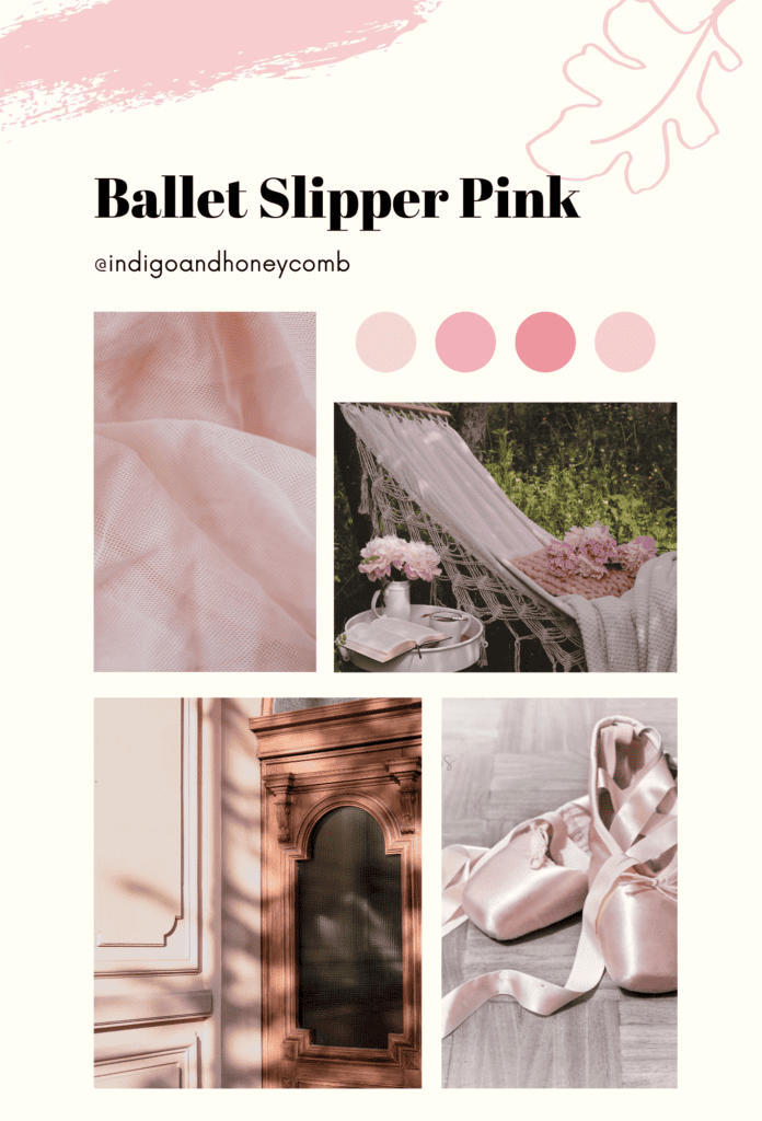
Ballet Slipper Pink
Ballet slipper pink is a soft, delicate shade that exudes femininity and grace. Reminiscent of the pale hue of ballet slippers, this sophisticated pink adds a touch of romance and whimsy to any space. Undoubtedly, when used as an accent color or as the main focus, ballet slipper pink infuses the room with a sense of elegance and charm, creating a serene and inviting atmosphere that’s perfect for relaxation and rejuvenation.
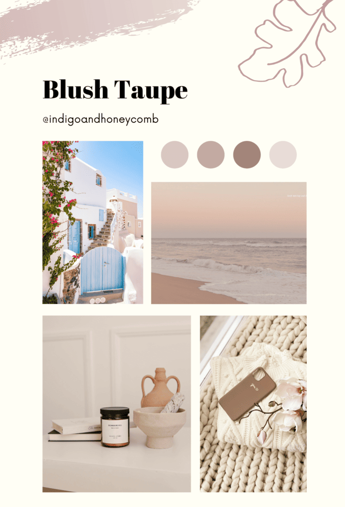
Blush Taupe
Blush taupe is a modern twist on traditional pink hues, combining the softness of blush pink with the sophistication of taupe. The result is a refined and versatile shade that adds a sense of warmth and sophistication to any room. When infusing blush taupe as a wall color, upholstery fabric, or decorative accent, this lush hue creates a timeless and elegant look that’s both tasteful and inviting.
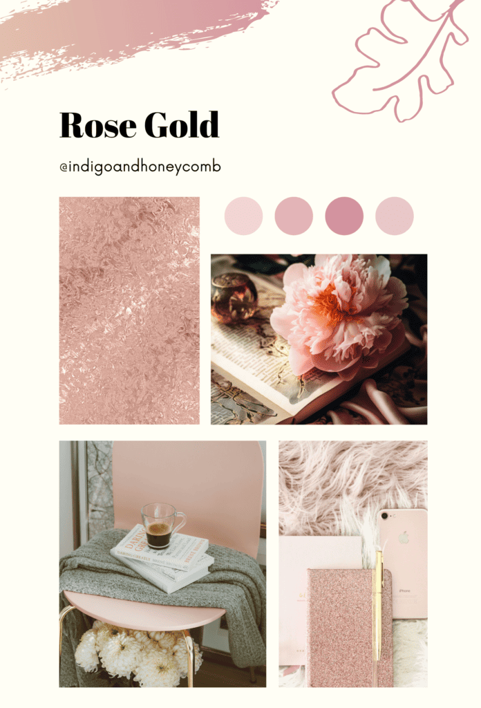
Rose Gold
Rose gold is a luxurious and glamorous shade of pink that adds a touch of opulence to any space. With its warm undertones and metallic sheen, rose gold infuses the room with a sense of glamour and sophistication. Whether incorporated into lighting fixtures, furniture, or accessories, rose gold adds a dose of elegance and drama that instantly elevates the space, creating a stylish and memorable interior that’s sure to impress.
Final Thoughts
Sophisticated pink paint colors offer a quiet kind of impact—one that unfolds over time rather than demanding immediate attention. When thoughtfully chosen, these hues move beyond trend and instead become part of a home’s foundation, shaping the way light, texture, and material are experienced throughout the day.
If you’re considering pink for your interiors, begin with the undertone. Look for shades softened with gray, beige, or violet to ensure the color feels balanced rather than overly sweet. From there, layer in complementary tones—warm neutrals, earthy greens, or deeper grounding hues—to create a palette that feels cohesive and intentional.
Ultimately, the most elegant pink interiors don’t rely on pink alone. They use it as a bridge—connecting color, light, and material in a way that feels both modern and enduring.
FAQs About Sophisticated Pink Paint Color in Interior Design
Is pink a good color for living rooms?
Yes—when chosen carefully, pink can be an excellent color for living rooms. Softer, more sophisticated pink paint colors like dusty rose or blush taupe create warmth without overwhelming the space, making them ideal for areas meant for both relaxation and gathering.
What undertones make pink look sophisticated?
Pink feels most sophisticated when it includes muted undertones such as gray, beige, or soft violet. These undertones reduce brightness and add depth, allowing the color to read as more neutral and refined rather than overly sweet or decorative.
Can pink work as a neutral in interior design?
In many cases, yes. Desaturated pinks—especially those blended with brown or gray—can function similarly to traditional neutrals. They provide subtle warmth and dimension while still pairing easily with other colors, materials, and finishes.
What colors pair best with pink interiors?
Pink pairs beautifully with a range of tones, depending on the mood you want to create. Warm neutrals like taupe and sand enhance its softness, while olive green and muted sage add an organic contrast. For a more grounded look, deeper shades like chocolate brown or charcoal help anchor pink within the space.
How do I choose the right sophisticated pink paint color for my home?
Start by considering lighting and undertones. Test pink paint colors in both natural and artificial light to see how they shift throughout the day. Then, coordinate your choice with existing materials—such as flooring, textiles, and wood tones—to ensure the color feels integrated into the overall design.