If early spring was introspective, and mid-spring returned us to the landscape, this is where the season becomes personal. Color begins to soften again but not into air, and not fully into earth. Instead, it settles into something more intimate. More expressive. More lived-in. This is where romantic interior color palettes for mid-spring begin to re-emerge in a lighter, more fluid way.
Earlier in the season, we explored the depth of Brontë-core and the quiet restraint of romantic neutrals. Now, those ideas begin to shift. Light filters in. Textures soften. Color takes on a gentle warmth that reflects broader mid-spring color palettes trending in 2026. The result is something less structured, and more felt, a defining trait of evolving romantic interior color palettes this season.
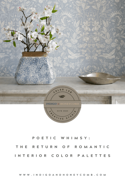
The Aesthetic: Poetic Whimsy
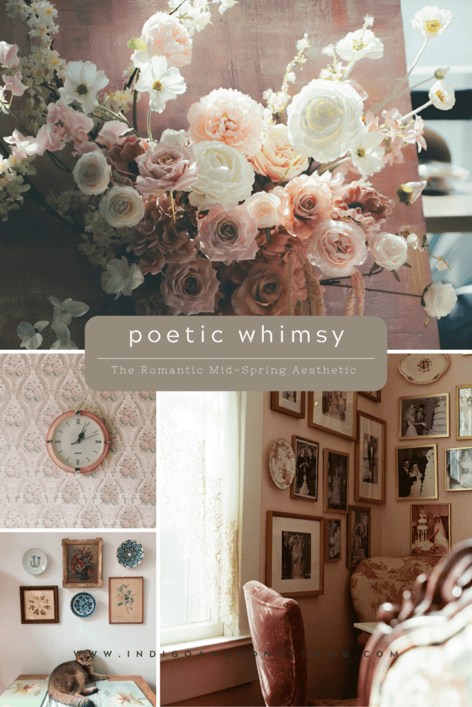
This mid-spring direction introduces a softer kind of romanticism. One that feels lighter, more fluid, and slightly undone. It reflects a growing movement within spring 2026 color trends, where emotional softness and lived-in texture take priority over formality.
It draws from heirloom textiles like lace and eyelet, sun-washed florals and faded prints, and natural materials that carry subtle age and variation. Together, these influences shape romantic interior color palettes for mid-spring that feel layered, expressive, and quietly nostalgic.
However, unlike earlier romantic styles, this approach doesn’t lean heavily into mood or drama. Instead, it embraces poetic softness, quiet imperfection, and a sense of time passing gently through a space.It’s less about recreating history and more about living with it.
5 Romantic Color Palettes for Mid-Spring
As romantic interiors soften for mid-spring, color begins to follow the same gentle shift: less defined, more diffused, and layered with intention. These romantic interior color palettes for mid-spring move away from contrast and toward harmony, blending florals, neutrals, and sun-washed tones in a way that feels effortless and natural within broader mid-spring color palettes.
Each one reflects a different expression of poetic whimsy within spring 2026 color trends, offering warmth, softness, and quiet depth.
Ballet Rose & Honey
Mood: soft, luminous, gently warm
Inspiration: morning light through sheer curtains, delicate movement
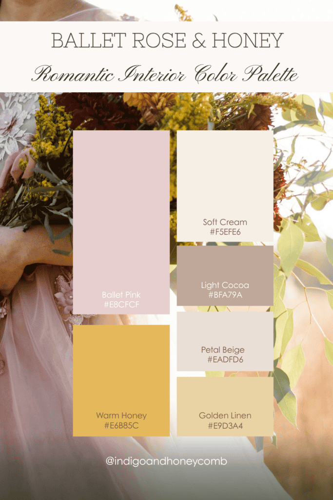
This palette defines a softer expression of romantic interior color palettes, where warmth is layered gently rather than contrasted sharply. Honeyed tones soften blush pink, while creamy neutrals keep the palette grounded and livable.
Lavender Veil
Mood: airy, quiet, ethereal
Inspiration: sheer fabrics, diffused light, barely-there color
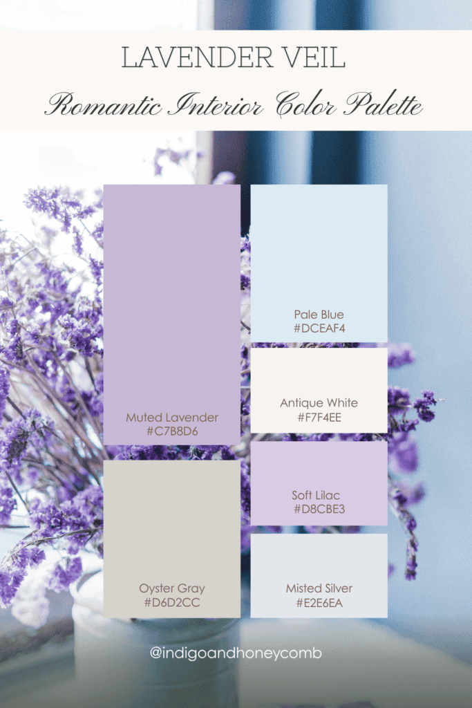
This palette reflects the more ethereal side of romantic interior color palettes for mid-spring, where color feels like atmosphere rather than structure. It aligns with softer mid-spring color palettes that emphasize lightness and diffusion.
Faded Florals
Mood: nostalgic, sun-washed, gently worn
Inspiration: vintage florals left to soften over time
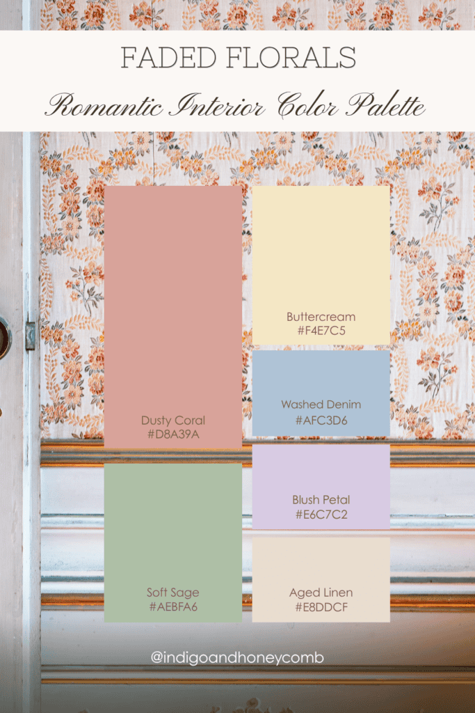
This palette embodies sun-washed softness, a key direction within spring 2026 color trends. It captures how romantic interior color palettes are shifting toward faded, natural tonal variation rather than crisp contrast.
Heirloom Garden
Mood: layered, storied, quietly romantic
Inspiration: collected pieces, passed down and lived with
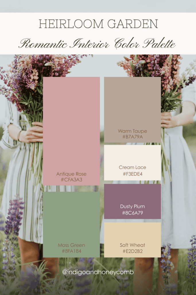
This palette connects directly to earlier Brontë-core influences but evolves them into softer mid-spring color palettes, where heritage tones feel lighter, more breathable, and less structured.
Sun-Washed Keepsake
Mood: warm, nostalgic, gently radiant
Inspiration: objects that hold memory, softened by time
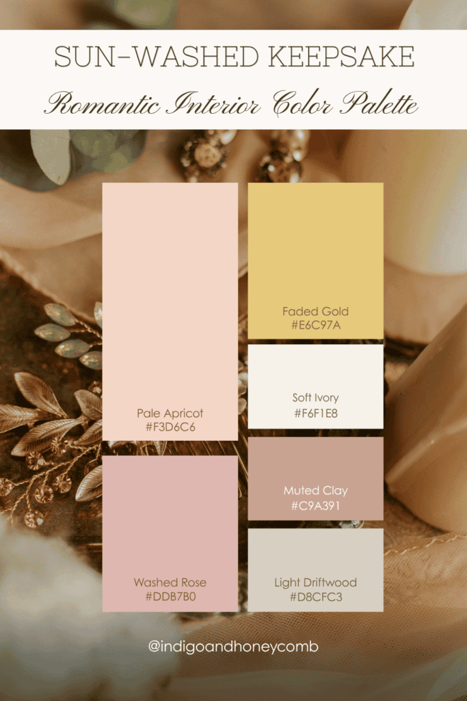
This palette reflects the nostalgic warmth often found in romantic interior color palettes for mid-spring, where light transforms color into something soft, collected, and memory-driven.
Design Insight on Romantic Interior Color Palettes
What defines romantic interiors in 2026 is not ornament, but feeling. Rather than relying on overtly decorative elements, this approach builds atmosphere through softened color transitions, layered tactile materials, and subtle irregularities that suggest age and use. These principles are central to evolving romantic interior color palettes and broader mid-spring color palettes this season.
As a result, interiors feel less styled and more remembered: shaped by time, use, and personal meaning rather than arrangement alone. This is where the shift becomes clear. Not perfection—patina. Not new—remembered.
Final Thoughts
As mid-spring continues, this softness begins to expand. Color becomes bolder, layering becomes more expressive, and the quiet romance of these palettes evolves into something more individual.
Within the larger landscape of spring 2026 color trends, this is where romanticism stops being nostalgic, and starts becoming lived-in.