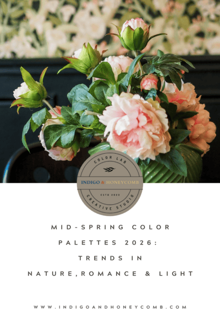
Mid-spring is where color begins to expand. After the quiet restraint of early spring, the season opens into something more layered, more expressive, and more alive. Light lingers longer. Landscapes deepen. Interiors begin to reflect not just the season, but the feeling of it. This is where mid-spring color palettes 2026 take shape.
Rather than a single trend, this moment is defined by a progression from atmosphere to nature, from softness to expression. Together, these shifts reflect the broader direction of spring 2026 color trends, where color becomes more fluid, more personal, and more connected to the natural world.
This guide brings together the full Mid-Spring Series from Indigo & Honeycomb, exploring how color evolves across four distinct, but connected, directions.
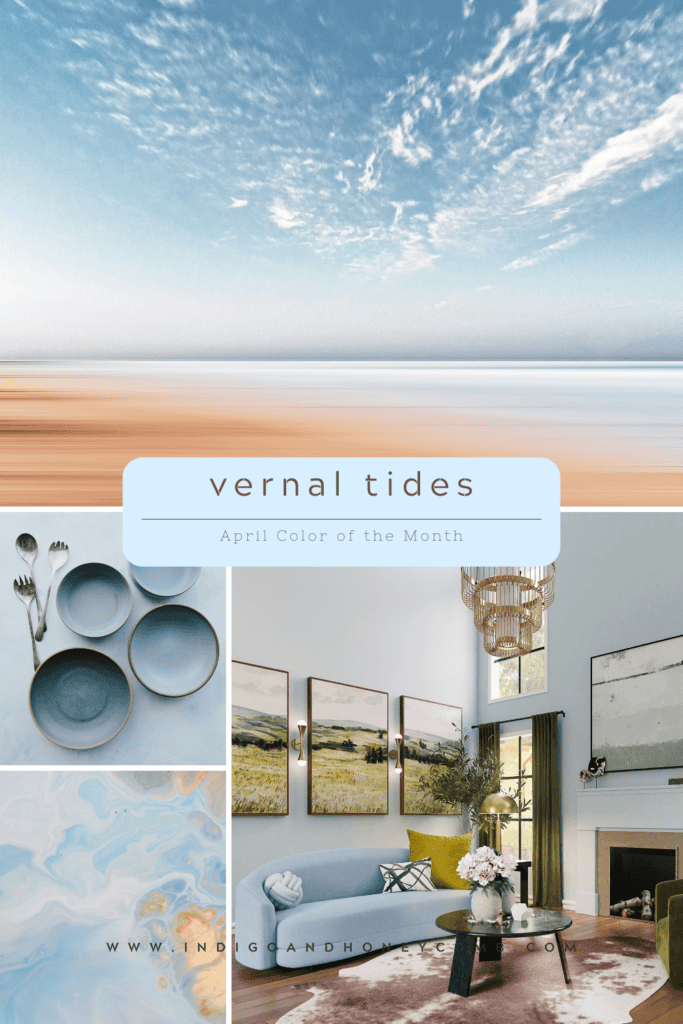
The Season Begins in Light
Mid-spring begins not with bold color but with clarity. Cool-toned hues soften the visual weight of winter, creating palettes that feel airy, reflective, and quietly expansive. These tones draw from water, sky, and the pale brightness of longer days.
This is where atmospheric palettes emerge, defining the earliest expression of mid-spring color palettes. Explore this shift in full in Vernal Tides: April’s Cool Blue Color of the Month.
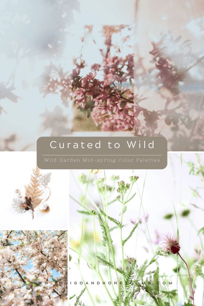
Color Returns to the Landscape
As the season progresses, color begins to gather again. This time in the landscape. Greens deepen. Florals emerge. Earth tones ground the palette in something more tactile and real. Unlike earlier botanical styles, these palettes feel less arranged and more organic, reflecting a growing preference for natural variation.
This is where nature-inspired color palettes take on new meaning—less curated, more lived-in. Discover how this shift unfolds in The New Botanical: Wild Garden Color Palettes for Mid-Spring.
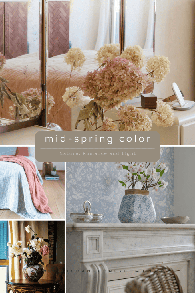
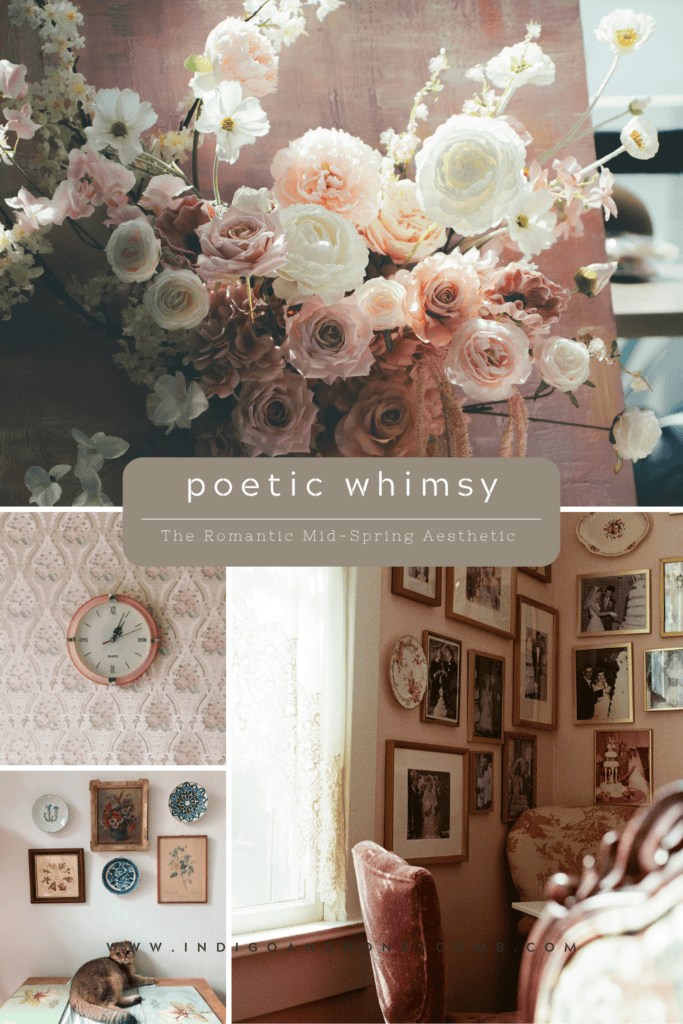
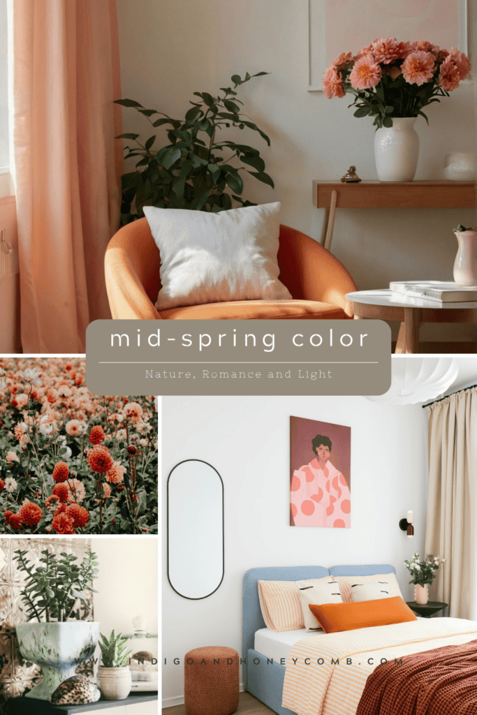
Color Becomes Personal
From landscape, color moves inward. Mid-spring introduces a softer, more emotional layer where interiors begin to reflect memory, texture, and quiet expression. Florals fade. Neutrals warm. Materials carry subtle age.
This is where romantic interior color palettes re-emerge, not as a return to the past, but as an evolution of it. These palettes feel less styled and more remembered, aligning with the softer direction of spring 2026 color trends. Explore this aesthetic in Poetic Whimsy: Romantic Interior Color Palettes for Mid-Spring.
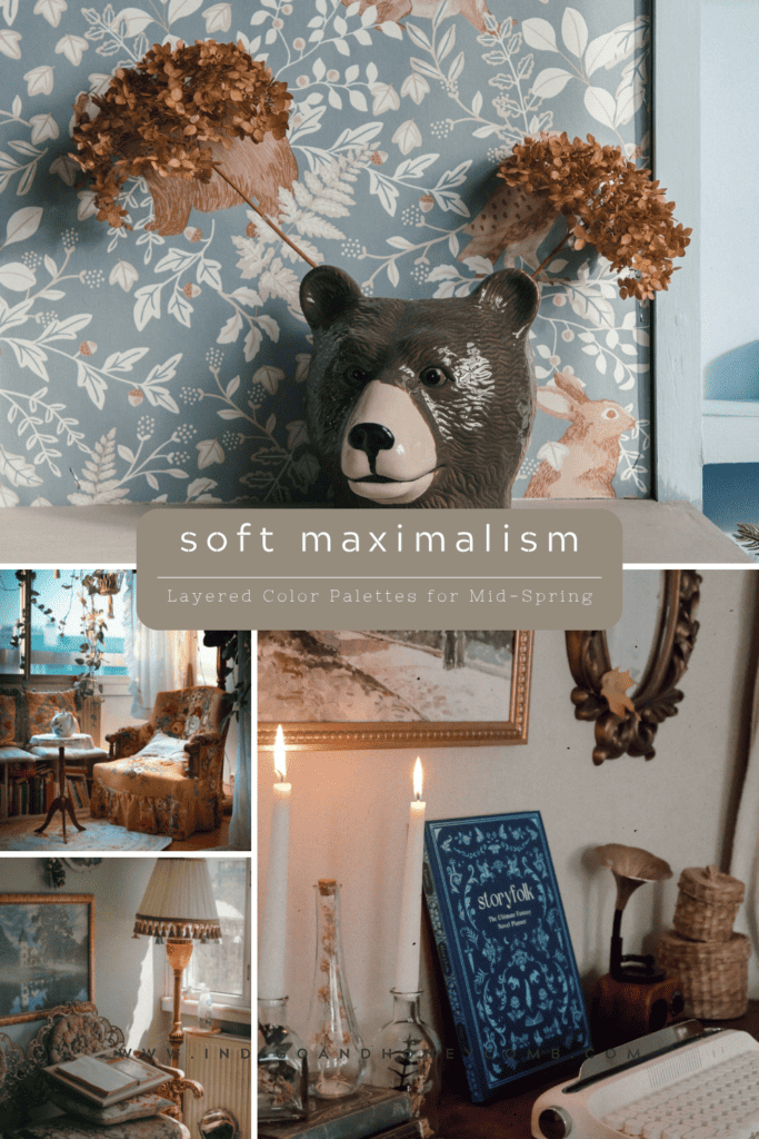
Color Fully Expresses Itself
At its peak, mid-spring becomes layered, expressive, and deeply personal. Rather than minimal or restrained, interiors begin to embrace contrast, texture, and individuality. This shift introduces a refined form of maximalism, one that feels intentional rather than overwhelming.
Known as soft maximalism interiors, this approach blends multiple tones, materials, and influences into a cohesive whole. Here, layered color palettes define the space, bringing together elements from earlier in the season into something more complete. See how it comes together in Soft Maximalism Interiors: Layered Color Palettes for Spring 2026.
The Mid-Spring Color Arc
What defines mid-spring color palettes 2026 is not a single palette, but a progression.
- From light → airy, atmospheric tones
- To landscape → botanical, grounded palettes
- To emotion → romantic, softened interiors
- To expression → layered, maximal compositions
Each stage builds on the last, creating a complete seasonal story. This is what sets mid-spring apart. Color doesn’t arrive all at once. It unfolds.
Design Insight
Across spring 2026 color trends, one idea becomes clear: color is no longer static. Instead, it moves between states—light to grounded, soft to expressive—reflecting a broader shift in how interiors are designed and experienced.
This approach prioritizes:
- variation over uniformity
- layering over simplicity
- feeling over formula
As a result, mid-spring color palettes feel more dynamic, more personal, and more connected to the rhythms of the natural world.
Final Thoughts
Mid-spring is not defined by a single look or palette. It is defined by movement. From the first light of the season to its most expressive interiors, color becomes a reflection of transition itself—shifting, softening, and expanding as the season unfolds. And within that movement, there is space to design not just for the season but for the way it feels.