Bringing Joy Through Colorful Home Decor
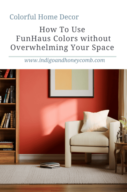
Colorful home decor is having a joyful moment. From painted kitchens and colorful furniture to checkerboard floors, bold stripes, and unexpected pops of color, the Summer 2026 FunHaus trend is encouraging us to bring more personality into our homes. But embracing color doesn’t mean every room needs to become a kaleidoscope.
The secret to making colorful home decor feel sophisticated is intentionality. Instead of covering every surface in a different shade, choose where color will have the greatest impact and allow the surrounding space to provide moments of calm. A single painted ceiling, beautifully saturated chair, or unexpected tile combination can completely transform a room without overwhelming it.
This is where FunHaus becomes especially interesting. Beneath all of its playful patterns and dopamine-inducing color is an important design lesson: color has the greatest impact when you give it room to breathe.
Start With One Hero Color
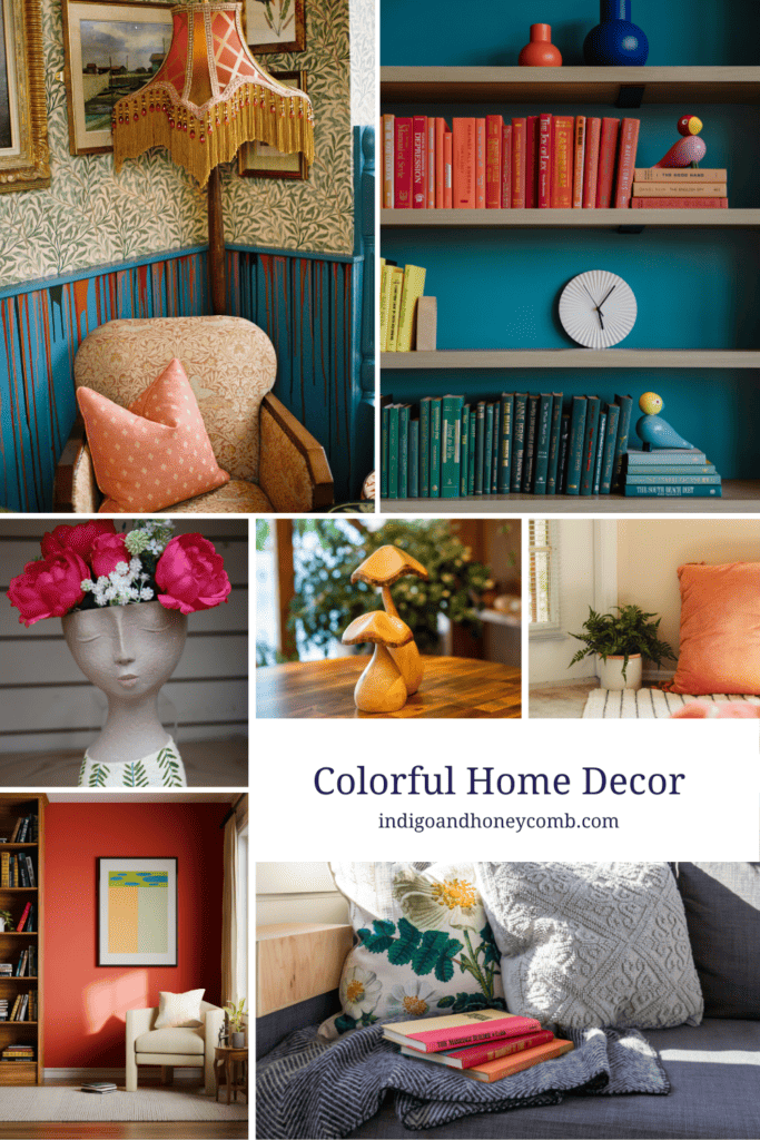
When you’re introducing colorful home decor into your space, the easiest place to begin is with one color that becomes the visual anchor of the room. For Summer 2026, warm Mediterranean-inspired shades are particularly beautiful for this approach. Sunwashed Terracotta brings the warmth of sun-baked clay, while Coral Dust adds a softer, playful note. Salt Blue offers a faded coastal quality, and Warm Bronze grounds brighter colors with an earthy, sophisticated finish.
Rather than treating these colors as a collection that all need to appear equally, choose one as your hero and allow the others to play supporting roles. A terracotta chair against warm white walls can be just as impactful as an entire colorful room. A saturated blue backsplash can become the focal point of a quiet kitchen. Even a painted ceiling can introduce a surprising dose of personality without changing the entire palette. The goal isn’t to use more color. It’s to make the color you choose matter.
Use Colorful Furniture as an Accent
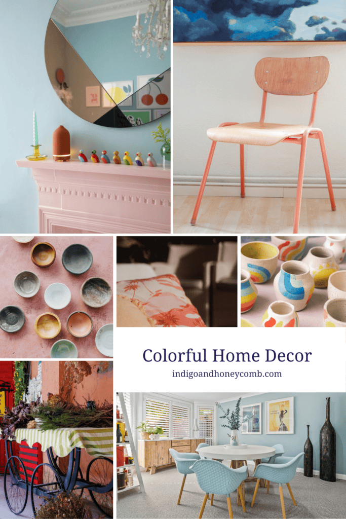
Colorful furniture is one of the easiest ways to experiment with colorful home decor because it gives you a defined dose of personality without requiring a complete room makeover.
A painted cabinet, vintage side table, upholstered chair, or small console can become the colorful punctuation mark in an otherwise restrained room. This works especially well when the furniture has an interesting silhouette or handcrafted quality—the color becomes part of the character of the piece rather than simply another decorative layer.
Try pairing a warm terracotta chair with natural linen, a faded blue cabinet with creamy walls, or a playful painted table with woven textures and weathered wood. The contrast between saturated color and natural materials keeps the room feeling collected rather than overly themed.
And don’t overlook smaller pieces. A colorful lamp, painted nightstand, lacquered stool, or unexpected ceramic can create the same sense of play on a smaller scale. FunHaus doesn’t require a complete room makeover. Sometimes all it takes is one wonderfully unexpected piece.
Look Up: The Painted Ceiling
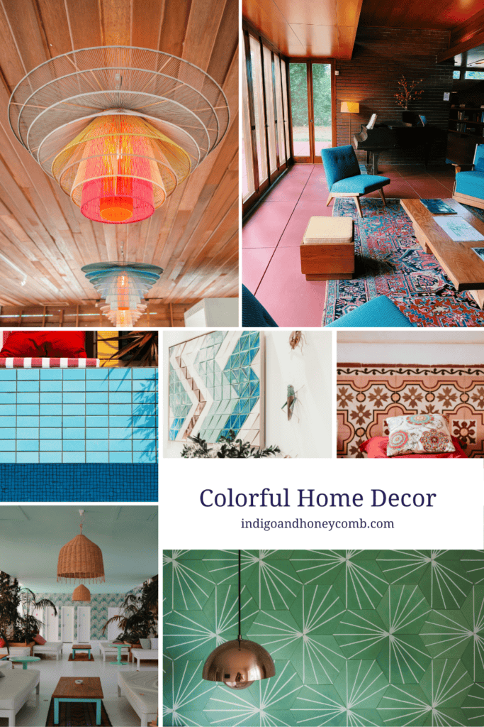
If you’re ready to take your colorful home decor a little further, look up. Painted ceilings are an increasingly creative way to introduce color because they place it somewhere unexpected. Instead of surrounding yourself with color at eye level, a painted ceiling creates a moment of discovery overhead.
For a subtle interpretation, choose a shade that’s only slightly deeper or warmer than the walls. A soft blue ceiling can create the feeling of an open summer sky, while a warm terracotta or peach tone can make a dining room or bedroom feel sun-drenched and intimate.
You can also use the ceiling to introduce a color that appears elsewhere only in small details. A muted blue ceiling might connect to a patterned rug or collection of ceramics without requiring blue furniture throughout the room. The effect is playful, but because the color is concentrated in one architectural element, the overall room can still feel calm.
Experiment With Colorful Tile
Tile is where FunHaus really comes alive. Colorful tile allows you to combine shades, patterns, and geometry in a way that feels playful while still being architectural. A checkerboard floor, striped backsplash, colorful border, or mix of tonal tiles can bring personality to kitchens, bathrooms, mudrooms, and entryways. The key is to give your tile combination some breathing room.
If your floor is highly patterned, keep the cabinetry and walls relatively quiet. If you’re creating a colorful backsplash, consider using simple countertops and natural wood cabinetry to balance it. And if you’re combining several shades, look for colors that share an underlying warmth or coolness so the overall palette feels intentional.
Colorful home decor doesn’t require every color to be bright. Some of the most sophisticated interpretations of FunHaus use weathered, sun-faded, or slightly muted versions of playful colors. A dusty terracotta, softened blue, aged butter yellow, or faded coral can feel expressive without becoming visually loud.
Practice Maximalist Restraint
There is an important distinction between maximalism and visual chaos. Maximalist decor is about layering. It allows pattern, color, texture, art, and objects to coexist in a way that feels expressive and personal. But successful maximalist interiors still need rhythm. The eye needs somewhere to rest.
That’s where maximalist restraint comes in. Instead of asking, “What else can I add?” ask, “What deserves to stand out?” You might have a colorful tile floor, but pair it with quiet walls. You might collect colorful ceramics, but display them against an uncluttered shelf. You might paint the ceiling a surprising shade, then keep the furniture and textiles more restrained.
Repeating a color two or three times throughout a room can also create cohesion. A terracotta accent chair might connect to a ceramic vase and a stripe in the rug. A soft blue ceiling might echo a patterned cushion and a piece of artwork. These small connections make colorful interior design feel intentional rather than accidental. The restraint is what allows the playful elements to shine.
Let Color Have a Hierarchy
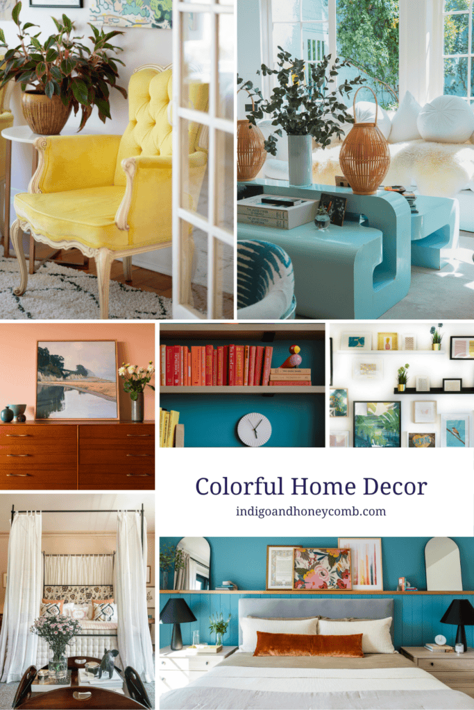
If you’re unsure how to balance colorful home decor, think about visual hierarchy. Your room needs a dominant color, supporting colors, and smaller moments of contrast. Without that hierarchy, even beautiful colors can begin competing for attention.
The familiar 60–30–10 approach can be a helpful starting point: approximately 60 percent of the room in a dominant color, 30 percent in a secondary shade, and 10 percent as an accent. But FunHaus gives you permission to loosen those boundaries.
Your dominant 60 percent might be warm white walls and natural materials. Your secondary color could come from blue cabinetry, a patterned rug, or terracotta upholstery. Then a much smaller accent—perhaps coral, yellow, or a graphic stripe—provides the playful surprise. The numbers aren’t the point. Hierarchy is.
When every color is competing equally for attention, a room can quickly feel chaotic. When you establish a dominant palette and reserve the strongest color for a few intentional moments, even colorful interiors can feel remarkably balanced.
Bring FunHaus Into the Kitchen
The kitchen may be one of the best places to experiment with colorful home decor because color can be introduced through so many different elements. Consider painted cabinetry in a faded blue or warm terracotta, paired with creamy walls and natural wood. Add a patterned tile backsplash, colorful ceramics, or a striped Roman shade, but allow at least one major element to remain visually quiet.
For a smaller commitment, introduce color through a painted island, vintage stools, pendant lights, or open shelving filled with collected ceramics. The most successful colorful kitchens don’t necessarily look “decorated.” They feel as though the color has always belonged there—part of the architecture, history, and personality of the home.
Create One Moment of Surprise
Perhaps the most charming part of FunHaus is its sense of unexpectedness. A colorful interior doesn’t have to announce itself the moment you walk through the door. Sometimes the most memorable use of color is tucked around a corner.
A painted interior door. A striped ceiling in a hallway. A coral-painted piece of furniture in an otherwise quiet bedroom. A checkerboard floor in a small powder room. A collection of brightly colored ceramics displayed against a simple backdrop. These moments work because they aren’t everywhere.
A home becomes more interesting when color occasionally surprises you. You turn a corner and discover something playful. You open a cabinet and find a saturated interior. You walk into a small room and suddenly encounter a pattern you weren’t expecting. That little bit of surprise can be more memorable than an entire room saturated in color.
Colorful Home Decor Should Feel Personal
The best way to bring FunHaus colors into your home is to remember what makes the trend so appealing in the first place: joy. Colorful home decor isn’t about following a rigid palette or recreating someone else’s colorful kitchen. It’s about allowing your home to feel more expressive, personal, and playful.
Start small if you need to. Paint one piece of furniture. Add a colorful lamp. Experiment with patterned tile in a powder room. Try a painted ceiling in a space where you’re willing to take a creative risk. Then step back and see how the color makes you feel.
Because ultimately, the most sophisticated version of FunHaus isn’t about how much color you can fit into a room. It’s about knowing where color can create the most delight. A little restraint gives color room to breathe—and sometimes the most memorable spaces are the ones that know exactly when to stop.
Read more in our Salt, Sun & Play summer series:
- June Color of the Month: Coastal Mineral Wash
- Summer 2026 Color Trends: The Rise of Summer Siren Style
- Fresh Coastal Exterior Colors: Seafoam Greens and Oyster Whites
- Summer Siren Aesthetic: The Coastal Trend Redefining Mermaidcore
- July Color of the Month: Harbor Stripe and the Return of Nautical Blue
- Sailorcore is Summer 2026’s Most Timeless Trend
- Lakeside Cottage Paint Colors Inspired by New England Summers
- August Color of the Month: Sunwashed Terracotta and Mediterranean Style
- FunHaus: The Joyful Color Trend Bringing Back Play
- Greek Isle Exterior Colors That Feel Timeless
- Whimsical Home Decor: Designing a More Playful Summer
- Why Greek Isle Style is Replacing Coastal Grandmother