Pink has evolved into one of the most versatile and sophisticated colors in interior design. No longer confined to overly sweet or decorative spaces, today’s pinks are softened, grounded, and thoughtfully layered, making them ideal for creating interiors that feel both elevated and livable.
A well-balanced pink color palette for interiors combines muted pink tones with complementary hues like warm neutrals, earthy greens, and soft grays. The result is a space that feels cohesive rather than themed, where pink acts less as a statement and more as a unifying element throughout the home.
Whether you’re designing a serene bedroom, a welcoming living room, or a more expressive dining space, pink offers a range of possibilities that can adapt to different styles, lighting conditions, and moods.
What Is the Best Pink Color Palette for Interiors?
The best pink color palettes for interiors combine soft, muted pinks with grounding tones like taupe, green, or gray. Rather than relying on bright or saturated pinks, more sophisticated palettes incorporate muted tones—such as dusty rose, blush taupe, or mauve—paired with grounding colors that add depth and contrast.
These palettes often include a mix of warm and cool elements. For example, pairing pink with taupe or sand creates warmth and cohesion, while adding olive green or soft gray introduces contrast without overwhelming the space. This layered approach allows pink to feel timeless and adaptable across a variety of interior styles.
For a more refined approach to selecting pinks, explore these sophisticated pink paint colors for interiors, where undertones and material pairings play a key role in creating a balanced palette.
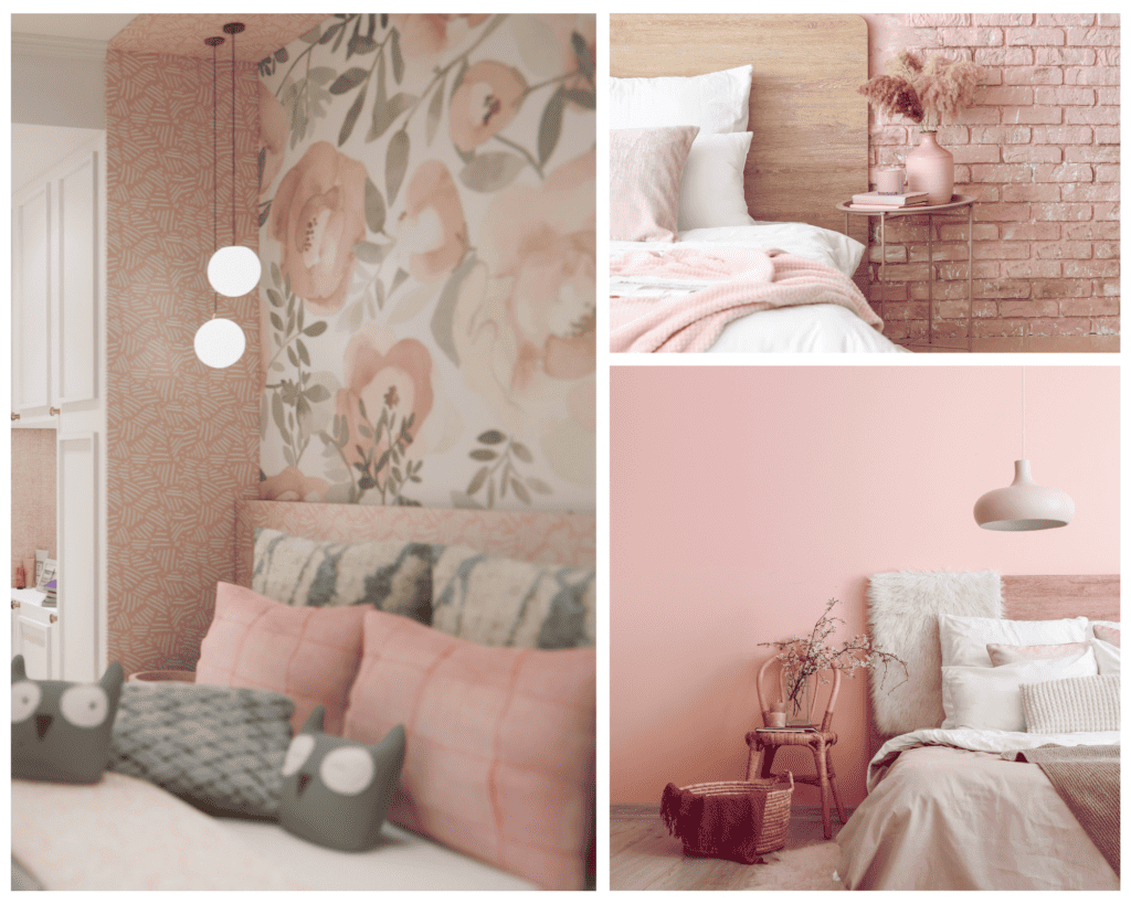
Soft Pink Bedroom Color Palette: Creating a Calm and Restful Space
A soft pink bedroom color palette is ideal for creating a calming, restorative environment. Blush tones with subtle gray or beige undertones bring warmth without feeling overly feminine, especially when paired with light neutrals and natural textures.
Layering is essential here. Combine soft pink walls or bedding with linen textiles, light wood finishes, and warm whites to create a space that feels both relaxed and refined. The goal is to maintain a sense of softness while introducing enough variation in tone and texture to keep the room visually interesting.
For a seasonal interpretation of this palette, tones like Frosted Blush offer a cooler, more atmospheric take on pink that works beautifully in bedrooms.
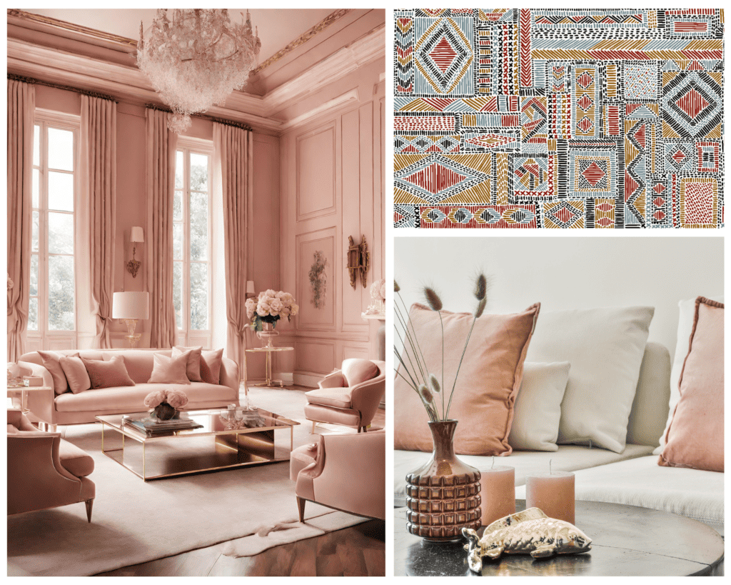
Elegant Pink Living Room Color Palette for a Sophisticated Home
In living spaces, a pink color palette can feel both inviting and elevated when grounded with richer, more structured tones. Dusty rose or rosewood pinks pair especially well with taupe, camel, and deeper browns, creating a layered environment that feels warm yet composed.
To avoid the space feeling overly styled, incorporate pink through larger elements such as upholstery or wall color, while allowing supporting tones to appear in wood finishes, rugs, and accent pieces. This approach creates balance and ensures the palette feels integrated rather than decorative.
For more inspiration on how pink functions across different spaces, explore this broader pink color palette for interiors approach.
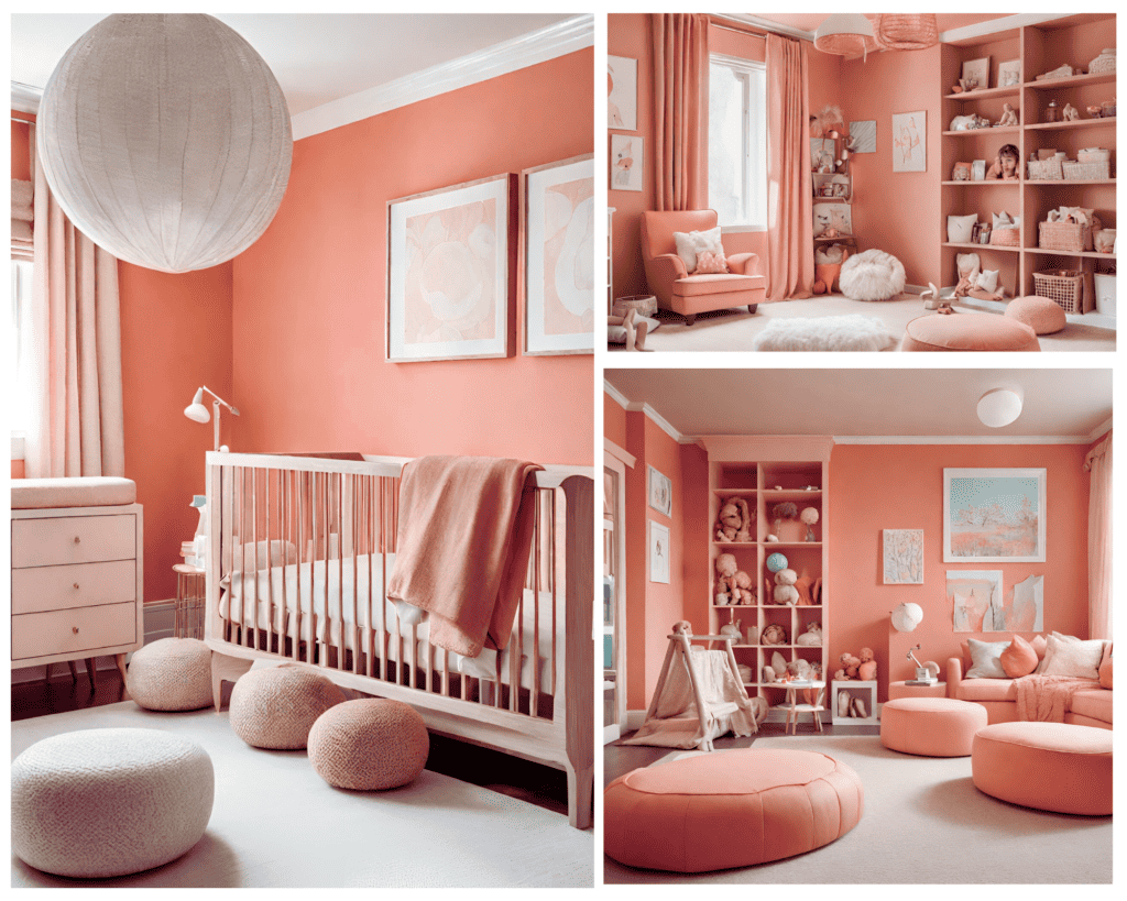
Playful Pink Color Palette for Children’s Rooms
Pink can take on a more playful and expressive role in children’s spaces while still maintaining a sense of cohesion. The key is to balance brighter or clearer pinks with softer neutrals to prevent the palette from feeling overwhelming.
Pairing pink with warm whites, soft yellows, or even muted greens can create a cheerful yet grounded environment. Incorporating natural materials such as wood or woven textures helps bring warmth and structure to the space, ensuring it can evolve over time.
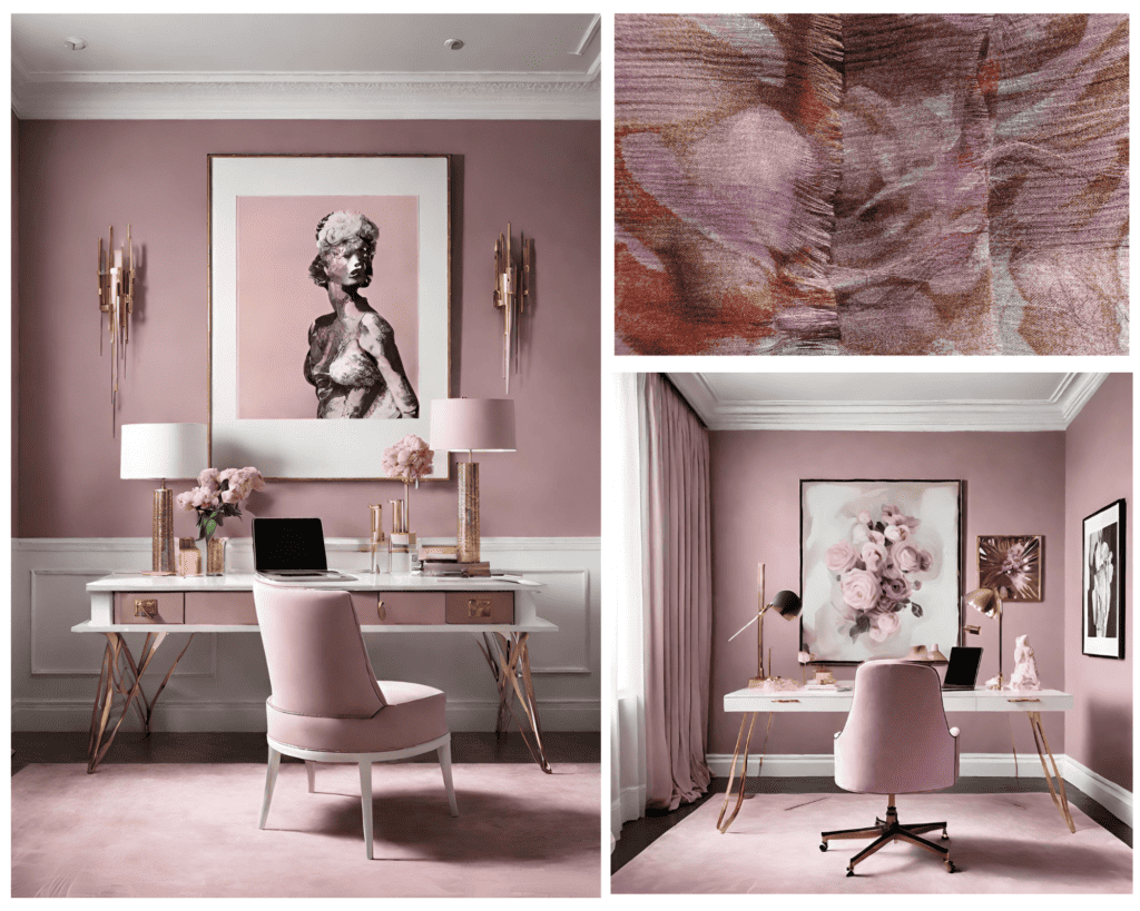
Sophisticated Mauve Pink Palette for a Productive Home Office
For a home office, pink can offer an unexpected balance between creativity and focus. Mauve or blush tones with cooler undertones work particularly well, as they introduce color without becoming distracting.
Pair pink with soft grays, charcoal accents, or muted metallics to create a more tailored, structured environment. This combination feels polished and intentional. Ideal for a space that needs to support both productivity and inspiration.
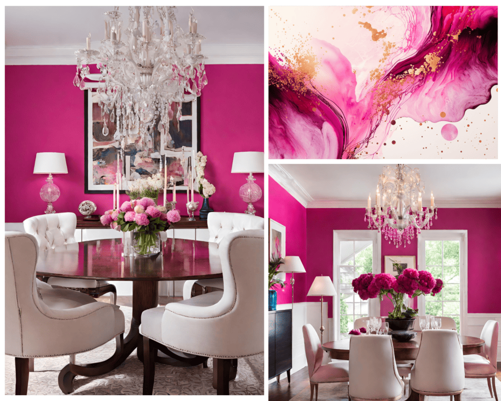
Bold Pink Dining Room Palette for Dramatic Interiors
In dining rooms, deeper pinks can create a sense of intimacy and richness. Rosewood or berry-toned pinks bring warmth and depth, especially when paired with darker hues like chocolate brown, espresso, or bronze finishes.
To balance the intensity, incorporate lighter elements such as warm ivory or soft neutral upholstery. This contrast keeps the space from feeling too heavy while still maintaining a dramatic, layered effect.
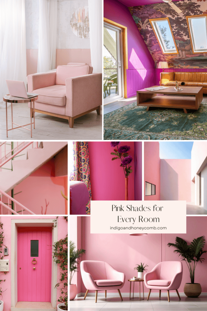
What Colors Go with Pink in Interior Design?
One of the most compelling aspects of a pink color palette for interiors is its versatility. Pink pairs effortlessly with a range of tones, allowing it to adapt to different moods and styles.
Earthy greens like olive and sage create a natural, organic contrast, while warm neutrals such as taupe, sand, and beige enhance pink’s softness. For a more structured look, deeper hues like charcoal or chocolate brown provide grounding and depth. Softer combinations like pink with muted blue or gray offer a more atmospheric, calming effect.
The key is to focus on balance. When paired thoughtfully, pink becomes less of a focal point and more of a connector within the overall palette.
Conclusion: Designing with Pink as a Modern Neutral
Pink, when approached thoughtfully, has the ability to function as a modern neutral—bringing warmth, softness, and depth into a space without overwhelming it. The most successful pink interiors rely on balance, layering, and an understanding of undertones rather than bold statements alone.
As you explore pink color palettes for your home, consider how each shade interacts with light, material, and surrounding colors. When used intentionally, pink becomes less about trend and more about creating spaces that feel personal, timeless, and quietly expressive.So go ahead, unleash your creativity, and paint your world pink!
FAQs About Pink Color Palettes for Interiors
What is the best pink color palette for a home?
The best pink color palette combines muted pink tones with grounding colors like taupe, green, or gray. This creates balance and allows pink to feel sophisticated and adaptable across different rooms.
Is pink a good color for every room?
Yes—pink can work in nearly every room when the tone and pairing are chosen carefully. Softer pinks are ideal for bedrooms and living spaces, while deeper tones can add richness to dining rooms or offices.
What colors balance pink in interiors?
Colors that balance pink include warm neutrals (taupe, beige), earthy greens (olive, sage), and deeper tones like brown or charcoal. These combinations help ground pink and create a more cohesive palette.
How do I decorate with pink without it feeling overwhelming?
Start with muted pink tones and layer them with neutrals and natural materials. Avoid overly bright shades, and focus on balance through texture and contrast to create a more refined look.