Early spring introduced some of the moodiest interior color trends 2026 has seen in years. Mineral blues, forest greens, smoky plum, espresso brown, and cocooning neutrals that reflected the quieter energy of late winter. By mid-spring, those palettes softened into hazier florals, watercolor pastels, muted lilacs, and airy romantic tones that brought renewal without losing depth.
Now, late spring is shifting the conversation again.
But instead of moving toward bright citrus or sharp summer color, the biggest interior color trends 2026 is embracing are warmer, earthier, and more sun-aged. Across design studios, trend forecasts, and home collections, late spring palettes are leaning into softened olive greens, butter yellows, clay tones, oat neutrals, oxidized brass, honeyed amber, and mineral-inspired textures that feel layered rather than freshly polished. The result is a season that feels less like a clean slate and more like a beautifully lived-in room touched by sunlight over time.
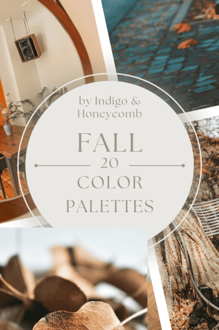
How Trends Shifted From Moody Spring to Honey-Warmed Late Spring
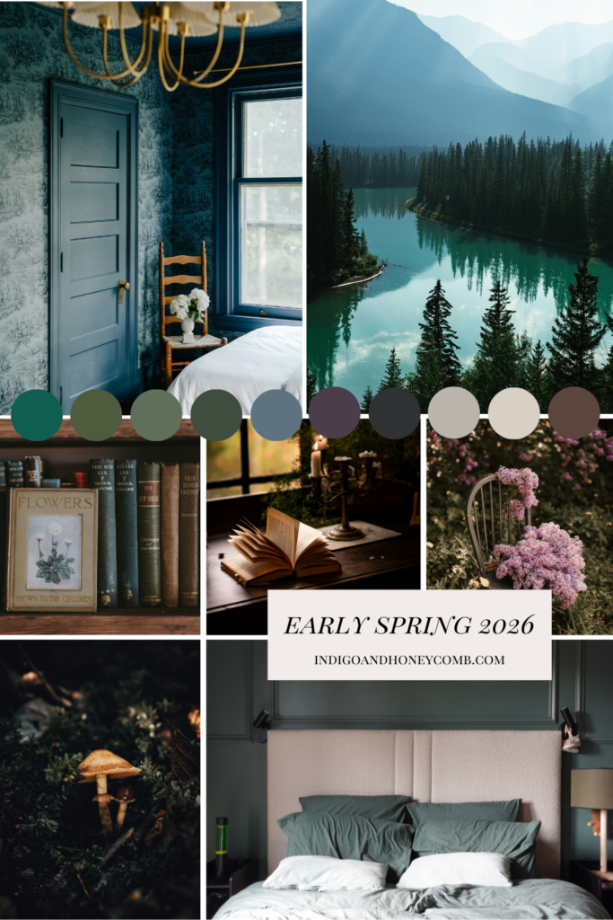
One of the most interesting aspects of the evolving interior color trends 2026 is how emotionally connected seasonal palettes have become. Early spring palettes leaned atmospheric. Moody mineral tones, rain-soaked greens, and softened neutrals define the atmospheric beginning of the Spring 2026 color story. Inspired by woodland landscapes, stormy skies, weathered stone, and cocooning interiors, this palette captures the quiet depth of early spring before the season begins to soften into bloom.
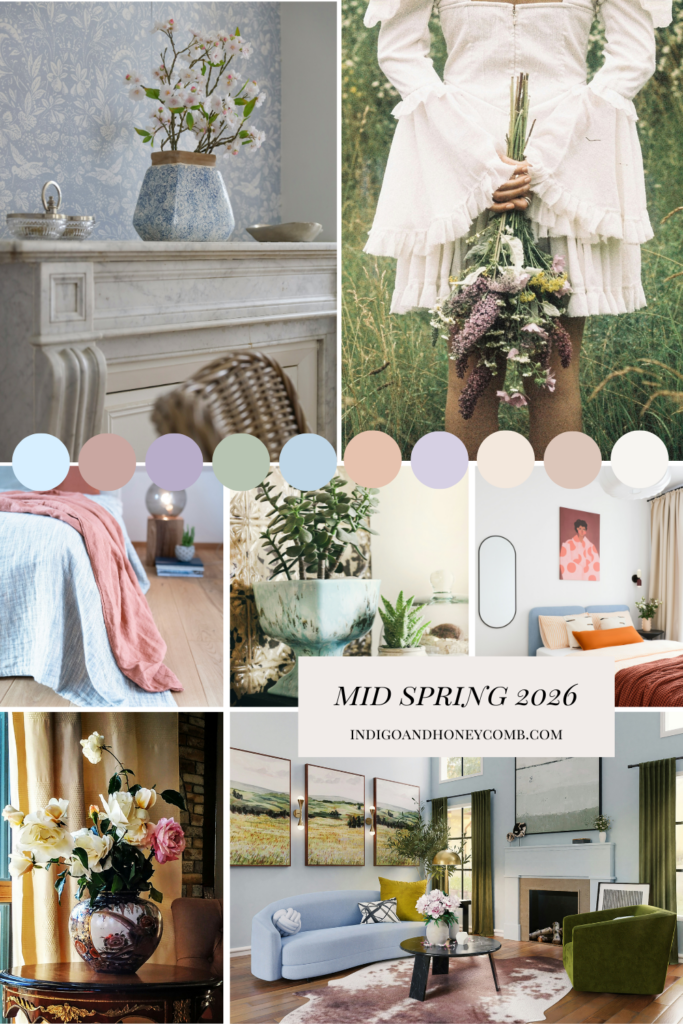
Mid-spring introduced more softness. Soft watercolor pastels, airy botanicals, and hazy romantic tones define the gentle transition into mid-spring 2026. Inspired by coastal skies, blooming gardens, pressed petals, and diffused morning light, this palette captures the softened optimism and atmospheric beauty of the season.
Late spring, however, introduces warmth. Not loud warmth. Not tropical brightness. Instead, the latest interior color trends 2026 are embracing tones filtered through linen curtains, aged plaster walls, antique brass, terracotta vessels, and sunlit wood finishes. Designers are increasingly favoring layered tonal palettes over sharp contrast, using warmth and texture to create interiors that feel collected and emotionally grounding.
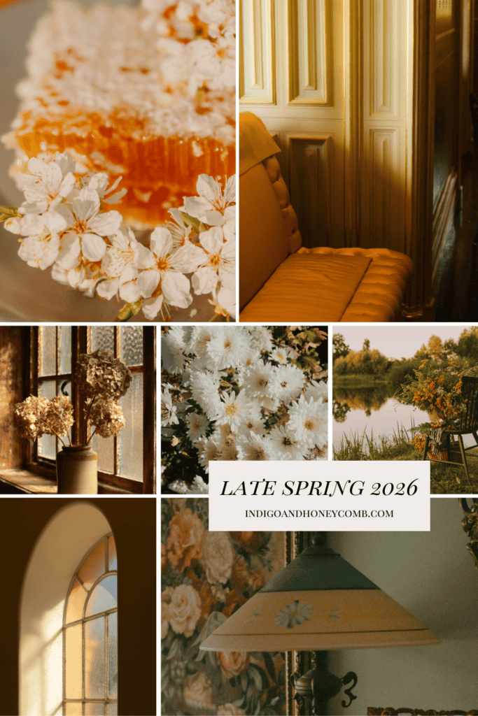
This is where Honeyed Patina enters the conversation. As Indigo & Honeycomb’s May Color of the Month, Honeyed Patina perfectly captures the direction late spring interiors are taking — somewhere between aged gold, olive undertones, warm amber, and softened clay.
Why 2026 Is Replacing “Fresh” Spring Colors With Patina Tones
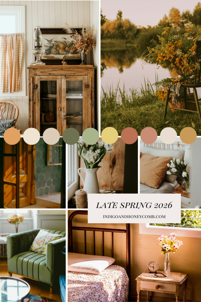
For years, spring interiors leaned heavily on cool whites and pastel color stories. But one of the defining interior color trends 2026 is the move away from overly sterile palettes in favor of spaces that feel warmer, softer, and more tactile. Warm honeyed neutrals, softened botanical greens, and sun-aged earth tones define the grounded elegance of late spring 2026. Inspired by Mediterranean landscapes, antique brass, handmade ceramics, weathered linen, and golden afternoon light, this palette captures the season’s shift toward warmth, texture, and layered living.
These colors feel aged in the best possible way like sunlight naturally softened them over time. Texture is also becoming just as important as color itself. Linen, limewash, plaster, brushed brass, woven fibers, and handmade ceramics are helping interiors feel layered and deeply human again.
Butter Yellow and Honeyed Amber Are Defining Colors in 2026
One of the clearest examples of evolving interior color trends 2026 is the transformation of butter yellow. Earlier spring palettes treated butter yellow as airy and pastel-driven. But by late spring 2026, the shade deepens into warmer amber and honey-inspired variations that pair beautifully with olive, walnut, terracotta, and dusty floral tones.
The newest yellow palettes feel:
- creamy rather than bright
- earthy rather than sugary
- sunlit rather than citrusy
This explains why honey-toned interiors suddenly feel so relevant within current interior color trends 2026. Late spring is no longer about floral sweetness. It’s about warmth, patina, and depth.
Olive, Clay & Botanical Earth Tones Are Leading Interior Color Trends 2026
Greens are evolving too. Early spring favored deeper forest and moss shades. Mid-spring softened them into airy sage. Now late spring introduces more mineral olive, pistachio, and yellow-based botanical greens that feel simultaneously vintage and modern.
Paired with clay, ochre, walnut, parchment, and honeyed neutrals, these greens create the grounded, collected feeling defining many of the strongest interior color trends 2026. This palette shift also reflects a broader desire for homes that feel emotionally comforting rather than perfectly minimal.
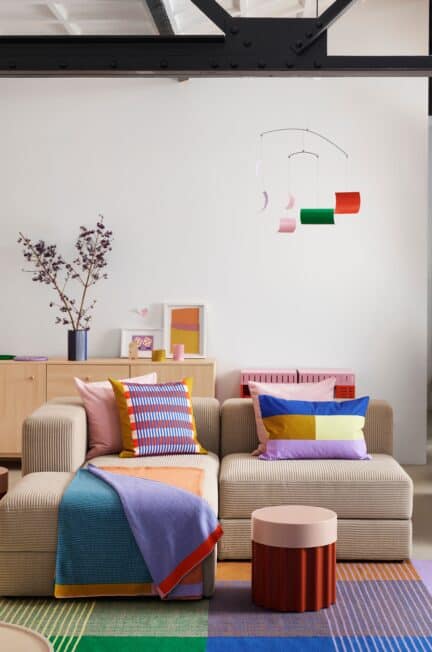
Rooms are becoming warmer, more layered, less polished, and far more personal, with softly nostalgic elements replacing the overly minimal spaces that dominated previous years. Across the latest interior color trends 2026, homes are embracing collected textures, aged finishes, and emotionally grounded palettes that feel lived-in rather than perfectly curated. And color is leading that transformation.
The Most Important Interior Color Trends 2026 for Late Spring
Some of the strongest late spring palettes emerging within today’s interior color trends 2026 include:
Olive & Amber Atelier
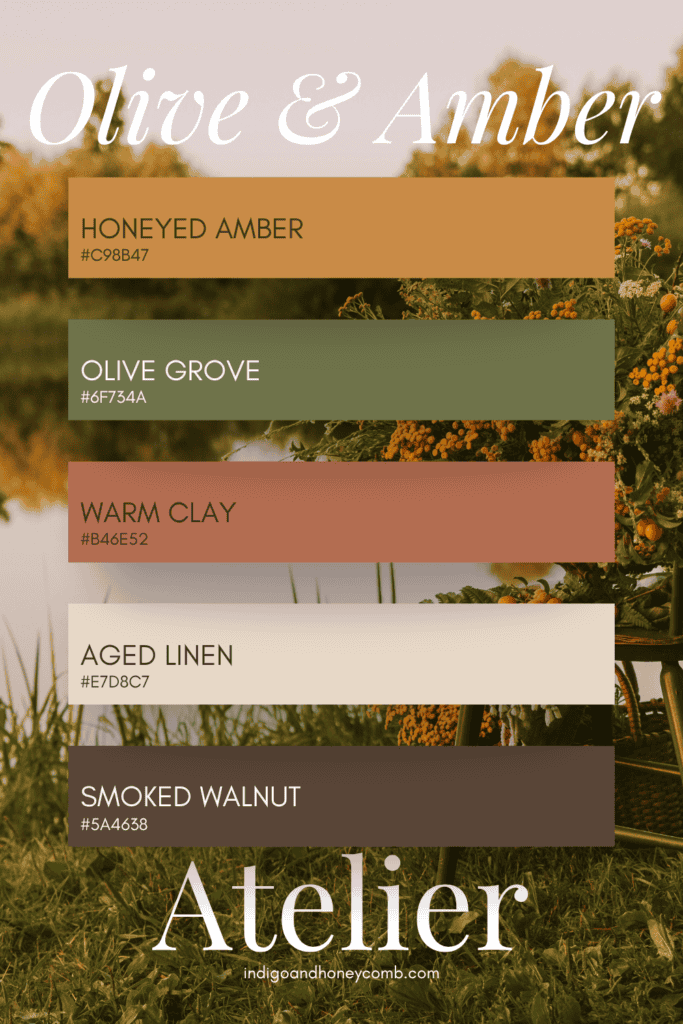
Warm, grounded, and Mediterranean-inspired.
Soft Spring Glow
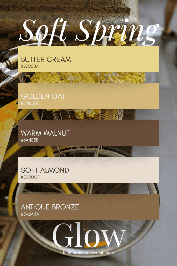
Soft optimism balanced by earthy depth.
Faded Garden Romance
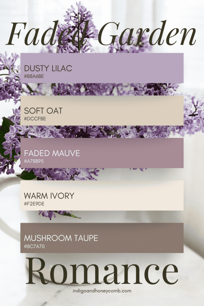
Romantic but muted enough to feel timeless.
Earthen Spring
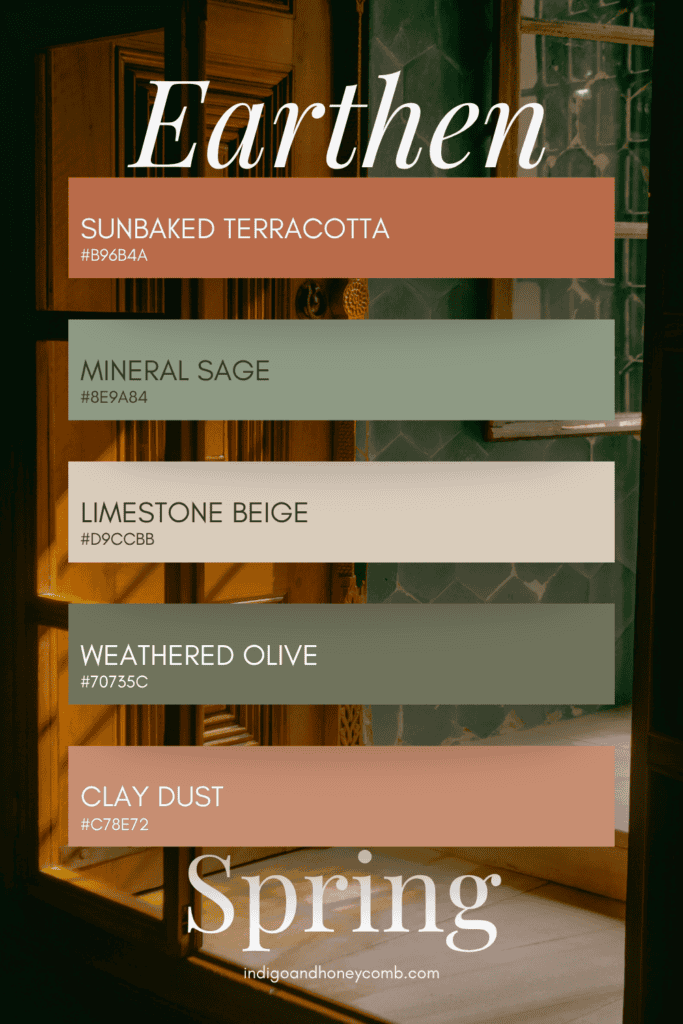
Organic, sun-washed, and quietly rustic.
Collected Warmth
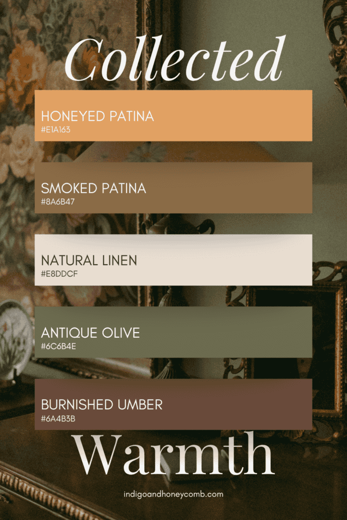
A perfect expression of the Honeyed Patina aesthetic.
Late Spring Botanical
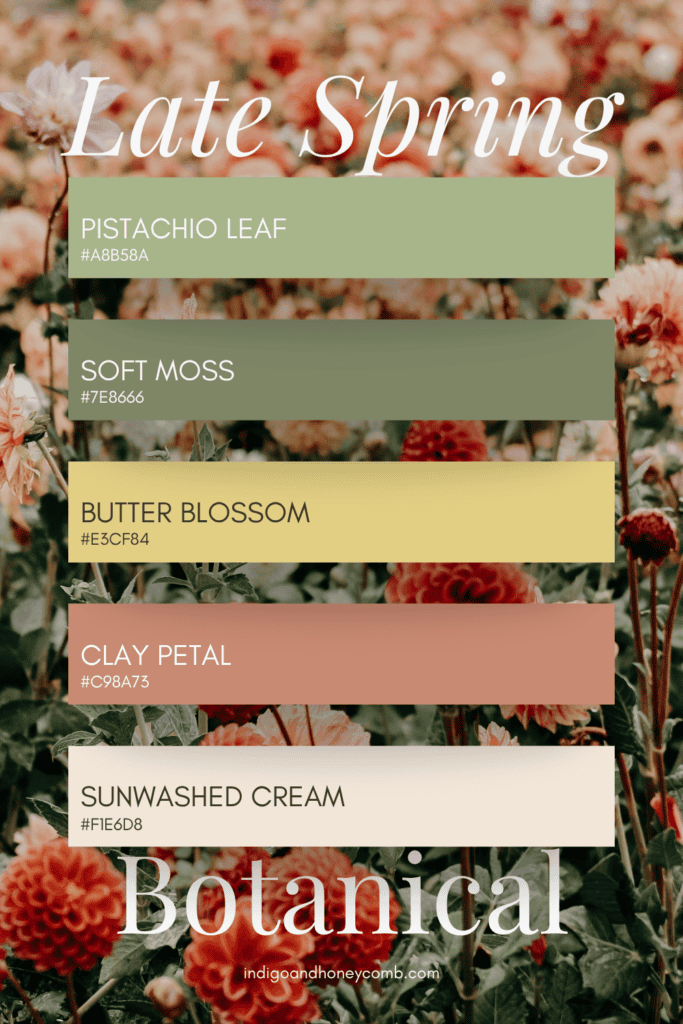
A fresh yet grounded palette inspired by herb gardens, sunlit conservatories, and the softened greens and florals that define late spring interiors in 2026.
Mediterranean Spring Days
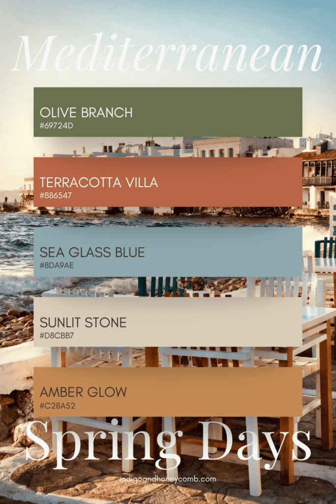
Warm terracotta, olive greens, sea glass blue, and sunwashed neutrals come together in a palette inspired by coastal villas and relaxed Mediterranean living.
Warm Patina Neutrals
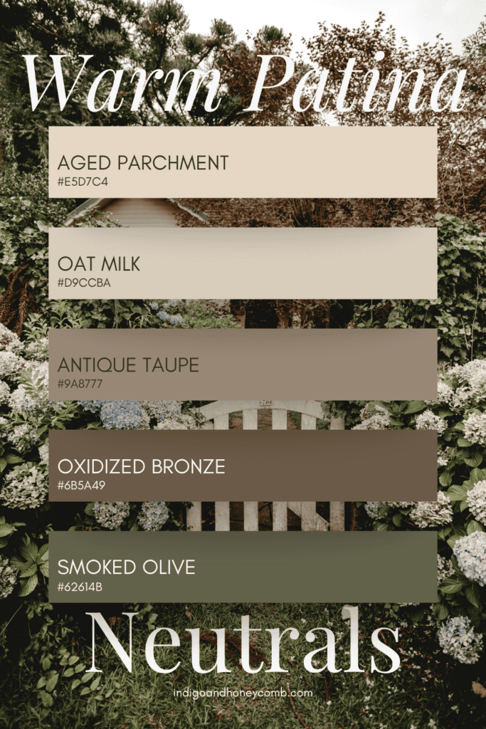
Layered oat tones, aged parchment, smoked olive, and oxidized bronze create a timeless neutral palette that feels collected, warm, and softly weathered by sunlight.
Why Interior Color Trends 2026 Feel More Emotional Than Seasonal
Perhaps the biggest shift happening within interior color trends 2026 is that seasonal palettes no longer feel disconnected from one another. Instead of abrupt trend changes, interiors are evolving gradually through mood, light, and texture:
- winter depth becomes early spring moodiness
- early spring softens into watercolor mid-spring palettes
- mid-spring warms into late spring patina tones
- late spring eventually transitions into sun-baked summer earthiness
The result feels far more natural — and far more livable. The strongest interior color trends 2026 prove that color doesn’t need to feel bright to feel hopeful. Sometimes warmth, softness, texture, and age create the most beautiful palettes of all.
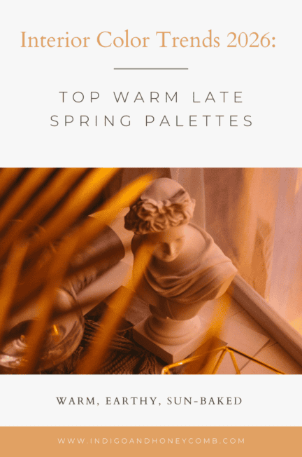
For more late spring inspiration, explore Indigo & Honeycomb’s May Color of the Month, Honeyed Patina, and the evolving world of warm layered interiors.