
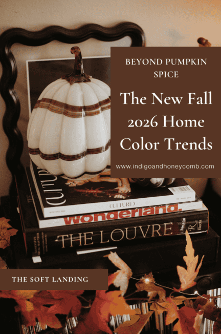
Fall 2026 is getting richer, moodier and a lot more interesting.
Fall has always had its colors. Pumpkin orange, rust, mustard, burgundy, forest green and warm brown arrive almost automatically when the calendar turns toward September. They are familiar, comforting and undeniably seasonal. But this year, the story is becoming more nuanced.The Fall 2026 home color trends are moving beyond the expected autumn palette and into colors with more depth, complexity and personality.
Chocolate brown is taking on the role of a sophisticated neutral. Oxblood and maroon bring drama without feeling overly bright. Bottle green is becoming deeper and more atmospheric, while smoky violet and dusky mauve introduce cooler notes that challenge the idea that fall decorating has to be warm from top to bottom. Straw yellow holds onto a little of summer’s optimism, deep navy brings a moody alternative to traditional autumn shades, and terracotta continues to evolve beyond its familiar bohemian associations.
What connects these colors isn’t simply that they are trending. It is the way they are being used. Fall 2026 interiors are becoming warmer, more layered and more personal, with color working alongside natural materials, darker woods, aged metals, vintage pieces and collected objects. Recent design reporting points toward interiors that feel lived-in and individual rather than perfectly coordinated, with richer colors helping to create that sense of depth and atmosphere.
That shift is important because it changes the way we should think about seasonal color. Instead of asking, “What colors should I decorate with for fall?” a better question might be, “Which colors can help my home feel warmer, richer and more like me as the season changes?”
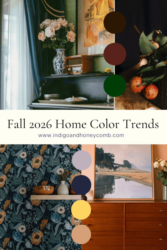
Fall Color Is Moving Beyond the Obvious
The most interesting thing happening with fall color right now is not the disappearance of traditional autumn shades. It is their evolution.
Chocolate brown, for example, isn’t simply replacing beige. It is becoming a more expressive neutral, one with enough depth to anchor a room while still working with cream, blue, green, pink and metallic accents. Oxblood isn’t simply another name for burgundy; its deeper, brown-red character gives it a moodier and more enveloping quality. Terracotta is no longer confined to rustic or Southwestern interiors, either. Used with stone, walnut, aged brass or unexpected cooler colors, it can feel sophisticated and architectural.
At the same time, colors that aren’t traditionally associated with autumn are finding their way into the season. Smoky violet, dusky lilac and deep blue bring a cooler dimension to fall interiors, while muted yellow provides a softer connection to the golden light of the season. The result is a palette that feels less literal and much more adaptable to the way people actually live.
This is also why the current movement toward collected interiors matters. When rooms are built around things you genuinely love rather than a single decorating formula, seasonal color becomes easier to incorporate. A deep green cabinet can live alongside a faded lilac textile. A chocolate brown sofa can work with blue-and-white ceramics. An oxblood lamp can sit comfortably next to a terracotta rug. The colors don’t have to match; they simply need to belong to the same visual conversation.
Chocolate Brown: The New Foundation
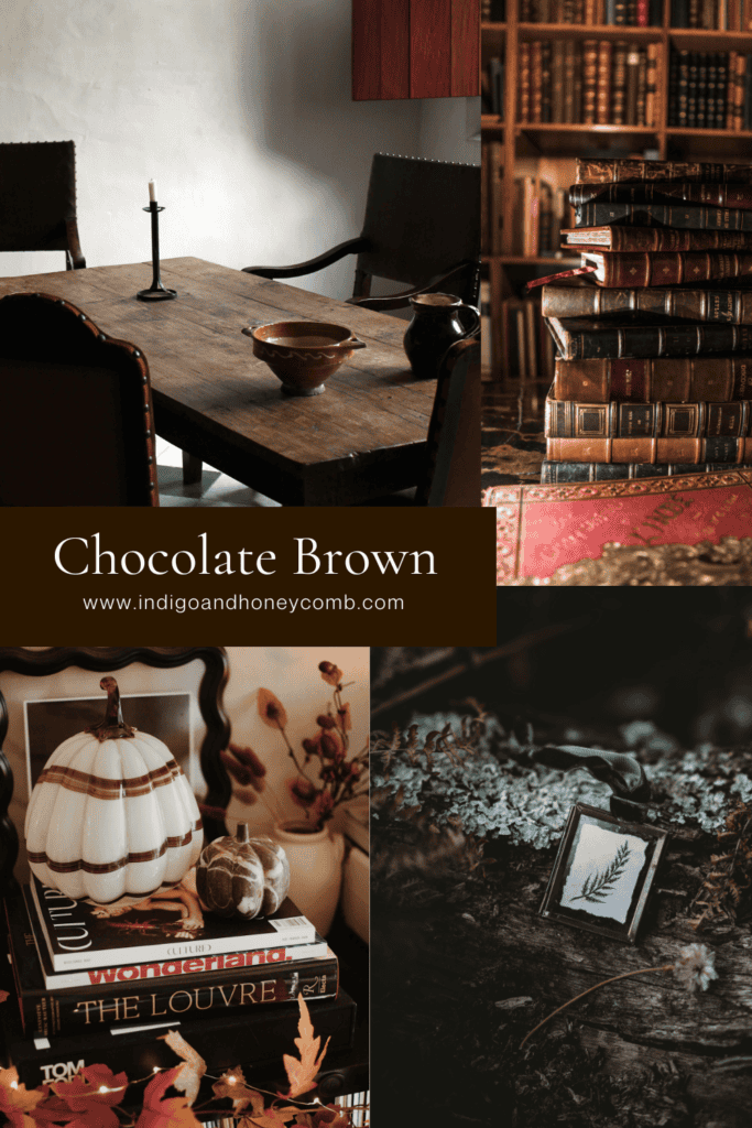
If there is one color that seems to be redefining the idea of a fall neutral, it is chocolate brown. After years of pale beige, warm white and increasingly soft greige palettes, deeper brown is bringing a sense of richness back to the foundation of the home.
What makes chocolate brown so useful is that it doesn’t behave like a statement color. It can anchor a room in much the same way a traditional neutral does, but with considerably more personality. Think walnut cabinetry, a chocolate-colored sofa, a large wool rug, painted walls or even a collection of darker wood furniture. The effect can be warm and cocooning without becoming heavy.
The key is to give brown some contrast. Warm ivory keeps it from becoming too dense, while pale blue, smoky lilac, olive green or muted yellow can introduce just enough color to keep the palette lively. Natural stone, linen, leather and aged brass also work beautifully with brown because they reinforce the sense of warmth and materiality that makes this color so appealing right now.
Oxblood and Maroon: Fall Gets More Romantic
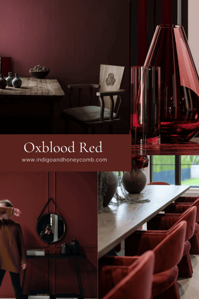
Oxblood and maroon are bringing a deeper, more sophisticated version of red into the home. Rather than the brighter cranberry and traditional holiday reds that tend to appear later in the year, these shades have a brown or wine-like quality that makes them feel atmospheric and grown-up.
Oxblood can be dramatic when used generously, particularly in a library, dining room, powder room or bedroom. But it doesn’t have to mean committing to dark walls. A velvet chair, lampshade, patterned rug, ceramic lamp or piece of artwork can introduce the color in a much more approachable way.
What makes these deep reds especially interesting is their ability to connect several different parts of the fall palette. Oxblood sits naturally alongside chocolate brown and walnut, but it can also bring warmth to deep green, smoky violet or navy. Used as an accent rather than a theme, it gives a room that little bit of tension that keeps a fall palette from feeling predictable.
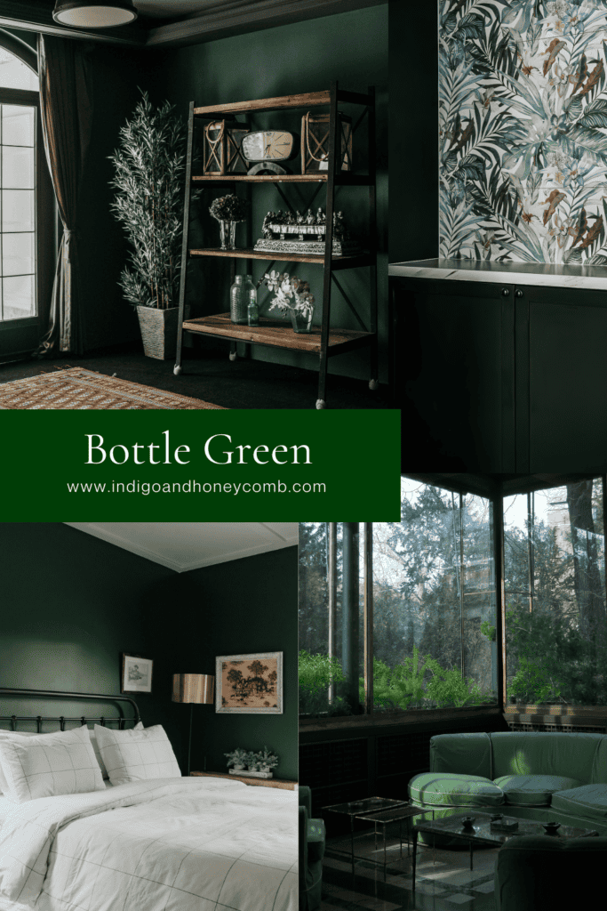
Bottle Green: From Fresh to Atmospheric
Green has already established itself as one of the defining colors of contemporary interiors, but Fall 2026 is pushing the shade into deeper territory. Instead of the lighter sage greens that dominated many recent palettes, bottle and forest greens are bringing more weight and atmosphere to rooms.
This deeper green works particularly well with the materials that are also gaining attention this season: natural wood, stone, leather, linen and aged metals. It can make cabinetry feel richer, turn a small room into a jewel box or provide an earthy counterpoint to lighter upholstery and walls.
Bottle green is also one of the easiest colors to use if you want a room to feel connected to nature without relying on the traditional colors of autumn. It recalls foliage and moss, but in a more sophisticated and enveloping way. Pair it with warm ivory for contrast, chocolate brown for depth or aged brass for a little glow.

Smoky Violet and Dusky Mauve: The Unexpected Side of Fall
Perhaps the biggest surprise in the Fall 2026 palette is the continued movement toward softened purples. Smoky violet and dusky mauve bring a cooler, more atmospheric quality to rooms that might otherwise lean heavily toward brown, red and green.
This is where September’s Weathered Lilac becomes part of the larger conversation. Its muted gray-violet quality represents one interpretation of this shift, proving that purple doesn’t have to feel sweet, pastel or traditionally feminine. Current fall color reporting is similarly pointing toward smoky violet-blue shades as a way to create mood without relying exclusively on warm colors.
The trick with these colors is context. Pair a dusty violet with crisp white and it can begin to feel springlike. Surround it with warm wood, aged brass, cocoa brown, olive or deep burgundy and the entire mood changes. The color becomes quieter, richer and unmistakably suited to fall.
That is one of the larger lessons of this season’s palette: a color doesn’t have to be traditionally autumnal to feel like fall. Sometimes the materials and colors surrounding it do more to establish the mood than the hue itself.
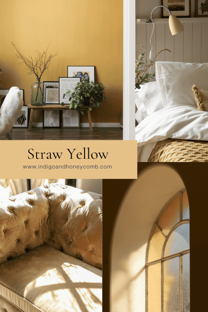
Straw Yellow: A Softer Kind of Golden
Yellow has always had a place in autumn decorating, but Fall 2026 is moving away from bright mustard and toward softer, dustier shades that feel closer to dried grasses, wheat and late-afternoon sunlight.
Straw yellow is particularly interesting because it creates a bridge between summer and fall. It still carries some of the optimism and lightness of yellow, but its muted quality gives it more grounding. Current fall reporting has highlighted dusty, sun-washed yellows as a way to retain some of summer’s warmth while moving into a more subdued seasonal palette.
In a home, this could mean a faded yellow textile, a vintage ceramic piece, a painted cabinet, patterned upholstery or artwork rather than an entire room covered in yellow. Pair it with walnut, chocolate brown, olive or deep blue and it becomes surprisingly sophisticated.
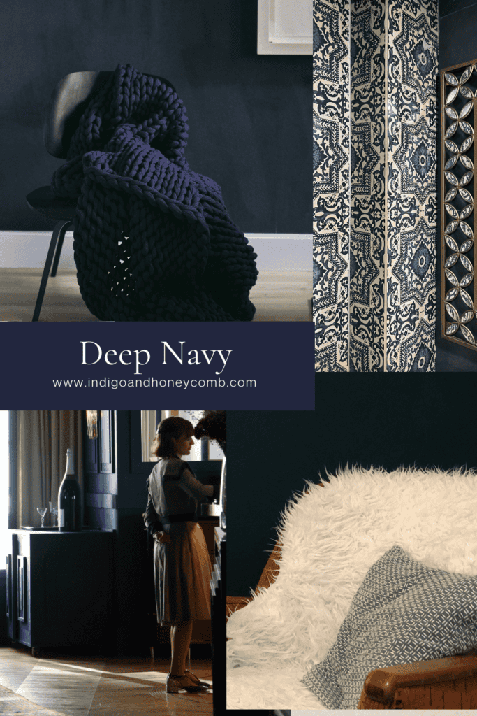
Deep Navy: The Cool Counterpoint
Not every fall room needs to be warm. Deep navy is offering a cooler alternative to the season’s browns, reds and greens while still delivering the depth that makes darker colors so appealing in autumn.
Navy has an advantage that some of the more obviously seasonal colors don’t: it feels timeless. It can evoke stormy coastal skies, old libraries, traditional interiors or a more contemporary monochromatic room depending on what surrounds it. Current designers are pairing deep blues with darker woods, brass, cognac leather and soft neutrals, giving navy a distinctly cozy fall personality.
For a quieter approach, introduce navy through upholstery, ceramics, artwork, bedding or a patterned rug. If you want more drama, consider using it on walls, cabinetry or built-ins. Layering several shades of blue can also create depth without requiring a lot of contrasting colors.
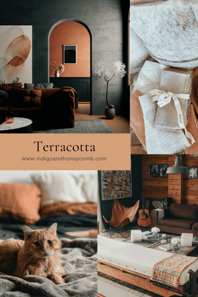
Terracotta: Still Here, But More Refined
Terracotta isn’t disappearing from the fall palette, but it is becoming more sophisticated. After several years of appearing alongside rattan, macramé and heavily bohemian styling, the color is moving into more refined interiors where it can be paired with stone, plaster, walnut, brass and richer jewel tones.
Its appeal is easy to understand. Terracotta brings warmth without the brightness of orange, and its connection to fired clay makes it feel naturally at home alongside other tactile materials. It can warm up a neutral room, soften a modern space or provide contrast against cooler blues and purples. Designers are continuing to use it in living rooms, bedrooms and spaces where texture is as important as color.
If you already have terracotta in your home, there is no need to replace it simply because the trend has evolved. Instead, change what you pair with it. Try adding deep navy, smoky violet, chocolate brown or bottle green rather than relying exclusively on cream and natural beige. Suddenly, a familiar color feels completely different.
The New Fall Palette Is About Relationships, Not Matching
Looking at these colors individually is useful, but the real story of Fall 2026 home color trends emerges when we start thinking about how they work together.
Chocolate brown gives the palette a grounding neutral. Bottle green brings an organic quality, while oxblood adds drama. Smoky violet introduces a cooler, more romantic note. Straw yellow brings lightness and a connection to the last golden days of summer, while navy provides a timeless counterpoint. Terracotta contributes warmth and a connection to natural materials.
These colors don’t need to appear together in one room. In fact, they probably shouldn’t. The point is to understand the range of possibilities available beyond the traditional fall formula. A room might be built around chocolate brown and navy. Another could combine bottle green with straw yellow. A third might use Weathered Lilac, warm ivory and walnut with a small touch of oxblood.
This is where fall decorating becomes much more personal. Instead of buying a matching collection of seasonal accessories, look at the colors already present in your home and consider which new shade could deepen or refresh them. The most successful seasonal interiors don’t necessarily look “decorated for fall.” They simply feel warmer, richer and more layered as the season changes.
How to Use Fall 2026 Colors Without Creating a Pumpkin Patch
There is nothing wrong with loving pumpkins, orange leaves or traditional autumn colors. The problem begins when seasonal decorating becomes so literal that the room starts to feel like a theme rather than a home.
One way to avoid that is to use seasonal color instead of seasonal objects. A rust-colored velvet pillow can create the feeling of fall without a pumpkin motif. A chocolate wool throw can bring warmth without a collection of artificial leaves. An oxblood vase, deep green lamp or smoky violet piece of artwork can shift the palette without announcing the season.
Materials can do just as much work as color. Natural wood, wool, linen, leather, stone, ceramics and aged metals immediately make a room feel more tactile and grounded. Layering those materials with deeper colors creates the warmth we associate with fall without relying on obvious seasonal decorations.
It also helps to resist the urge to change everything at once. Bring in one or two new colors and let them interact with what you already own. Move a darker piece of furniture into a room, add a richer textile, replace a few accessories or introduce artwork with deeper tones. A small shift can change the atmosphere considerably.
And perhaps most importantly, choose the colors that make sense for your home rather than trying to use every color that happens to be trending. A trend should give you possibilities, not a shopping list.
Fall 2026 Home Color Trends: The Art of Fall Is in the Layering
The Fall 2026 home color trends ultimately tells a larger story about where interiors are heading. We are moving away from rooms that feel designed around a single aesthetic and toward spaces that feel collected, personal and lived in. Color is becoming one of the tools that helps create that feeling.
This is why the season’s most interesting colors aren’t necessarily the loudest ones. Chocolate brown, bottle green, smoky violet, deep navy and oxblood all have something in common: they create atmosphere. They give other colors something to react to. They become richer when paired with natural materials, vintage pieces, imperfect finishes and the objects that accumulate naturally over time.
That feels particularly appropriate for The Art of Fall. September’s The Soft Landing began with Weathered Lilac, a color that gently moves us away from summer’s brighter palette. Now the larger Fall 2026 color story begins to emerge around it—deeper, warmer, moodier and more unexpected, but never requiring us to abandon the things we already love. Because the best fall palette isn’t necessarily the one that looks the most autumnal. It’s the one that makes home feel a little more inviting when the light changes, the evenings arrive earlier and we naturally begin gathering in closer.


Leave a Reply