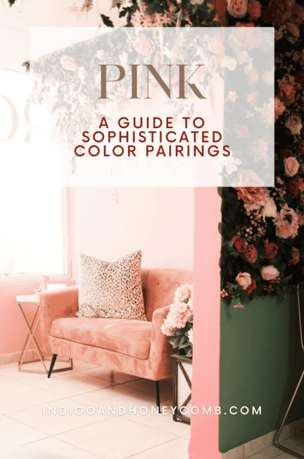
What colors go with pink is one of the most common questions in interior design, and for good reason. Pink is an incredibly versatile color, but its impact depends entirely on how it is paired within a space.
When exploring what colors go with pink, the answer is rarely one-dimensional. The most successful interiors use pink as a connector; layering it with warm neutrals, earthy greens, soft blues, or deeper grounding tones to create palettes that feel balanced, cohesive, and quietly sophisticated.
Rather than functioning as a statement color on its own, pink becomes most powerful when it is integrated thoughtfully into a broader interior palette, shaping mood through contrast, undertone, and texture.
Best Colors That Go with Pink in Interior Design
The most successful pink color palettes are built on contrast through subtlety. Rather than pairing pink with overly bold or competing hues, designers often choose colors that enhance its undertones, allowing pink to feel integrated rather than dominant.
Warm neutrals like taupe, beige, and sand bring out pink’s softness, while earthy greens introduce a natural contrast that feels grounded and organic. For a more structured or tailored look, deeper tones like charcoal, chocolate brown, or even muted navy can anchor pink and give it a sense of depth.
Ultimately, the best color pairings depend on the mood you want to create. Softer combinations feel calm and atmospheric, while higher-contrast palettes introduce a sense of drama and definition.
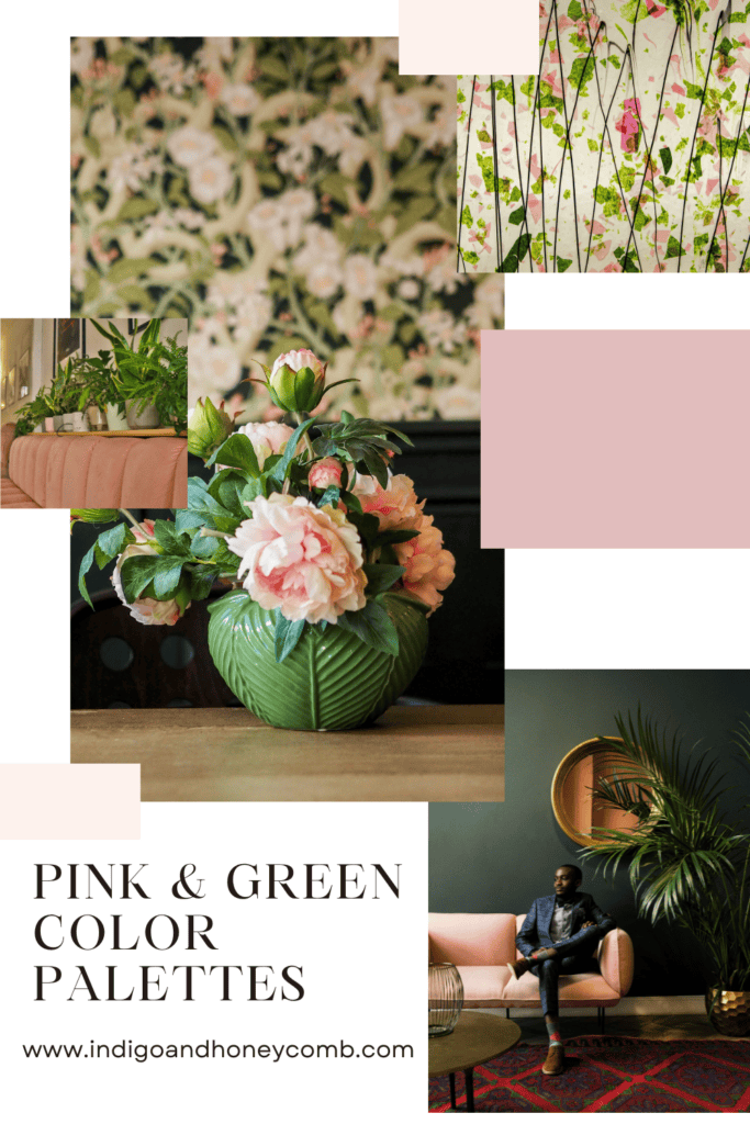
Pink and Green Color Combinations in Interior Design
Pink and green is one of the most timeless combinations in interior design. Rooted in nature, this pairing feels inherently balanced. Soft floral tones meet grounded, organic greens to create a palette that is both fresh and calming.
Olive green and muted sage work especially well with dusty rose or blush taupe, offering contrast without overwhelming the space. This combination is ideal for living rooms, bedrooms, or kitchens where a relaxed, natural mood is desired.
To keep the palette sophisticated, focus on muted tones rather than bright or saturated versions. Incorporating natural materials like wood, linen, or stone further enhances the organic feel.
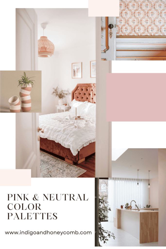
Pink and Neutral Color Palettes for Interiors
Pairing pink with warm neutrals creates a palette that feels effortless and refined. Shades like taupe, sand, ivory, and soft beige allow pink to function as a near-neutral, blending seamlessly into the overall design.
This approach works particularly well in minimalist or modern organic interiors, where the focus is on texture and tone rather than bold color contrast. Layering different neutral shades alongside pink adds depth while maintaining a calm, cohesive look.
For a more elevated result, choose pinks with gray or brown undertones like Terra Blush. These feel less decorative and more architectural within the space.
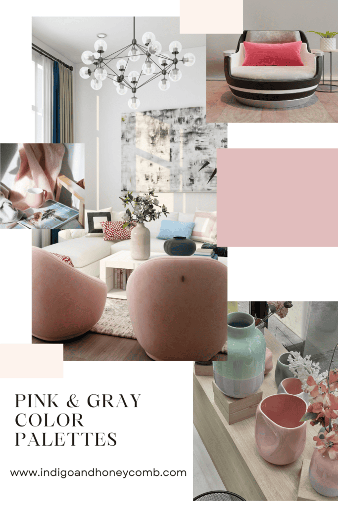
Pink and Gray Color Pairings for a Sophisticated Look
For a cooler, more structured palette, pink and gray offer a refined balance. Mauve, dusty rose, or cooler blush tones pair beautifully with soft grays, creating interiors that feel calm, tailored, and slightly more formal.
Light gray keeps the palette airy, while deeper charcoal tones introduce contrast and definition. This pairing is especially effective in bedrooms, home offices, or transitional spaces where a sense of quiet sophistication is key.
To soften the overall look, incorporate warm elements such as wood finishes or brushed metals to prevent the palette from feeling too cool.
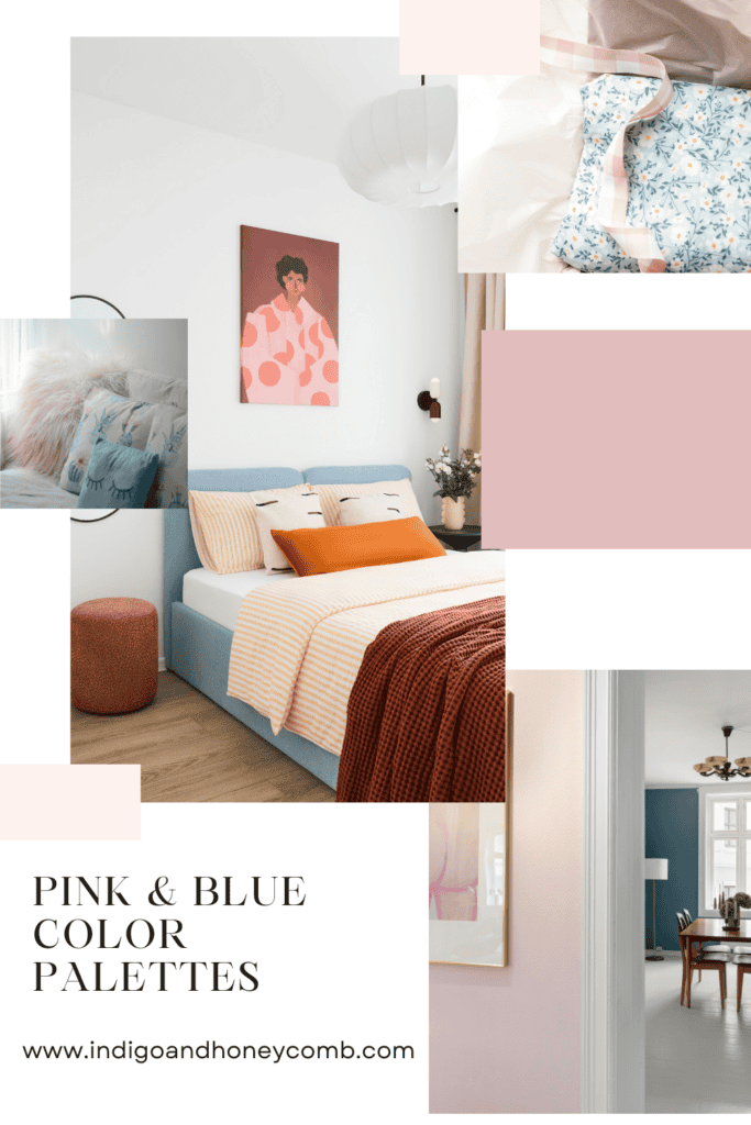
Pink and Blue Interior Color Combinations
Pink and blue create a gentle contrast that feels both classic and contemporary. When muted, this pairing becomes especially calming—perfect for spaces designed for rest and relaxation.
Soft blues, such as misty or powdery tones, complement blush and dusty pinks without overpowering them. This combination works beautifully in bedrooms, bathrooms, or coastal-inspired interiors where a lighter, more atmospheric palette is desired.
To maintain balance, keep both colors slightly desaturated and introduce warm neutrals to unify the space.
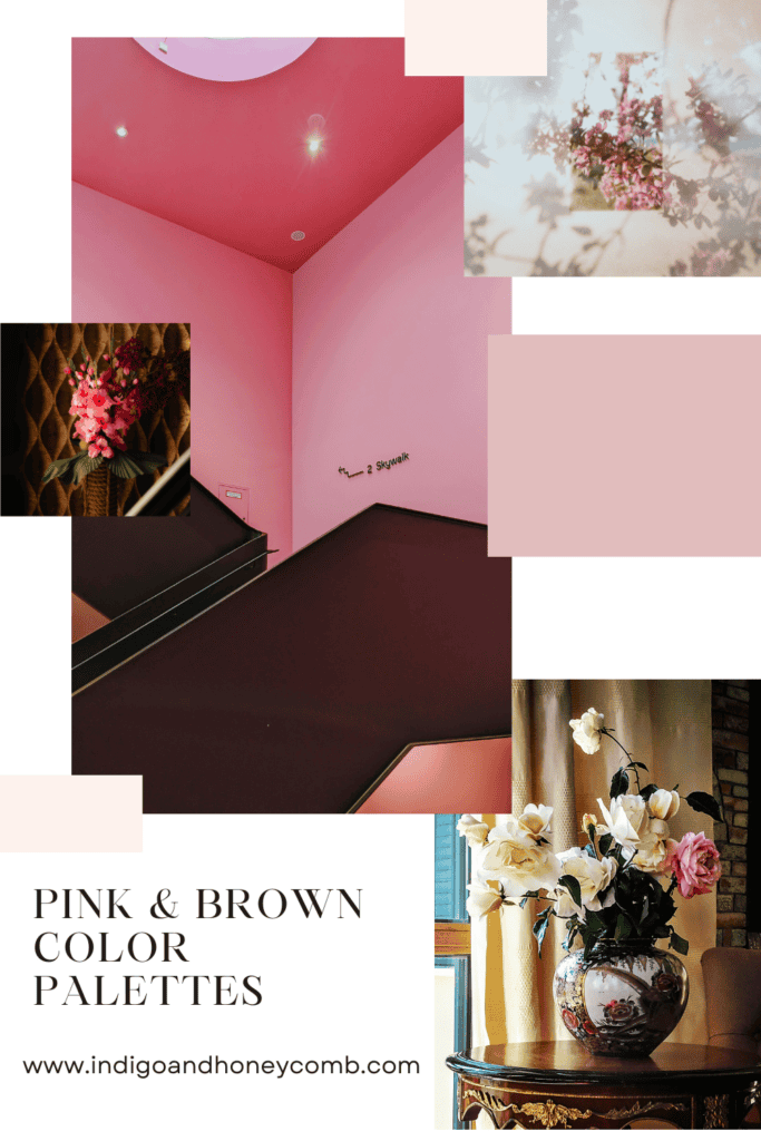
Pink and Brown Color Pairings for Warm Interiors
Pairing pink with brown creates a palette that feels warm, grounded, and quietly luxurious. Chocolate brown, espresso, or warm wood tones anchor pink and give it a sense of depth and maturity.
This combination works particularly well with deeper pinks—such as rosewood or muted berry tones—where the richness of both colors enhances the overall atmosphere. It’s an ideal choice for dining rooms, studies, or living spaces where you want a more intimate, layered feel.
Balancing the palette with lighter elements, like warm ivory or soft beige, helps prevent it from becoming too heavy.
How to Choose the Best Colors That Go with Pink
When selecting colors to pair with pink, start by identifying the undertone of your pink—warm, cool, or neutral. This will guide your supporting palette and ensure the colors feel cohesive rather than disconnected.
Next, consider the role pink will play in the space. If it’s your primary color, keep supporting tones more subdued. If it’s an accent, you can introduce slightly more contrast through deeper or richer hues.
Finally, think in layers. The most successful interiors combine color with texture—linen, wood, stone, and metal—to create depth and dimension beyond the palette alone.
For a more comprehensive look at how pink functions as a foundational color, explore these sophisticated pink paint colors for interiors, where undertones and material pairings are key to creating a balanced design.
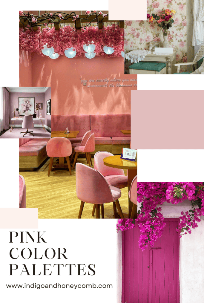
Pink Color Palette Ideas and Combinations to Try
Use these combinations as a starting point:
Blush Pink + Olive + Warm White
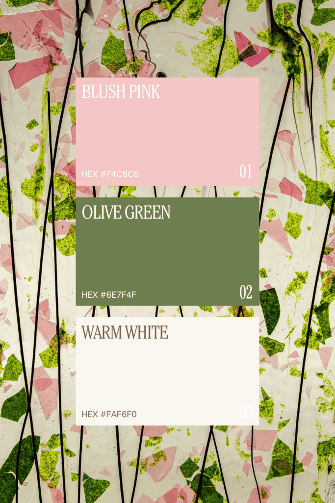
Soft botanical balance with a natural, organic feel.
Dusty Rose + Taupe + Sand
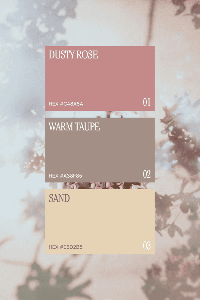
Earthy, grounded, and timeless—ideal for layered neutral interiors.
Mauve + Gray + Charcoal
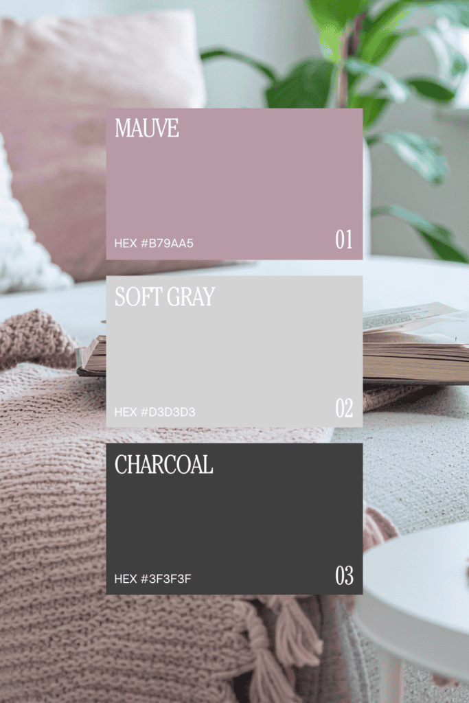
Tailored, modern, and slightly moody with architectural clarity.
Soft Pink + Misty Blue + Ivory
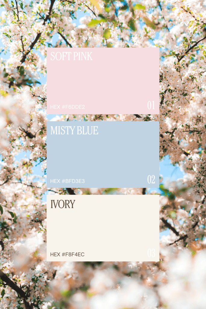
Airy, serene, and coastal-inspired with a light, restorative feel.
Rosewood + Chocolate Brown + Bronze
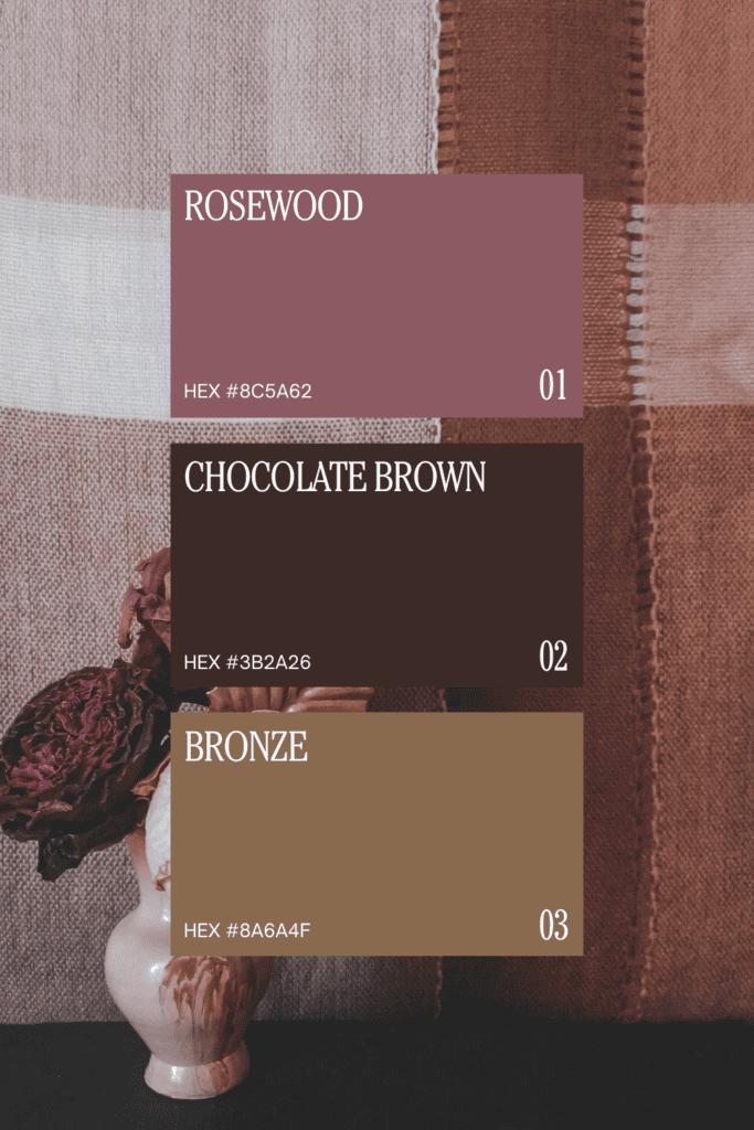
Rich, enveloping, and sophisticated with a warm, editorial depth.
These palettes can be adapted across different rooms, styles, and lighting conditions, making pink one of the most flexible colors to work with in your home.
Designing with Pink: Creating Balanced Interior Color Palettes
The most compelling pink interiors are not defined by pink alone, but by how it interacts with the colors around it. When paired thoughtfully, pink becomes a unifying element by softening contrasts, adding warmth, and creating a sense of cohesion throughout the space.
By focusing on undertones, balance, and layering, you can create a pink color palette that feels both sophisticated and enduring. One that evolves with your space rather than defining it.
FAQs: What Colors Go with Pink?
What color complements pink the best?
Green is often considered the most natural complement to pink, particularly in softer tones like olive or sage. This pairing creates balance and feels organic and calming.
Can pink go with neutral colors?
Yes—pink pairs beautifully with neutrals like taupe, beige, ivory, and gray. These combinations allow pink to feel more subtle and refined, often functioning as a neutral itself.
Does pink go with brown in interiors?
Absolutely. Pink and brown create a warm, grounded palette that feels rich and sophisticated. This pairing works especially well with deeper pink tones and natural wood finishes.
What colors make pink look more sophisticated?
Muted tones like olive green, taupe, charcoal, and soft gray help make pink feel more sophisticated by adding depth and contrast without overwhelming the palette.