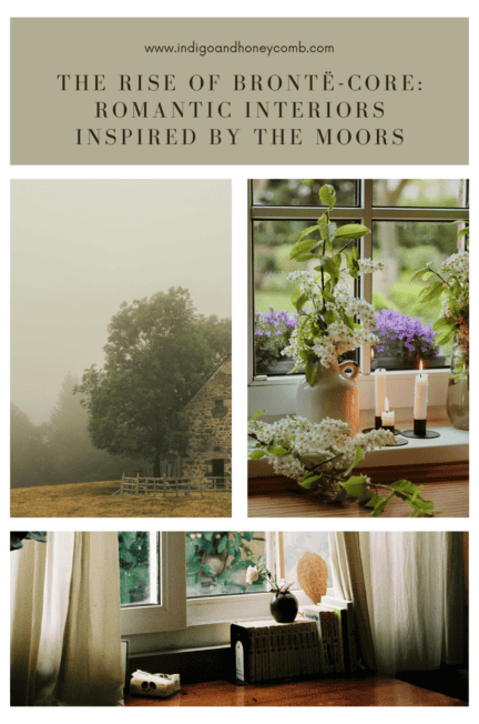
A windswept hillside. A storm gathering on the horizon. Candlelight flickering across dark paneled walls. The aesthetic known as Brontë-core is quietly emerging as one of the most evocative interior design influences of 2026. Rooted in the literary world of the Brontë sisters, namely Charlotte Brontë and Emily Brontë, this movement celebrates atmosphere, emotion, and the dramatic beauty of the natural landscape.
Partly fueled by renewed attention around Wuthering Heights, Brontë-core has reintroduced a collective fascination with windswept moors, storm-laden skies, and interiors illuminated by candlelight rather than bright overhead lighting. But beyond the film itself, the aesthetic reflects a broader cultural shift toward romantic nostalgia, slower living, and deeply atmospheric spaces. At its heart, Brontë-core is about interiors that feel storied, introspective, and emotionally rich.
What Is Brontë-Core?
Brontë-core draws inspiration from the literary worlds created in novels like Wuthering Heights and Jane Eyre. Stories steeped in dramatic landscapes, emotional intensity, and Gothic romance.
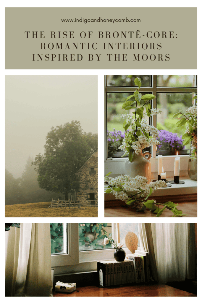
Unlike many contemporary design trends focused on minimalism or brightness, Brontë-core leans into mood and texture. Rooms feel layered with time: heavy drapery, worn leather chairs, stacks of books, and deep color palettes that evoke the shifting light of the English countryside. The feeling is less “styled” and more lived-in, literary, and atmospheric.
From a design perspective, Brontë-core reflects a broader shift away from overly bright, minimal interiors toward spaces with emotional depth. Darker palettes naturally create intimacy, allowing rooms to feel layered and contemplative rather than purely decorative. The goal isn’t to recreate a historical room exactly, but to capture the atmosphere—a sense that the space has evolved slowly over time.
Brontë-Core vs. Dark Academia: What’s the Difference?
Because both aesthetics draw inspiration from literature, history, and moody interiors, Brontë-core and Dark Academia are often confused. While they share a love of atmospheric spaces, their inspirations and the feelings they create are distinctly different.
As noted earlier, Brontë-core is rooted in the emotional landscapes of the English countryside described in novels like Wuthering Heights and Jane Eyre. The aesthetic draws heavily from windswept moors, stormy skies, and romantic Victorian interiors. Rooms inspired by Brontë-core often feel organic and deeply connected to nature, featuring botanical greens, weathered wood, linen textiles, and candlelit spaces that feel intimate and slightly mysterious.
Dark Academia, on the other hand, is inspired by European university traditions and classical scholarship. The aesthetic evokes old libraries, lecture halls, and scholarly study rooms. Interiors tend to feature darker wood furniture, stacks of books, classical artwork, leather armchairs, and rich tones like espresso brown, burgundy, and charcoal. The feeling is intellectual and academic rather than windswept and romantic.
In simple terms, Brontë-core is countryside romanticism, while Dark Academia is scholarly nostalgia. Both celebrate history and literature, but Brontë-core leans toward nature and emotional atmosphere, whereas Dark Academia centers on knowledge, study, and classical academia.
For interior design, the difference often comes down to palette and materials. Brontë-core favors deep greens, heather tones, and earthy neutrals inspired by landscapes, while Dark Academia relies more on dark woods, burgundies, and antique brass associated with historic libraries and study halls.
Both aesthetics embrace mood and depth. But Brontë-core invites you to imagine the storm rolling across the moors, while Dark Academia places you quietly at a desk beneath towering bookshelves.
The Cultural Forces Behind the Trend
Several cultural movements are converging to bring Brontë-core into the spotlight.
Literary Nostalgia
There has been a renewed fascination with classic literature, particularly Romantic and Gothic works from the 19th century. Writers like Emily and Charlotte Brontë created worlds where landscape and emotion are inseparable. Their stories emphasize wild nature, stormy skies, and the intensity of human feeling. Qualities that translate beautifully into interior spaces. When digital life feels constant and fast-moving, these stories offer a sense of retreat into slower, quieter worlds.
The “Poet Aesthetic”
Closely related to Brontë-core is the rise of the “poet aesthetic.” Popular across design, fashion, and social media, this aesthetic romanticizes intellectual and creative spaces: writing desks by the window, handwritten letters, worn books, linen shirts, and quiet rooms designed for reflection. These interiors often feature layered textures, candlelight, and natural materials, reinforcing the moody atmosphere central to Brontë-core.
Historical Interior Design Revivals
Interest in historic interiors is also contributing to the movement. Designers are revisiting Georgian and Victorian design traditions. Eras defined by rich color palettes, architectural millwork, and rooms designed for depth rather than brightness. Brontë-core aligns naturally with these periods, particularly the Victorian love of saturated colors, heavy textiles, and richly decorated interiors.
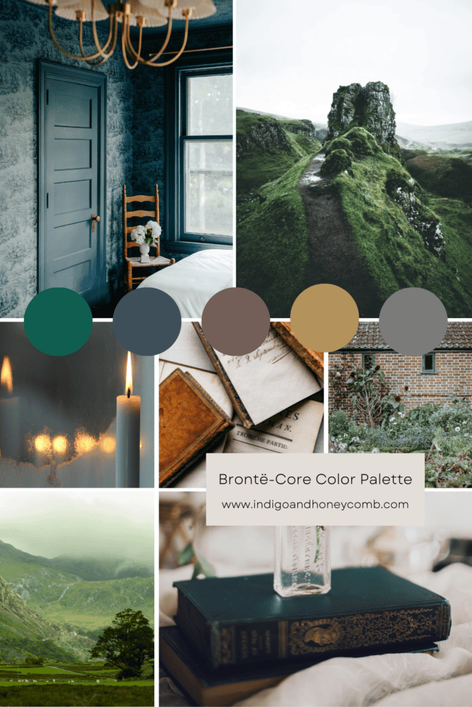
The Brontë-Core Color Palette
Color plays a central role in creating the emotional atmosphere associated with Brontë-core. Instead of light spring pastels or airy neutrals, this aesthetic favors moody, nature-inspired hues that feel pulled directly from the landscape.
Key colors include:
- Deep botanical greens
- Stormy slate blues
- Earthy umbers and browns
- Oxidized brass tones
- Dark charcoal grays
- Soft parchment ivories
These tones are inspired by the English countryside with moss-covered stone walls, shadowed forests, and the dramatic skies that define moorland landscapes. And a color like Moorland Reverie (#0F5E4F) perfectly embodies this palette. Its deep, saturated green reflects the richness of wild grasses and forest canopies under shifting clouds. Rather than brightening a room, colors like these create atmosphere.
One of the easiest ways to bring Brontë-core into a modern home is through paint color. Deep greens, stormy blues, and rich charcoals create an immediate sense of mood and architectural depth. Colors like Moorland Reverie (#0F5E4F) work especially well in studies, dining rooms, or libraries where a darker palette enhances the room’s intimacy rather than competing with natural light.
How to Create a Brontë-Core Color Palette for Your Home
Designing a Brontë-core palette begins with thinking like a landscape painter rather than a trend forecaster. The colors should feel as though they were drawn directly from the moors: dense grasses, shadowed forests, stormy skies, and weathered stone.
Start with a deep botanical green as the anchor. A saturated hue like Moorland Reverie (#0F5E4F), establishes the atmospheric foundation of the palette. This grounding color works beautifully on walls, cabinetry, or built-in shelving.
Next, layer in stormy blues and charcoals to mirror shifting skies and distant horizons. These darker tones add contrast while maintaining the moody elegance that defines the aesthetic.
To soften the palette, introduce parchment-inspired neutrals. Warm ivories and aged linen shades that evoke old book pages or candlelit interiors. These colors prevent the palette from feeling too heavy while preserving its historical character.
Finally, bring in earth-rich accents like oxblood leather, walnut, and oxidized brass. These materials and tones echo Victorian-era interiors while adding warmth and tactile depth.
The result is a palette that feels immersive and layered. Romantic without being overly theatrical, dramatic without sacrificing comfort.
When creating darker palettes, it’s helpful to think in terms of contrast through texture rather than brightness. A deep green wall paired with linen drapery, antique brass lighting, and leather seating will feel far richer than a palette that relies only on lighter colors for balance.
5 Paint Colors That Capture the Brontë-Core Aesthetic
While Brontë-core interiors can incorporate many shades drawn from nature, a few paint colors capture the essence of the aesthetic particularly well. These hues harken the landscapes, atmosphere, and emotional depth that define the movement.
Moorland Reverie
A saturated, dark botanical green that mirrors windswept grasses across the moors. This color works beautifully in libraries, dining rooms, and studies where depth and drama enhance the room’s atmosphere.
Stormbound Blue
A brooding slate blue reminiscent of gathering rain clouds over the countryside. Used on paneled walls or cabinetry, it creates a refined backdrop for brass lighting and warm wood tones.
Heathered Plum
Inspired by the purple wild heather that dots the English moorlands, this muted plum adds a romantic Victorian sensibility. It works especially well in bedrooms or reading rooms where a softer darkness is desired.
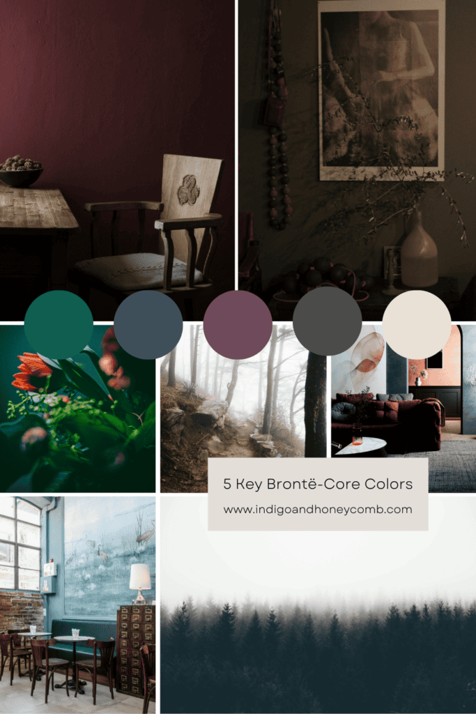
Weathered Stone Gray
A complex charcoal-gray that reflects the color of old manor walls and weathered stone pathways. This hue anchors lighter textiles and prevents a room from feeling overly formal.
Parchment Ivory
Not a stark white, but a warm, aged ivory reminiscent of antique paper. This tone provides contrast to darker colors while maintaining the historic softness central to the Brontë-core aesthetic.
Together, these hues create a palette that feels literary, atmospheric, and deeply connected to the natural landscape that inspired the works of Emily and Charlotte Brontë. Rather than relying on bright seasonal colors, this palette invites depth, shadow, and storytelling into the home.
Designing a Brontë-Core Interior
Translating this aesthetic into a modern home is less about recreating a period room and more about embracing the mood and materials that define it.
A Brontë-inspired interior often includes layered textures like velvet, wool, linen, and aged leather that create visual warmth and depth. Furniture tends to feel substantial and timeless, such as upholstered armchairs, wooden writing desks, and antique cabinets.
Lighting is intentionally soft and intimate. Table lamps, wall sconces, and candles replace harsh overhead lighting, allowing shadows and highlights to shape the room’s atmosphere.
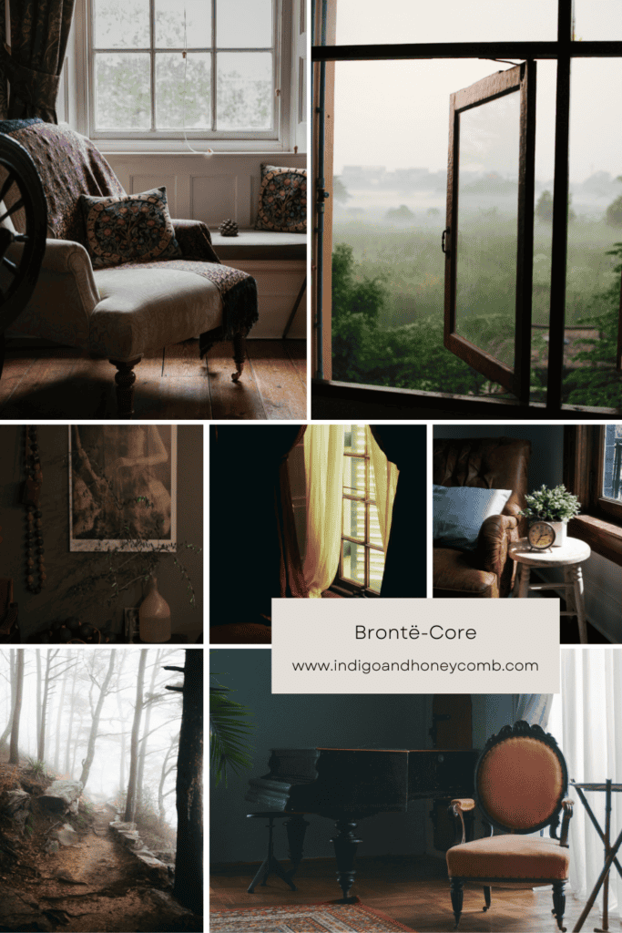
Architectural details also play a role. Paneled walls, built-in bookcases, and classic molding bring structure to darker color palettes, preventing them from feeling heavy.
Above all, the space should feel personal and collected, like a room that has evolved over decades rather than one styled in a single afternoon.
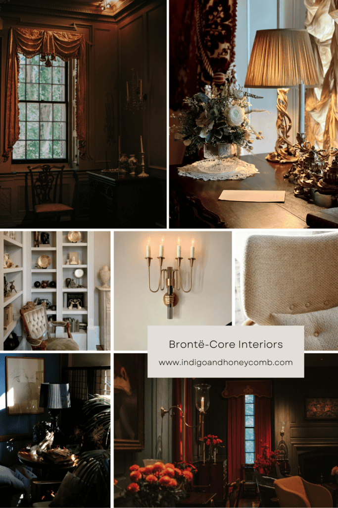
Brontë-Core Interior Design: Key Elements Beyond Color
While color establishes the atmospheric foundation of Brontë-core interiors, the aesthetic truly comes to life through materials, lighting, and layered details. Inspired by the landscapes and richly described settings found in novels, these spaces rely on texture and storytelling just as much as hue.
One of the defining characteristics of Brontë-core design is a sense of lived-in history. Furniture tends to feel substantial and timeless. Think of upholstered armchairs, carved wood tables, and antique writing desks. Rather than sleek modern silhouettes, the focus is on pieces that suggest permanence and craftsmanship.
Layered textiles also play a major role. Velvet cushions, wool throws, linen drapery, and aged leather upholstery introduce tactile richness that complements deeper paint colors. These materials soften darker palettes while reinforcing the romantic, slightly dramatic atmosphere associated with the aesthetic.
Lighting is intentionally warm and intimate. Instead of bright overhead fixtures, Brontë-core spaces favor table lamps, wall sconces, and candlelight that create pockets of soft illumination. The effect is subtle but transformative. Shadows deepen, textures emerge, and rooms feel more contemplative.
Architectural details further enhance the mood. Paneled walls, built-in bookcases, traditional molding, and deep window casings add visual structure, allowing darker colors to feel elegant rather than heavy. These elements reflect the historic interiors of the Georgian and Victorian eras, periods that strongly influenced the works of writers and artists.
Ultimately, Brontë-core design is less about recreating a specific historical period and more about capturing a sense of atmosphere. Rooms should feel layered, personal, and slightly mysterious. Spaces that invite quiet reflection, creative thought, and the kind of romantic storytelling that made the Brontë sisters’ worlds so enduring.
When working with darker colors, texture becomes just as important as hue. Pairing deep paint colors with materials like velvet upholstery, aged brass hardware, linen drapery, and weathered wood prevents the space from feeling flat. These layered materials catch light differently throughout the day, adding dimension and reinforcing the atmospheric quality that defines Brontë-core interiors.
Why Brontë-Core Resonates Now
The popularity of Brontë-core reflects a deeper cultural desire for emotional depth and authenticity in design. After years of bright, minimalist interiors dominated by white walls and light wood, many homeowners are gravitating toward richer palettes and more atmospheric spaces.
Dark greens, deep blues, and layered textures create rooms that feel protective and intimate. Places designed for reflection, reading, and quiet moments rather than constant activity.
In many ways, the appeal mirrors the emotional intensity found in novels of that period. These stories remind us that beauty isn’t always calm or cheerful; sometimes it’s dramatic, wild, and deeply romantic. That same sensibility is now shaping the interiors of 2026.
While trends often emphasize brightness in spring, deeper colors can actually make seasonal spaces feel more grounded and timeless. A saturated green or stormy blue creates a sophisticated backdrop that allows natural elements like fresh branches, flowers, and sunlight to stand out even more dramatically.
The Return of Romantic Interiors
Brontë-core isn’t simply a nostalgic trend. It represents a broader return to romantic interior design. It values atmosphere over perfection, storytelling over simplicity, and depth over brightness. Rooms inspired by the moors offer something different. Quiet spaces filled with shadow, texture, and imagination. And like the landscapes that inspired the Brontë sisters, these interiors are great examples showing the most compelling beauty often lies in a little mystery.

Leave a Reply