Skip to Content
  • Let’s BeginHOME
  • Learn MoreABOUT
    • PORTFOLIO
    • EDITORIALS
  • Read MoreBLOG
    • Art
    • Color
    • Creativity
    • Design
    • Fashion
    • Lifestyle
    • Holidays
  • ColorCOLOR CONSULTING
    • Color Consulting FAQs
    • Color Fundamentals
      • Color Wheel Basics
      • Color Harmony
      • Color Psychology
      • Base Color
      • Creating Contrast
      • Balancing Colors
  • DiscoverSHOP
  • Get in TouchCONTACT
    • SUBSCRIBE
Indigo and Honeycomb COLOR LAB
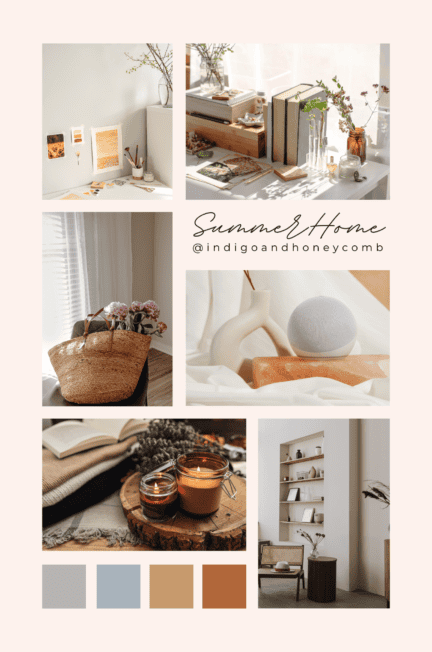
Home summer cleaning

summer cleaning

Showing: 1 - 1 of 1 Articles

Easy Summer Home Organization Hacks for a Tidy and Stress-Free Space

Here are some practical tips to help home organization and keep the chaos at bay while getting a head start on your fall deep cleaning.

READ the ARTICLE

About Me

Sara McLean
Sara McLean

Certified Color Expert | Design Stylist | Author | Creator

Sara McLean

Recent Posts

  • BlogColorDesign

    Miel d’Or: Celebrate the Butter Yellow Color Trend in May

    May 5, 2025
  • BlogColorCreativityDesign

    April Color of the Month: Strawberry Patch

    April 8, 2025
  • BlogLifestyle

    Spring Wellness Tips: How to Refresh Your Mind and Body Naturally

    March 27, 2025

Latest Pins!

Recent Posts

  • BlogColorDesign

    Miel d’Or: Celebrate the Butter Yellow Color Trend in May

  • BlogColorCreativityDesign

    April Color of the Month: Strawberry Patch

  • BlogLifestyle

    Spring Wellness Tips: How to Refresh Your Mind and Body Naturally

Check Out My Shop

Link on over to my shop for merch ideas ~

Poshmark Closet


Recent Posts

  • BlogColorDesign

    Miel d’Or: Celebrate the Butter Yellow Color Trend in May

  • BlogColorCreativityDesign

    April Color of the Month: Strawberry Patch

  • BlogLifestyle

    Spring Wellness Tips: How to Refresh Your Mind and Body Naturally

Category

Popular Posts

  • BlogColorCreativityDesign

    Warm Minimalism: The Ultimate Guide to Cozy, Modern Design

  • Pink Color
    BlogColorCreativityDesignFashion

    Pink Color: Exploring Its Enduring Allure and Stylish Journey

  • BlogColorCreativityDesign

    Summer Sage Color Palettes: Design Your Home with 10 New Ideas

indigoandhoneycomb

🎨 Color expert, designer, stylist | 📚 Author | ✨ Creative Curator | Embracing the vibrant hues of life & style through fashion & decor! 🌈✍️

🌿 Earthy & Grounded: A Rose Haze Color Palette 🌿 Earthy & Grounded: A Rose Haze Color Palette for Warmth & Balance 🌿

Embrace the natural beauty of soft, sun-warmed tones with the Earthy & Grounded color palette, featuring Rose Haze (#D6B9B1) as its soothing, anchoring hue. This palette is a celebration of organic textures, rustic elegance, and the comforting embrace of nature—perfect for bringing warmth and balance into your space this March.

🌅 The Inspiration Behind Earthy & Grounded
Inspired by sunlit canyons, weathered clay, and flourishing greenery, this palette channels a sense of peace, resilience, and connection to the earth. It’s about finding stability in nature, embracing soft pinks, rich terracottas, and grounding greens to create a harmonious, restorative atmosphere.

✨ The Colors of Earthy & Grounded
🌸 Rose Haze (#D6B9B1) – A muted, warming pink that softens and soothes.
🌿 Sage Green (#9EAD88) – A fresh, earthy green that brings balance and renewal.
🍂 Terracotta (#D98E73) – A sunbaked, clay-toned hue that adds richness and warmth.
🏺 Warm Clay (#B67D5A) – A deep, grounded brown inspired by raw, organic textures.
🌾 Linen Beige (#E5D7C5) – A soft, neutral beige for effortless elegance and calm.

🏡 Where to Use This Palette
Home Interiors: Layer natural textures like linen, terracotta, and aged wood with these warm, grounding hues for a cozy, inviting space.
Fashion & Style: Incorporate Rose Haze and earthy neutrals for an effortlessly chic, nature-inspired wardrobe.
Branding & Design: Perfect for brands that want to convey warmth, authenticity, and organic sophistication.
This March, let Earthy & Grounded inspire a season of mindfulness, strength, and connection to the natural world. How will you use this palette to bring warmth into your life? 🌾✨

#EarthyAndGrounded #RoseHaze #MarchColorPalette #WarmMinimalism #OrganicBeauty #NatureInspiredDesign #indigoandhoneycomb
💫 Modern Romance: A Rose Haze Color Palette for 💫 Modern Romance: A Rose Haze Color Palette for Elegance & Depth 💫

Step into a world of soft sophistication and timeless allure with the Modern Romance color palette, featuring Rose Haze (#D6B9B1) as its graceful and grounding centerpiece. This palette blends warmth, drama, and delicate charm, perfect for creating an atmosphere of elegance, depth, and emotional richness.

🌹 The Inspiration Behind Modern Romance
Inspired by vintage love letters, candlelit evenings, and the beauty of fleeting moments, this palette balances soft, feminine tones with bold, moody hues. It’s a celebration of contrast—where gentle pinks meet deep, passionate shades, infusing feelings of love, mystery, and quiet sophistication.

✨ The Colors of Modern Romance
🌸 Rose Haze (#D6B9B1) – A muted, warm pink that exudes softness and grace.
🍷 Deep Merlot (#6D2E3E) – A rich, wine-toned hue that adds depth and drama.
🌜 Soft Mauve (#B29EA0) – A romantic, dusky shade that enhances warmth.
🕯️ Champagne Gold (#E6CBA8) – A luminous neutral that brings a touch of luxury.
🖤 Charcoal Gray (#4A4A4A) – A grounding, moody shade that balances softness with strength.

🏡 Where to Use This Palette
Home Interiors: Perfect for adding a touch of vintage romance with velvet textures, antique gold accents, and moody florals.
Fashion & Style: Blend delicate pinks with deep jewel tones for a wardrobe that feels both feminine and bold.
Branding & Design: Ideal for brands that exude refined elegance, passion, and a hint of nostalgia.
Let Modern Romance inspire a season of beauty, depth, and timeless charm. How will you bring this color story into your world? ✨🌹

#ModernRomance #RoseHaze #MarchColorPalette #TimelessElegance #MoodyInteriors #RomanticAesthetic #indigoandhoneycomb
🌸 Spring Awakening: A Rose Haze Color Palette f 🌸 Spring Awakening: A Rose Haze Color Palette for Renewal & Fresh Energy 🌸

As winter melts into spring, nature awakens in a soft yet vibrant symphony of color. The Spring Awakening palette, featuring Rose Haze (#D6B9B1) as its heart, is a celebration of new beginnings, fresh blooms, and the gentle warmth of the changing season.

🌿 The Inspiration Behind Spring Awakening
Inspired by the first light of dawn, delicate petals, and the golden glow of longer days, this palette embodies hope, energy, and a sense of renewal. Each hue reflects the natural beauty of spring, from soft pastels to sun-kissed warmth and fresh greenery.

✨ The Colors of Spring Awakening
🌸 Rose Haze (#D6B9B1) – A soft, grounding pink that mirrors the first blush of spring.
💛 Buttercream Yellow (#F7E3A9) – A warm, sunlit hue that brings optimism and light.
🌿 Eucalyptus Green (#A4C5A6) – A fresh, nature-inspired green for balance and renewal.
🌅 Sunset Coral (#E4977C) – A gentle yet invigorating shade that adds warmth and vibrancy.
🌊 Ocean Teal (#497D80) – A deep yet calming blue-green, reminiscent of spring rain and crisp air.

🏡 Where to Use This Palette
Home Interiors: Bring the essence of spring indoors with soft pastels, natural textures, and airy, light-filled spaces.
Fashion & Style: Layer blush tones, warm neutrals, and pops of green for an effortless seasonal refresh.
Branding & Design: Perfect for businesses that embody fresh energy, wellness, and optimism in their aesthetic.
Let Spring Awakening inspire you to embrace renewal, joy, and the beauty of a fresh start. How will you bring this color story to life? ✨🌿

#SpringAwakening #RoseHaze #MarchColorPalette #SpringRenewal #FreshStart #ColorInspiration #indigoandhoneycomb
🕯️ Cozy & Timeless: A Rose Haze Color Palette 🕯️ Cozy & Timeless: A Rose Haze Color Palette for Warmth & Comfort 🕯️

As the seasons shift and life moves forward, some colors remain everlasting, grounding us in warmth, familiarity, and effortless elegance. The Cozy & Timeless palette, featuring Rose Haze (#D6B9B1) as its heart, embraces soft nostalgia, inviting textures, and classic beauty.

🌿 The Inspiration Behind Cozy & Timeless
Inspired by the comfort of a well-loved space, the warmth of candlelight, and the richness of natural materials, this palette speaks to a sense of home, heritage, and serenity. It blends earthy depth with soft neutrals, creating an aesthetic that feels both refined and welcoming.

✨ The Colors of Cozy & Timeless
🌸 Rose Haze (#D6B9B1) – A soft, muted pink that adds warmth and charm.
☕ Cocoa Brown (#7E5D52) – A rich, grounding hue reminiscent of warm coffee and vintage leather.
🪵 Aged Oak (#9C7456) – A deep, organic wood tone that adds a timeless, earthy feel.
🏡 Taupe Gray (#B8A89A) – A versatile neutral that creates balance and sophistication.
🕯️ Creamy White (#F2ECE5) – A gentle, soft white that enhances light and coziness.

🏡 Where to Use This Palette
Home Interiors: Perfect for inviting living rooms, cozy bedrooms, and elegant dining spaces, this palette brings a sense of timeless beauty and warmth.
Fashion & Style: Soft knits, neutral layering, and classic silhouettes elevate everyday wear with effortless charm.
Branding & Design: Ideal for businesses that evoke heritage, craftsmanship, and comfort.
Let Cozy & Timeless inspire you to slow down, savor the moment, and embrace beauty that never fades. How will you bring this palette into your space? ✨🏡

#CozyAndTimeless #RoseHaze #MarchColorPalette #WarmInteriors #TimelessDesign #ColorInspiration #indigoandhoneycomb
🌸 Soft & Serene: A Rose Haze Color Palette for 🌸 Soft & Serene: A Rose Haze Color Palette for Tranquility 🌸

Step into a world of calm, warmth, and effortless elegance with the Soft & Serene color palette, featuring Rose Haze (#D6B9B1) as the heart of its soothing embrace. This palette is designed to create a sense of peace, balance, and renewal, perfect for welcoming the gentle transition into spring.

🌿 The Inspiration Behind Soft & Serene
Inspired by the quiet moments of early spring, this palette mirrors misty mornings, soft linen textures, and the first blush of dawn. It’s about finding beauty in simplicity—where warm neutrals, muted blues, and earthy greens blend seamlessly to create a restorative, mindful atmosphere.

✨ The Colors of Soft & Serene
🌸 Rose Haze (#D6B9B1) – A delicate, grounding pink that exudes warmth and calm.
☁️ Warm White (#F5F2EE) – A soft, airy white that brings lightness and clarity.
🌾 Sandstone (#C4A68A) – A gentle earthy beige, adding warmth and stability.
🌊 Misty Blue (#A5B8C8) – A muted blue with a tranquil, sky-like quality.
🍃 Olive Gray (#878E7D) – A subtle green-gray, bringing in an organic, grounding touch.

🏡 Where to Use This Palette
Home Interiors: Create a serene bedroom or living space with soft pinks, warm neutrals, and subtle blue accents.
Fashion & Style: Layer cozy knitwear in Rose Haze with muted blues and earthy accessories for a timeless, relaxed look.
Branding & Design: Elevate your visuals with this harmonious, understated color combination for an elegant and inviting aesthetic.
This March, Soft & Serene inspires a season of renewal, self-care, and mindful beauty. How will you bring this palette into your world? 💫

#SoftAndSerene #RoseHaze #MarchColorPalette #WarmMinimalism #SoothingInteriors #SpringAwakening #indigoandhoneycomb
✨ Happy International Women’s Day! ✨ Today, ✨ Happy International Women’s Day! ✨

Today, we celebrate the strength, resilience, and achievements of women around the world. From trailblazers who broke barriers to the everyday heroes shaping our communities, your voices, creativity, and leadership inspire change. 💜🌍

Tag a woman who inspires you! ✨💪 #InternationalWomensDay #EmpoweredWomen #WomenSupportingWomen #indigoandhoneycomb
🌸 March Color of the Month: Rose Haze 🌸 As 🌸 March Color of the Month: Rose Haze 🌸

As winter melts into spring, say hello to Rose Haze (#D6B9B1)—a soft, warm pink that embodies renewal, resilience, and well-being. This delicate yet grounding hue mirrors the blush of early spring skies, the first blooms of the season, and the comforting embrace of self-care.

Why Rose Haze?
This year, pinks are trending in a whole new way—elevating from playful and bold to soothing and sophisticated. Rose Haze embraces this shift, blending effortlessly into interiors, fashion, and wellness spaces. Soft pinks are known to reduce stress, encourage mindfulness, and promote optimism—making this the perfect shade for March’s fresh start.

🌿 Wellness in Color
March is a time to reset, prioritize self-care, and embrace balance—Rose Haze is the perfect reflection of that mindset. Whether through calming interiors, cozy fashion choices, or simple moments of pause, let this color be your gentle reminder to nurture yourself.

✨ Spring Awakening
Paired with warm neutrals, fresh greens, and earthy tones, Rose Haze welcomes the season with an effortless elegance. Whether in home design, beauty, or lifestyle, this color is a symbol of growth, softness, and strength.

How will you bring Rose Haze into your life this March? 💕 #RoseHaze #MarchColorOfTheMonth #ColorAndWellness #SpringRenewal #WarmMinimalism #indigoandhoneycomb
Hello, March! 🌿✨ Welcome to a brand-new mont Hello, March! 🌿✨

Welcome to a brand-new month, filled with fresh beginnings, longer days, and the first whispers of spring! 🌸💫 March is a time of renewal, growth, and finding joy in the little things—whether it’s the scent of blooming flowers, the return of golden sunsets, or simply embracing the change in the air.

Here’s a March Bucket List to make the most of this beautiful transition:

🌷 Refresh your space with fresh flowers
🌦️ Embrace the rainy days with a cozy book & tea
🌱 Start a new plant or herb garden
☕ Try a seasonal coffee or tea flavor
🌼 Visit a botanical garden or park
🎨 Add a pop of spring color to your wardrobe
🛍️ Support a small business with spring finds
🌿 Take a mindful morning walk to soak in the fresh air
🍋 Try a citrus-infused recipe for a zesty refresh
🕊️ Set a new intention for the season ahead

What are you most excited for this March? Drop it in the comments! 💚👇 #HelloMarch #SpringAwakening #MarchMagic #indigoandhoneycomb
February: A Time for Reflection ✨ It's already February: A Time for Reflection ✨

It's already mid-February, and I find myself looking back on the past year—a year of transitions, deep reflection, and incredible milestones. Among the most fulfilling moments was publishing Chromatic Chronicles: My Journey Through the World of Color and Seasonal Color Reflections: Exploring Nature's Ever-Changing Harmonies. 🌿🎨

Each book captures what inspires me most about color and design—the way hues tell stories, spark emotions, and shape the world. Looking ahead, I’m excited to keep exploring new color narratives and bring my next book to life. 💫

Both books are available now on Amazon! 📚✨

Here’s to embracing growth, creativity, and the endless inspiration that color provides! 💛

#ColorStory #DesignInspiration #ChromaticChronicles #SeasonalColorReflections #CreativeJourney #FebruaryReflections #ColorLover #Bookstagram #NowOnAmazon #indigoandhoneycomb
🌹 Happy Valentine’s Day! 💕 Today is all a 🌹 Happy Valentine’s Day! 💕

Today is all about love in all its forms—romantic, platonic, and most importantly, self-love. 💖 Whether you're celebrating with a special someone, your best friends, or indulging in some well-deserved me-time, today is filled with warmth, joy, and a little extra beauty. ✨

🌷 Color Mood: A dreamy palette of soft blush, deep red, and warm gold—because love deserves to be wrapped in the most enchanting hues.
💌 Vibe: Cozy candlelit dinners, love letters, and fresh blooms filling the air with sweetness.
🍓 Indulgence: Dark chocolate, a glass of red wine, and something silky to wear.

Tell me, how are you celebrating today? Drop a ❤️ if you’re feeling the love!

#ValentinesDay #LoveInEveryHue #RomanticVibes #BlushAndBurgundy #indigoandhoneycomb
🍒 February Awaits with Sweet Cherry Hues 🍒 🍒 February Awaits with Sweet Cherry Hues 🍒

"While it is February one can taste the full joys of anticipation. Spring stands at the gate with her finger on the latch." — Patience Strong

February feels like Sweet Cherry — bold, rich, and filled with anticipation for what’s to come. It’s the month where winter lingers, yet whispers of spring begin to stir. Just like the vibrant warmth of this color, there's a sense of energy brimming beneath the surface, ready to bloom. 🌸✨

Celebrate the beauty of waiting — and the vibrant hues that remind us spring is just a heartbeat away.

#FebruaryColorOfTheMonth #SweetCherryVibes #PatienceStrong #AnticipateSpring #ColorStory #indigoandhoneycomb
🌿✨ Rustic Charm Color Palette Featuring Sweet 🌿✨ Rustic Charm Color Palette Featuring Sweet Cherry 🍒

This February, embrace the warm, earthy beauty of the Rustic Charm palette, where Sweet Cherry (#74070E) meets nature-inspired hues for a cozy, grounded aesthetic. Ideal for rustic design lovers, this color combination inspires charming countryside vibes infused with timeless elegance.

💡 Color Breakdown & Inspiration:
1️⃣ Sweet Cherry (#74070E): Deep, inviting, and bold, this rich red hue brings warmth and sophistication to any rustic-inspired setting.
2️⃣ Olive Green (#556B2F): Earthy and calming, olive green reflects the tranquility of natural landscapes, grounding the palette beautifully.
3️⃣ Burnt Orange (#CC5500): Vibrant yet earthy, burnt orange offers a fiery accent reminiscent of autumn leaves and warm sunsets.
4️⃣ Chestnut Brown (#987456): Soft and woodsy, chestnut brown highlights the charm of natural timber and hand-carved elements.
5️⃣ Cream White (#FFFDD0): A gentle, creamy neutral that adds lightness and balance, capturing the essence of vintage farmhouse interiors.

🌟 Why It Works:
The Rustic Charm palette blends the warmth of Sweet Cherry and burnt orange with the natural sophistication of earthy greens and browns. Cream white ties it all together, creating a fresh yet grounded atmosphere that feels both nostalgic and timeless.

🎨 Mood Board Inspiration:
Picture a rustic living room with Sweet Cherry textiles, olive green accents, and wooden furniture in chestnut tones. Add pops of burnt orange through decor and cream white for balance — perfect for creating a welcoming retreat filled with warmth and charm.

Bring rustic beauty into your world this February with the Rustic Charm palette 🌾🍂

#SweetCherry #RusticCharm #ColorInspiration #FebruaryPalette #CozyDesign #WarmInteriors #indigoandhoneycomb
💖✨ Valentine’s Day Dream Color Palette Feat 💖✨ Valentine’s Day Dream Color Palette Featuring Sweet Cherry 🍒💖

This February, Sweet Cherry (#74070E) takes on a romantic twist in our Valentine’s Day Dream palette. Perfect for love-filled spaces and creative designs, this color collection is a harmonious blend of deep reds, dreamy pastels, and shimmering gold accents.

💡 Color Breakdown & Inspiration:
1️⃣ Sweet Cherry (#74070E): Bold and passionate, this rich red is the foundation of the palette, symbolizing love and elegance.
2️⃣ Rose Pink (#FFC0CB): Soft and romantic, this classic pink adds a playful touch, reminiscent of bouquets and heart-shaped treats.
3️⃣ Lavender (#E6E6FA): Ethereal and calming, lavender balances the warmth of Sweet Cherry with its cool, dreamy undertones.
4️⃣ Gold (#FFD700): A radiant accent that brings opulence and warmth, like the sparkle of Valentine’s Day jewelry.
5️⃣ Pearl White (#F8F8FF): Clean and luminous, pearl white offers a light, airy contrast that elevates the entire palette.

🌟 Why It Works:
This palette strikes the perfect balance between bold romance and soft sophistication. Sweet Cherry commands attention, while rose pink and lavender infuse a sense of sweetness and calm. Gold adds a luxurious shimmer, and pearl white ensures everything feels fresh and polished.

🎨 Mood Board Inspiration:
Imagine a romantic dining setup with Sweet Cherry tableware, rose pink florals, lavender candles, and shimmering gold details. Pearl white textiles tie it all together for a dreamy Valentine’s celebration.

Set the scene for love this February with the Valentine’s Day Dream palette — where passion meets elegance.

#SweetCherry #ValentinesDay #ColorOfTheMonth #RomanticDesign #ColorInspiration #FebruaryDreams #indigoandhoneycomb
🎨🍒 Modern Monochrome Color Palette Featuring 🎨🍒 Modern Monochrome Color Palette Featuring Sweet Cherry 🍒🎨

This February, Sweet Cherry (#74070E) takes center stage in a sleek, contemporary palette we’re calling Modern Monochrome. Balancing drama with elegance, this collection pairs rich tones with light neutrals for a bold yet refined aesthetic.

✨ Color Breakdown & Inspiration:
1️⃣ Sweet Cherry (#74070E): A captivating red with depth and warmth — the statement color that adds vibrancy and sophistication.
2️⃣ Deep Maroon (#4B0F0F): A moody complement to Sweet Cherry, reminiscent of vintage wine and velvety textures.
3️⃣ Charcoal Gray (#333333): Dark and grounding, this deep gray provides a modern, sleek contrast.
4️⃣ Soft Gray (#D3D3D3): A subtle, transitional neutral that brings softness to balance the bolder shades.
5️⃣ Crisp White (#FFFFFF): Clean and fresh, this classic white creates striking visual contrast and breathes light into the palette.

💡 Why It Works:
The Modern Monochrome palette creates an ideal environment for Sweet Cherry to shine. The combination of deep maroon and charcoal gray offers drama and sophistication, while soft gray and crisp white lighten the mood, maintaining balance and visual harmony.

🌟 Mood Board Inspiration:
Picture a contemporary dining space with Sweet Cherry statement chairs, a charcoal gray table, crisp white ceramics, and accents of maroon textiles. The result? A sleek, stylish ambiance where modernity meets timeless charm.

Step into February with Modern Monochrome and make Sweet Cherry the star of your design story!

#SweetCherry #ModernMonochrome #ColorOfTheMonth #FebruaryVibes #InteriorInspiration #ColorPalette #DesignAesthetic #indigoandhoneycomb
🍒🌿 Earthy Elegance Color Palette Featuring S 🍒🌿 Earthy Elegance Color Palette Featuring Sweet Cherry 🌿🍒

February’s Color of the Month: Sweet Cherry (#74070E) shines in the beautifully curated Earthy Elegance palette. This harmonious combination blends bold, nature-inspired hues with warm, grounded tones to create a timeless and elevated aesthetic.

✨ Color Breakdown & Inspiration:
1️⃣ Sweet Cherry (#74070E): The heart of this palette — a bold, passionate red that brings warmth and vibrancy, reminiscent of fresh berries and romantic energy.
2️⃣ Forest Green (#228B22): A rich, grounding hue inspired by lush woodlands, providing balance and depth.
3️⃣ Mustard Yellow (#FFDB58): Bright and uplifting, this cheerful golden tone adds a radiant pop to the earthy tones.
4️⃣ Clay Brown (#B66A50): Warm and rustic, evoking natural elements like pottery and earthy textures, grounding the palette beautifully.
5️⃣ Sand Beige (#F4A460): A soft, sun-kissed neutral that brings lightness and refinement to the mix.

💡 Why It Works:
The combination of Sweet Cherry's rich vibrancy with the organic warmth of clay brown, the lush greenery of forest green, and the radiant energy of mustard yellow creates a versatile, grounded aesthetic. Sand beige ties it all together, offering a sophisticated backdrop.

🌸 Mood Board Inspiration:
Imagine styling a cozy living room with Sweet Cherry accents, forest green velvet upholstery, clay brown pottery pieces, and mustard yellow throws — all illuminated by soft beige walls. The vibe? A refined space where elegance meets comfort.

Celebrate the beauty of nature-inspired sophistication with Earthy Elegance this February!

#SweetCherry #EarthyElegance #ColorOfTheMonth #FebruaryInspiration #WarmMinimalism #ColorPalette #DesignVibes #indigoandhoneycomb
💖🍒 Romantic Blush Color Palette Featuring Sw 💖🍒 Romantic Blush Color Palette Featuring Sweet Cherry 🍒💖

February’s Color of the Month: Sweet Cherry (#74070E) is bold, passionate, and timeless. Paired with soft blush hues and warm neutrals, it transforms into the dreamy Romantic Blush palette — a perfect celebration of love, elegance, and gentle sophistication.

✨ Color Breakdown & Inspiration:
1️⃣ Sweet Cherry (#74070E): The vibrant heart of this palette — bold and striking, it embodies love, passion, and empowerment.
2️⃣ Blush Pink (#F4C2C2): A soft, delicate shade symbolizing sweetness and romance, offering a gentle contrast to Sweet Cherry.
3️⃣ Champagne Beige (#F3E5AB): A warm neutral reminiscent of golden celebrations, adding sophistication to the palette.
4️⃣ Warm Taupe (#9B8475): Earthy and grounding, it balances the richness of Sweet Cherry and the softness of blush.
5️⃣ Soft Ivory (#F9F6EE): Pure and serene, it brightens the palette, creating an airy and elegant feel.

💡 Why It Works:
This palette captures the essence of romance, making it ideal for Valentine’s Day designs, elegant interiors, or creative projects that need a touch of timeless charm. Sweet Cherry anchors the palette, while blush and champagne hues soften the look, creating a balanced harmony.

🌸 Mood Board Inspiration:
Picture a beautifully styled dining table with Sweet Cherry floral arrangements, blush-toned linens, and champagne gold accents. Or imagine a cozy bedroom featuring Sweet Cherry throw pillows against warm taupe bedding and soft ivory walls.

Celebrate the season of love with this harmonious palette full of beauty and warmth. 🌺

#SweetCherry #RomanticBlush #ColorOfTheMonth #DesignInspo #ColorPalettes #FebruaryVibes #WarmMinimalism #indigoandhoneycomb
✨ Grateful Heart Bucket List for February ✨

“Grateful for the small things, big things, and everything in between.”

February is all about love — not just romantic love, but love for life, the little joys, and everyday moments. 💕 Celebrate gratitude this month with a meaningful bucket list:

1️⃣ Fresh blooms from the farmer’s market 🌸
2️⃣ Cozy evenings with a warm cup of tea ☕
3️⃣ Heartfelt conversations with loved ones 💌
4️⃣ Sunsets that remind us to slow down 🌅
5️⃣ A handwritten note of appreciation ✍️
6️⃣ Laughter that fills the room 😂
7️⃣ Spontaneous adventures, big or small 🚶‍♀️🌍
8️⃣ Taking time for self-care moments 🛁
9️⃣ The warmth of your favorite sweater 🧣
🔟 Acts of kindness that ripple outwards 🤲

This Valentine's, focus on all forms of love — and be grateful for it all. ❤️

What’s on your February gratitude list? Share below! 👇 #GratitudeInFebruary #SmallThingsBigLove #GratefulMoments #indigoandhoneycomb
🌿🎨 Sweet Cherry Meets Bohemian Bliss 🎨🌿

February’s Color of the Month: Sweet Cherry (#74070E) brings warmth, richness, and vibrancy — a perfect match for the eclectic and soulful vibe of Bohemian Design. 🍒

💡 Why It Works:

Layered Warmth: Sweet Cherry adds depth and coziness, making it ideal for creating inviting boho spaces filled with earthy hues and rich textures.
Eclectic Charm: Pair Sweet Cherry with patterned textiles, vintage finds, and lush greenery for a beautifully curated, collected-over-time look.
Natural Harmony: Its earthy undertone complements woven materials, terracotta elements, and macramé accents that define Bohemian aesthetics.
✨ Mood Board Inspiration:
Picture a dreamy living room adorned with Sweet Cherry throw pillows, an intricately patterned rug, layered textures, and soft lighting. Add hints of brass, natural wood, and vibrant greens for that perfectly balanced boho vibe.

Looking to infuse your space with warmth and creativity? Sweet Cherry is your boho muse! 🌺

#SweetCherry #ColorOfTheMonth #BohemianStyle #BohoVibes #InteriorInspo #EclecticDesign #DesignTrends #indigoandhoneycomb
🎨✨ Sweet Cherry in Contemporary Design ✨🎨

February’s Color of the Month, Sweet Cherry (#74070E), takes center stage in Contemporary Design — where simplicity meets sophistication. This deep, refined red becomes the perfect focal point for sleek, modern interiors with clean lines and curated minimalism.

💡 Why It Works:

Bold Yet Balanced: Sweet Cherry offers a powerful color contrast when paired with neutral palettes like soft grays, crisp whites, and charcoal tones.
Minimalist Elegance: In contemporary spaces, a single Sweet Cherry accent — such as a feature wall or statement furniture — brings warmth without overwhelming the space.
Artful Expression: Abstract artwork or sculptural décor in Sweet Cherry adds a creative, edgy touch that aligns with contemporary aesthetics.
✨ Mood Board Inspiration:
Imagine a living space featuring a Sweet Cherry sofa against a light gray wall, adorned with clean-lined furniture, geometric accents, and thoughtfully placed metallic elements.

Ready to elevate your space with this bold yet elegant hue? 🍒

#SweetCherry #ColorOfTheMonth #ContemporaryDesign #InteriorInspo #ModernSpaces #DesignTrends #BoldElegance #indigoandhoneycomb
🎞️✨ Sweet Cherry Meets Vintage Revival ✨🎞️

This February, embrace timeless charm with Sweet Cherry (#74070E) as the Color of the Month. Its rich, nostalgic hue brings warmth and character to Vintage Revival design — a style that blends retro elements with modern updates for a fresh yet familiar feel.

💡 Why It Works:

Nostalgic Elegance: Sweet Cherry evokes the vibrant tones found in retro kitchens, vintage wallpaper patterns, and repurposed heirlooms.
Playful Charm: Pair with cheerful florals, antique furnishings, or repainted statement pieces for a look that’s both quirky and cozy.
Modern Twist: Sweet Cherry anchors the design, making it easy to bridge past and present aesthetics seamlessly.
✨ Mood Board Inspiration:
Imagine a charming living space featuring Sweet Cherry-painted cabinets, vintage brass accents, and playful geometric patterns—a space where the past meets present creativity.

Are you ready to revive the beauty of the past with Sweet Cherry? 🍒

#ColorOfTheMonth #SweetCherry #VintageRevival #DesignInspo #InteriorDesignTrends #RetroCharm #TimelessDesign #indigoandhoneycomb
Follow on Instagram
© Copyright 2024. All Rights Reserved. Sarada Lite | Developed By Blossom Themes. Powered by WordPress. Privacy Policy
  • Privacy Policy
  • Terms
  • Disclaimer