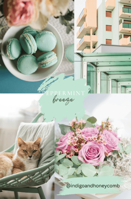
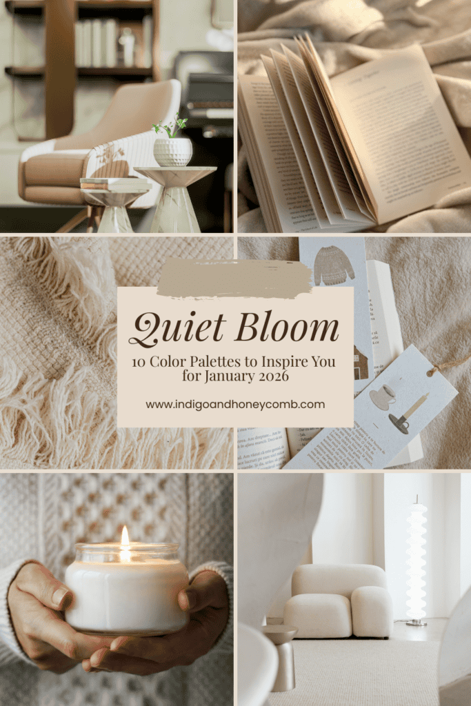
Quiet Bloom, our January 2026 Color of the Month, is a soft blush neutral that captures winter calm, subtle warmth, and the promise of renewal. These Quiet Bloom color palettes highlight the versatility of this refined hue, inspired by Benjamin Moore’s First Crush. Sitting beautifully between beige and blush, Quiet Bloom serves as an ideal foundation for soft neutral color palettes, winter interiors, and intentional design storytelling across interiors, branding, and seasonal visuals.
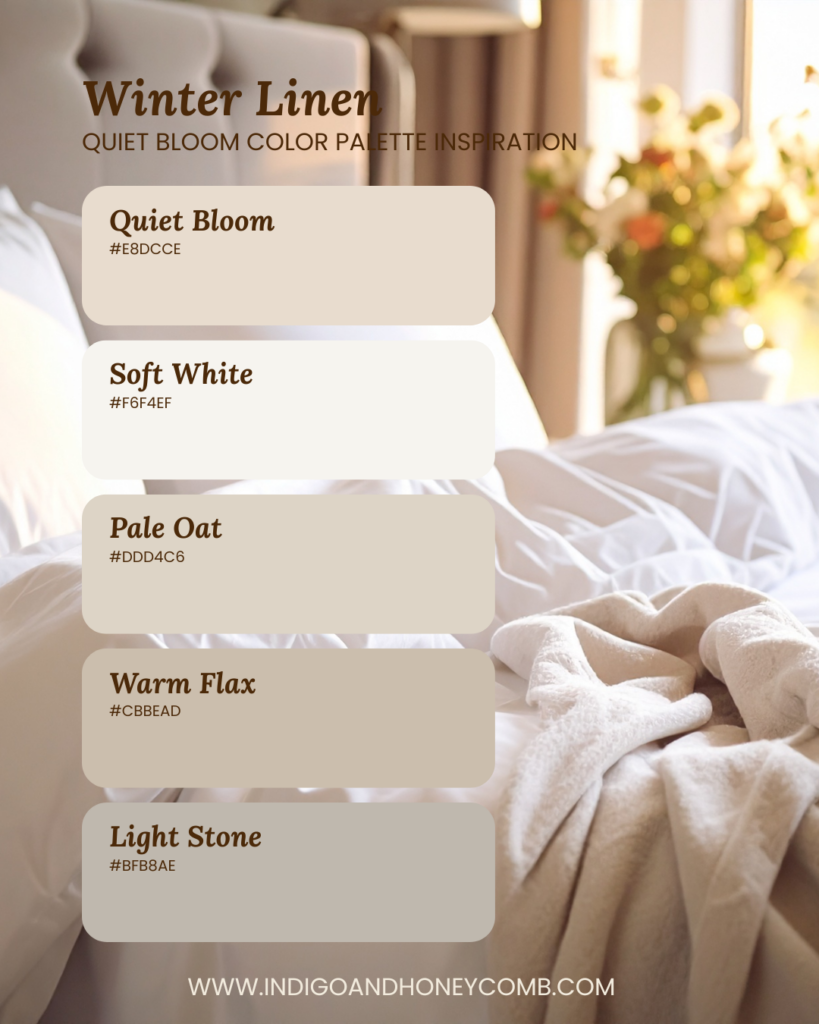
1. Winter Linen — Quiet Bloom Color Palette
Inspiration: Soft textiles, diffused daylight, and quiet winter mornings.
2026 Macro Color Trend: Elevated Neutrals — warm, fabric-inspired tones replacing stark whites. A light, airy palette that emphasizes calm and simplicity.
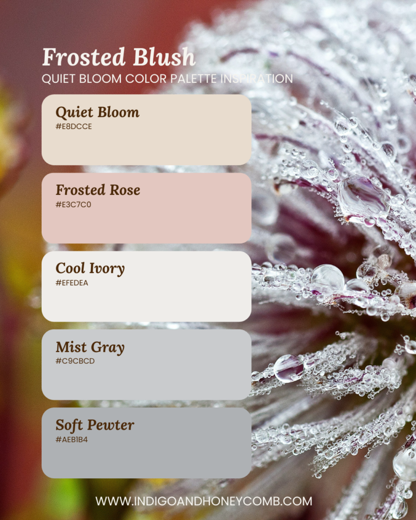
2. Frosted Blush — Soft Neutral Winter Palette
Inspiration: Icy mornings with a hint of warmth beneath the surface.
2026 Macro Color Trend: Warm–Cool Balance — blending blush warmth with cool winter grays. This palette balances blush tones with cool winter neutrals.
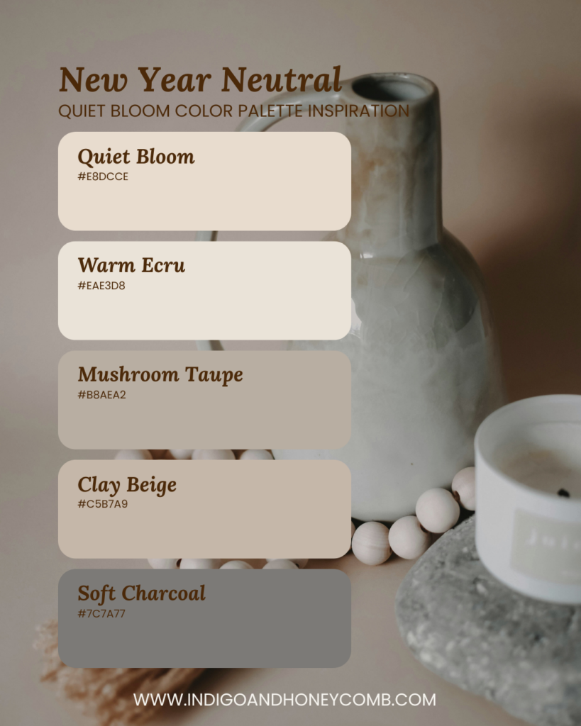
3. New Year Neutral — January 2026 Color Palette
Inspiration: Clean slates, intentional resets, and minimalist interiors.
2026 Macro Color Trend: Soft Minimalism — neutrals with depth replacing flat monochrome palettes. A modern neutral palette that feels grounded and fresh.
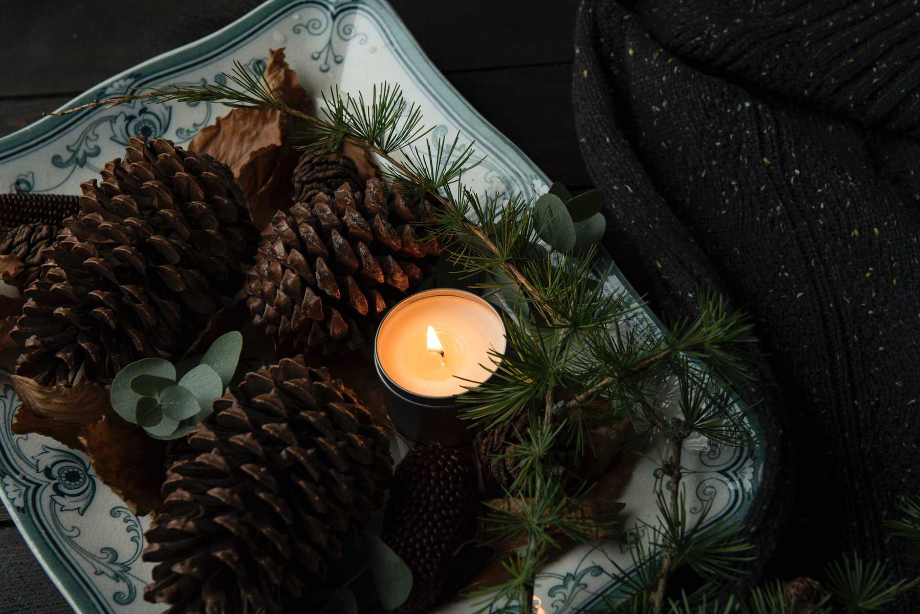
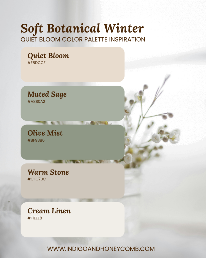
3. Soft Botanical Winter — Muted Winter Color Palette
Inspiration: Winter greenery and nature at rest.
2026 Macro Color Trend: Muted Biophilia — softened greens inspired by nature and sustainability. Muted greens bring life and balance to Quiet Bloom’s warmth.
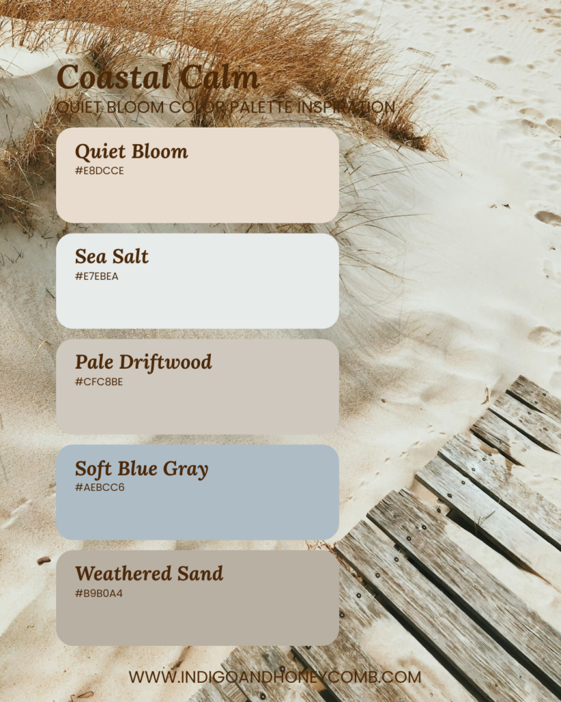
5. Coastal Calm — Quiet Bloom Color Palette
Inspiration: Winter coastlines, sea fog, and sandy shores.
2026 Macro Color Trend: Coastal Neutrals — mineral blues and sands with a quieter, winter tone. A serene palette that feels light, breathable, and timeless.
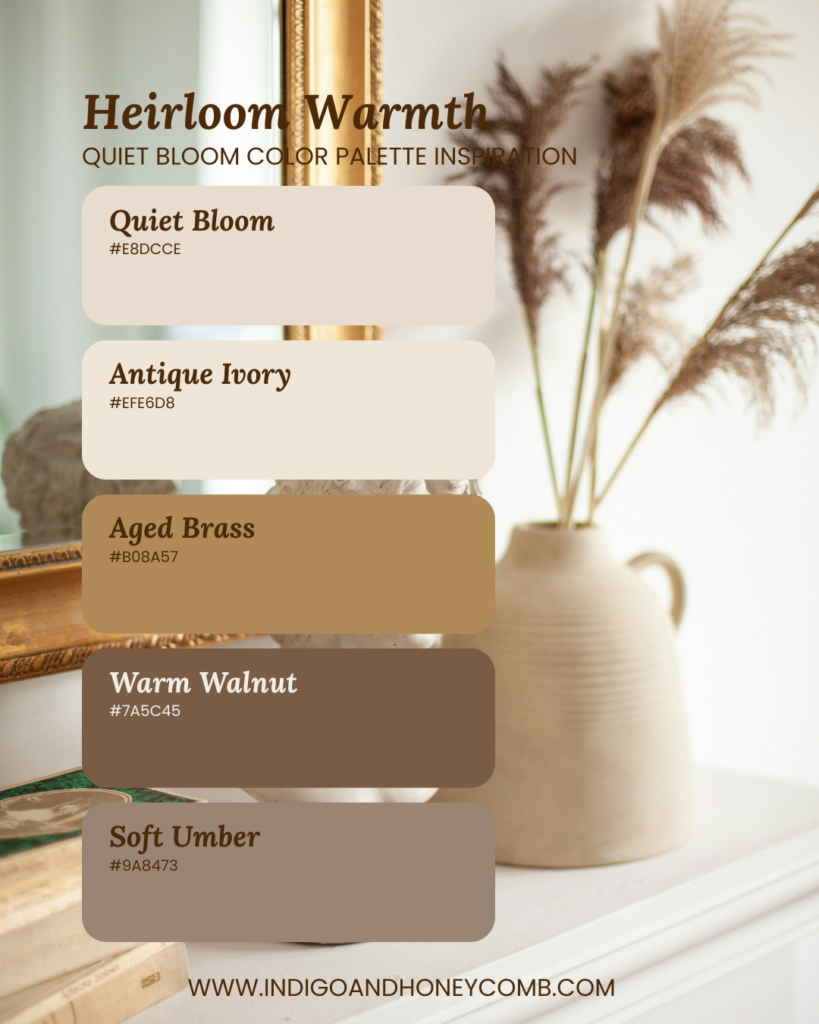
6. Heirloom Warmth
Inspiration: Collected interiors, patina, and classic materials.
2026 Macro Color Trend: Heritage Warmth — timeless browns, brass, and patinated finishes. This palette layers warmth and depth while staying refined.
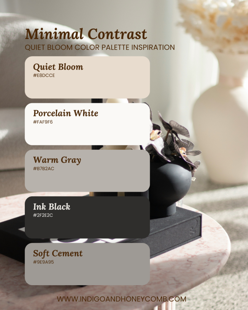
7. Minimal Contrast — Modern Neutral Color Palette
Inspiration: Modern design with subtle visual tension.
2026 Macro Color Trend: Refined Contrast — softer blacks and grays paired with warm neutrals. High restraint with just enough contrast to feel intentional.
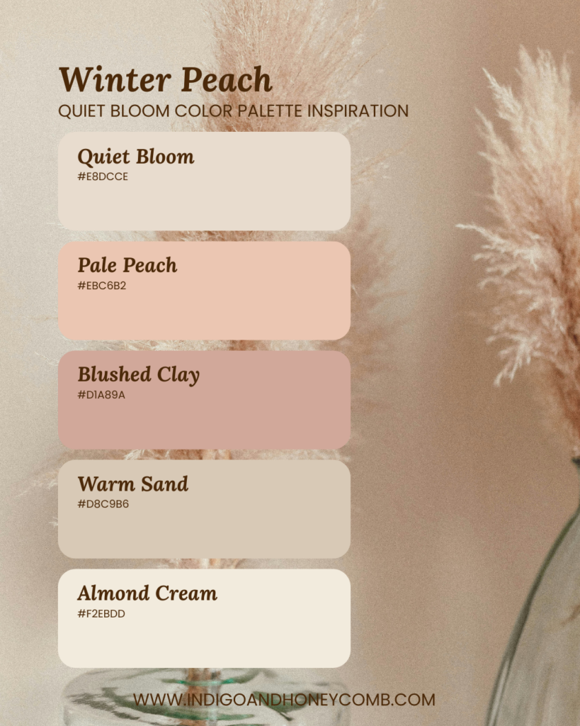
8. Winter Peach
Inspiration: Soft fruit tones muted by seasonal light.
2026 Macro Color Trend: Muted Edibles — desaturated peach and clay tones inspired by food culture. A gentle, romantic palette without feeling overly sweet.
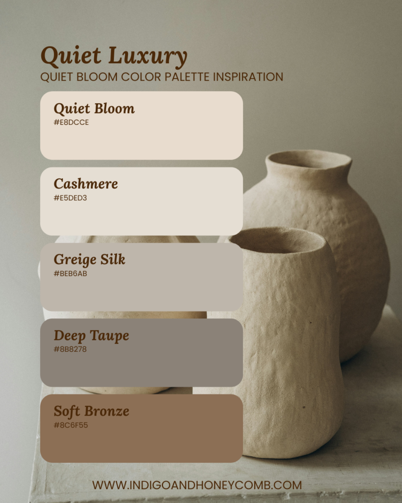
9. Quiet Luxury
Inspiration: Elevated neutrals and understated sophistication.
2026 Macro Color Trend: Quiet Luxury — low-contrast palettes that emphasize material quality. Perfect for refined interiors, branding, or hospitality spaces.
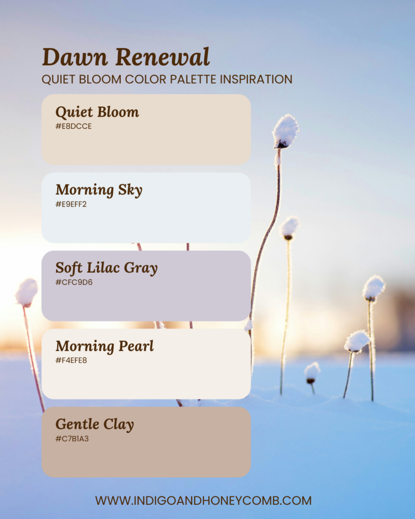
10. Dawn Renewal
Inspiration: Early morning light and the promise of a new day.
2026 Macro Color Trend: Soft Pastel Revival — gentle lilacs and pearls signaling optimism. A hopeful palette that bridges winter into early spring.
Designing with Quiet Bloom Color Palettes
Whether you’re creating interior palettes, brand visuals, or seasonal content, Quiet Bloom adapts beautifully across moods, from minimal and modern to warm and romantic. These palettes inspire intentional layering, softness, and balance for early 2026. Quiet Bloom shows that even the quietest colors can tell the most meaningful stories.