March Color of the Month | Deep Green for Spring 2026
These Moorland Reverie color palettes reflect the shift toward deeper, more atmospheric hues defining spring 2026 color trends. Anchored by Moorland Reverie (#0F5E4F), a rich botanical green, each palette explores a different design direction, from Brontë-core romance to cottagecore softness and modern organic minimalism. As interiors move away from traditional pastels, these curated combinations offer a fresh approach to moody green color palettes, blending depth, nature, and timeless appeal for the season ahead.

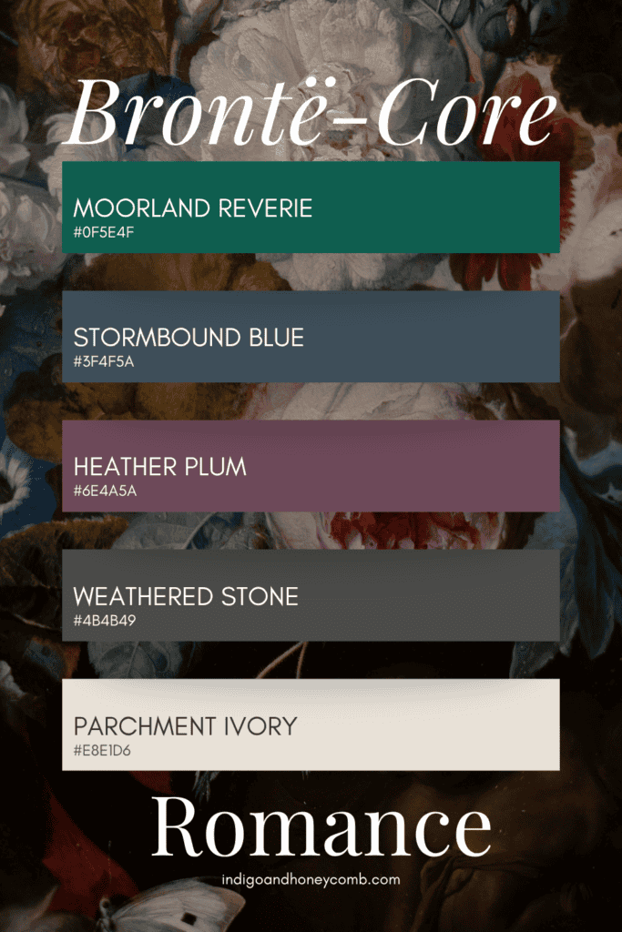
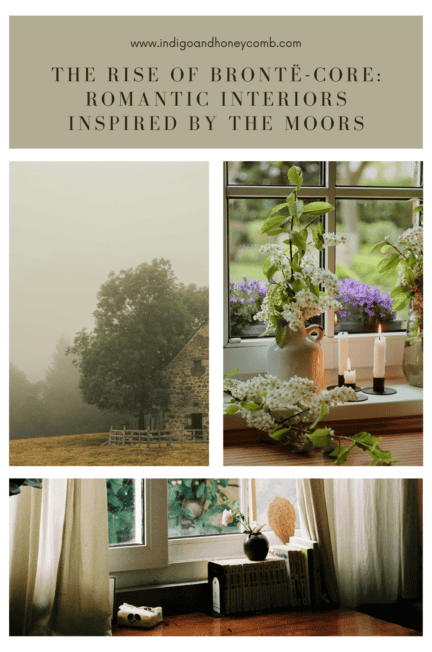
Brontë-Core Moorland Reverie Color Palette for Moody Interiors
Inspired by Wuthering Heights, this palette is dark, emotional, and atmospheric. Perfect for layered interiors with candlelight, velvet textures, and antique wood.
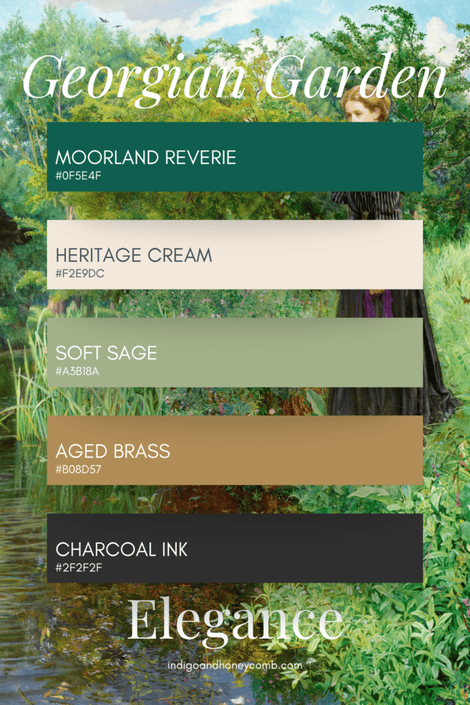
Georgian-Inspired Green Color Palette with Moorland Reverie
A refined palette that balances symmetry and softness, ideal for paneled walls, traditional millwork, and timeless interiors.
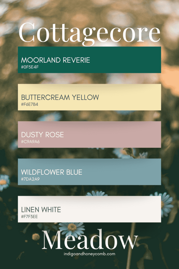
Cottagecore Color Palette Featuring Moorland Reverie
A softer interpretation of Moorland Reverie, this palette brings a pastoral charm with a grounded, earthy base.
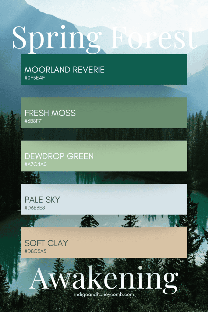
Spring 2026 Color Trends: A Fresh Green Color Palette
This palette bridges winter and spring, layering greens to reflect new growth while maintaining depth.
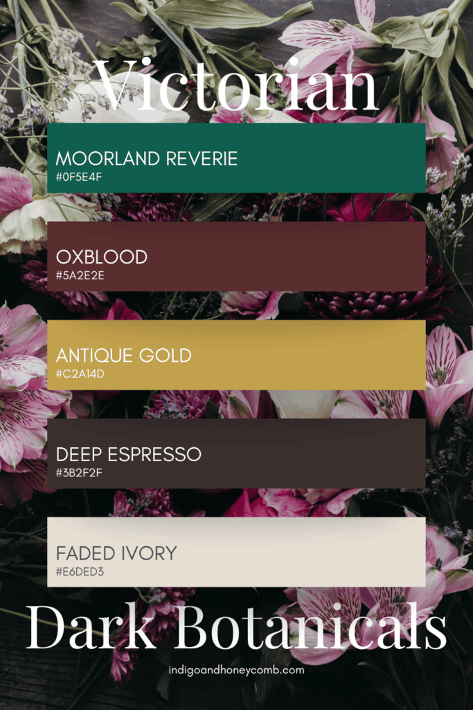
Victorian Dark Romantic Color Palette with Deep Green
Rich and dramatic, this palette leans into Victorian interiors with opulent, moody tones.
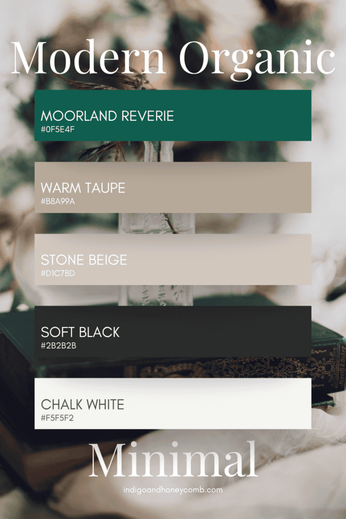
Modern Organic Moorland Reverie Color Palette
A contemporary take on moody green. Clean, grounded, and quietly sophisticated.
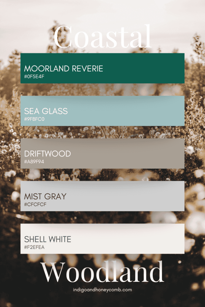
Coastal Green Color Palette with Moody Undertones
Where forest meets coast, this palette softens Moorland Reverie with airy, weathered tones.
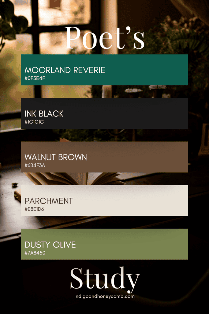
Brontë-Inspired Moody Green Color Palette for Interiors
Inspired by the worlds of Emily and Charlotte Brontë, a deeply intellectual palette designed for quiet spaces like libraries, studies, and reading rooms.
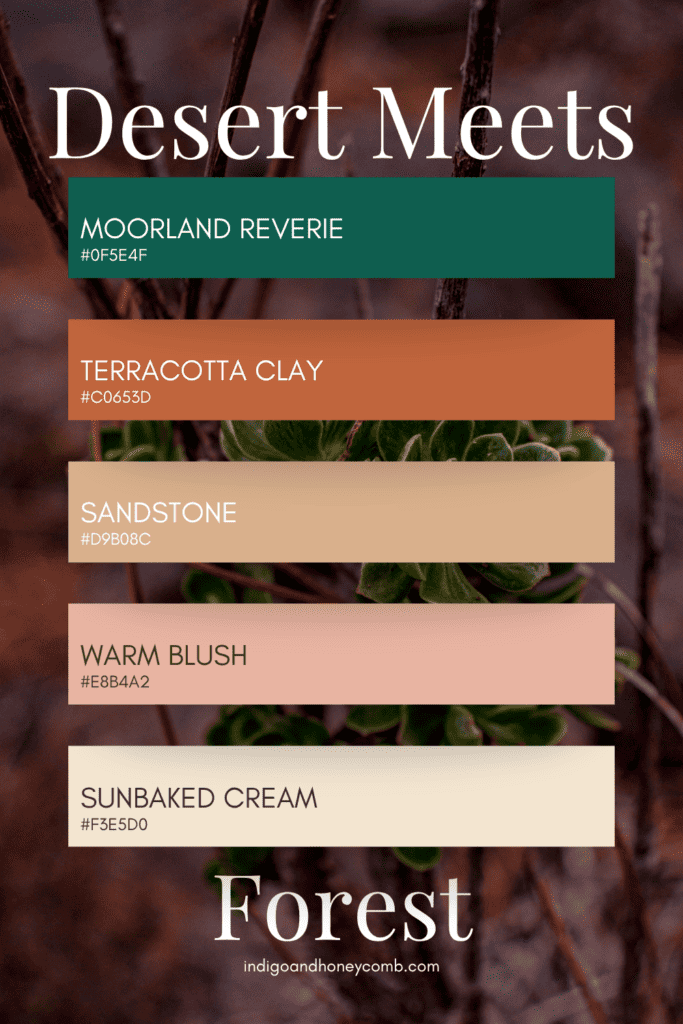
Warm Earth-Tone Color Palette with Moorland Reverie
An unexpected pairing that brings warmth and contrast to deep green.
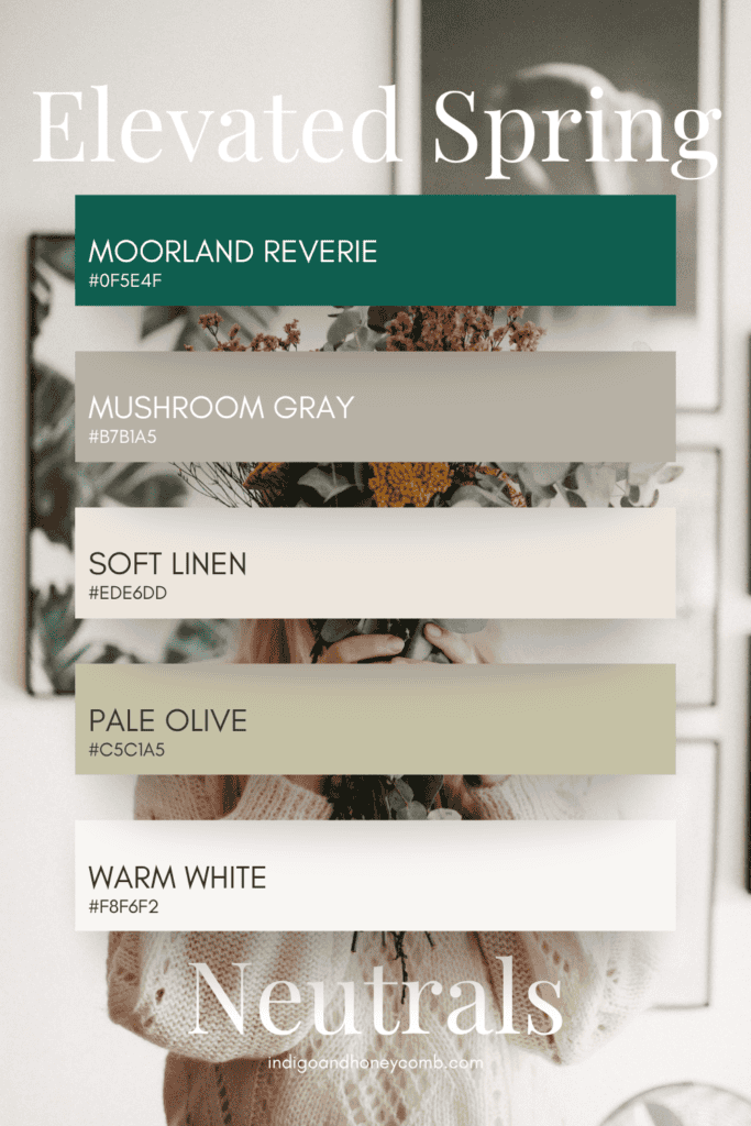
Elevated Neutral Color Palette with Deep Green Accents
A sophisticated neutral palette that proves spring can feel calm, layered, and grounded.
Why Moorland Reverie Color Palettes Define Spring 2026 Color Trends
What makes Moorland Reverie so compelling is its range. It can feel:
- Romantic and dramatic in Brontë-core interiors
- Soft and nostalgic in cottagecore spaces
- Clean and architectural in modern organic design
- Fresh yet grounded in spring palettes
It reflects the broader shift in spring 2026 color trends, where depth replaces delicacy and color tells a richer story.
Moorland Reverie (#0F5E4F) isn’t just a color. It’s a foundation. Whether layered into romantic interiors or softened for spring, it brings a sense of atmosphere, grounding, and timeless elegance to any palette. Spring, reimagined, starts here.
Leave a Reply