Why Butter Yellow Is Trending in Spring 2025
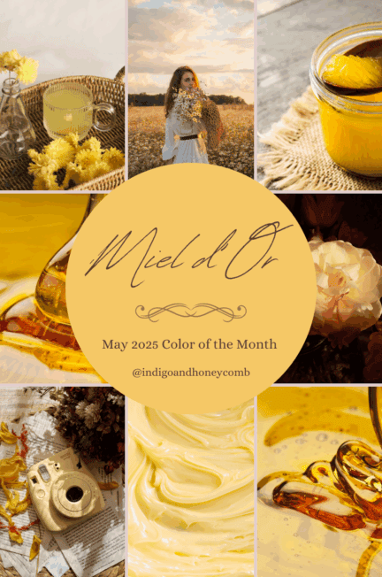
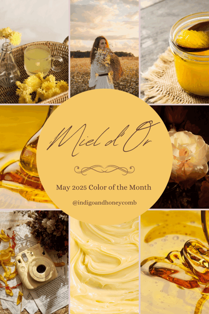
Introducing Miel d’Or
Butter yellow is having a moment—and in Spring 2025, it’s more luminous and luxe than ever. As part of the rising butter yellow color trend, we’re celebrating Miel d’Or, a golden, honey-infused hue that captures the warmth of sunlit mornings, blooming fields, and timeless elegance. In this post, we’ll explore the story behind the shade, its rise in the Spring 2025 color landscape, the history of honey and golden yellows, five design styles that pair beautifully with it, and five versatile palettes to inspire your next creative project.
The Inspiration Behind Miel d’Or and the Butter Yellow Color Trend
Miel d’Or—French for “golden honey”—draws its essence from the natural warmth and quiet luxury found in sunlit fields, vintage textiles, and slow mornings. It evokes the color of spun honey on toast, candlelit interiors, and spring’s first golden blooms. But this shade isn’t just nostalgic—it’s timely. The butter yellow color trend is emerging as a defining hue in both fashion and interiors for Spring 2025, and Miel d’Or captures its most elevated expression.
In fashion, butter yellow has been steadily making its way down the runways and into ready-to-wear collections. Spring/Summer 2025 fashion forecasts from trend authorities like WGSN and Pantone highlight soft yellows as key colors in response to a broader shift toward comfort, optimism, and sensory warmth. Designers like Loewe, Max Mara, and Chloé have embraced buttery yellows in silk blouses, tailored separates, and sheer dresses—often styled monochromatically to let the softness of the tone shine.
In interiors, we’re seeing the same movement. Miel d’Or aligns with the growing embrace of warm minimalism, where golden yellows are used to soften clean lines and neutral spaces. This trend is visible in curated color stories from Farrow & Ball, Jotun Lady, and Benjamin Moore, whose spring palettes feature warm yellows alongside natural materials like linen, rattan, terracotta, and unvarnished wood.
There’s also a cultural shift influencing this trend. In a post-maximalist, post-pandemic world, people are turning toward restorative, grounding colors that offer quiet joy. Butter yellow strikes that balance—it’s soft without being dull, joyful without being loud. Miel d’Or is born from this desire: a hue that feels as indulgent as a spoonful of honey and as timeless as a spring sunrise.
Whether layered with neutrals or paired with deeper heritage tones, Miel d’Or offers an elevated take on yellow that feels chic, calming, and unmistakably of the moment.
Yellow Trends for Spring 2025
Yellow is having a major moment in Spring 2025—but it’s not just any yellow. This season, we’re seeing a shift from neon and lemon to buttery, honeyed hues that feel tactile and lived-in. Think sun-washed pastels, creamy golds, and yellows with a hint of vintage nostalgia. These softer shades speak to a broader design shift toward comfort, optimism, and elegance with ease.
Miel d’Or stands out within this trend as a yellow that’s not loud, but deeply expressive. It works just as well as a feature color as it does in supporting roles—adding light, depth, and warmth without overwhelming the senses.
The History Behind the Butter Yellow Color Trend: Golden and Honey Hues Through Time
The butter yellow color trend may feel fresh in 2025, but its roots run deep across centuries of culture, art, and symbolism. From ancient civilizations to modern design, golden and honey-toned yellows have long been associated with warmth, vitality, and abundance.
In ancient Egypt, yellow ochre was considered sacred—a color linked to the sun god Ra and used in tomb paintings and artifacts as a symbol of eternity. Meanwhile, Greek and Roman societies used soft golden pigments in frescoes to depict light, intellect, and divine favor.
During the Renaissance, artists like Titian and Vermeer harnessed buttery yellows and golds to illuminate skin tones and natural light in their masterworks. These hues suggested warmth, humility, and understated wealth—a counterbalance to the bold reds and rich blues of the time.
In the 18th and 19th centuries, golden yellows took on domestic and romantic associations. The soft, buttery glow of candlelight inspired interior colors in English estates and French châteaux. The Industrial Revolution introduced new dye technologies, including chrome yellow, which brightened textiles, wallpapers, and ceramics.
By the mid-20th century, buttery and golden yellows were embraced in both fashion and interiors as a sign of optimism. Think sunny kitchens of the 1950s, goldenrod sofas of the 1970s, and the return of warm minimalism in the early 2000s. Today, that lineage reemerges as the butter yellow color trend—a nuanced update that feels at once nostalgic and forward-thinking.
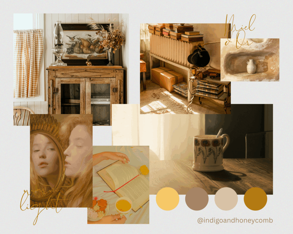
Miel d’Or represents this continuity: a shade that honors the past but fits seamlessly into modern palettes. Its subtle glow is a reminder that yellow doesn’t have to shout to be heard—it can whisper warmth, confidence, and comfort into any space or style.
5 Design Styles That Embrace the Butter Yellow Color Trend with Miel d’Or
Miel d’Or is a highly versatile hue that adapts beautifully across a wide range of aesthetics. Whether your design leans rustic or modern, romantic or minimalist, this butter yellow color trend adds just the right dose of sunlit sophistication. Here’s how it glows in five trending styles:
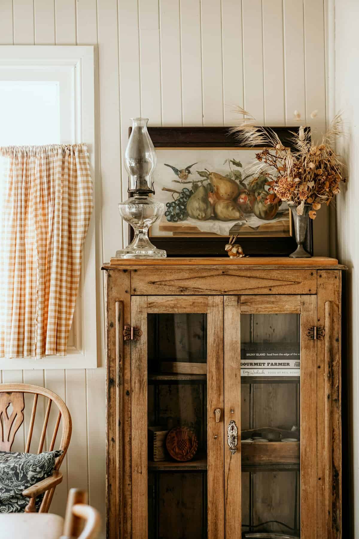
French Country
Style Mood: Romantic • Rustic • Timeless
With its roots in the sun-soaked villages of Provence, French Country design is all about elegance with a relaxed, lived-in feel. Miel d’Or feels right at home here, echoing the golden light over lavender fields and limestone farmhouses.
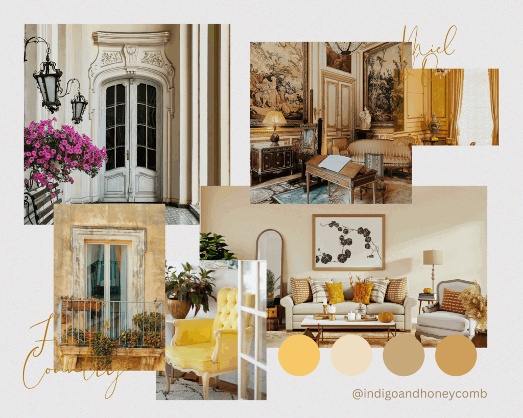
How to use it:
- Pair Miel d’Or with chalky whites, weathered wood, and soft florals.
- Use it on kitchen cabinets, upholstered dining chairs, or ceramic accents.
- It also pairs beautifully with vintage copper cookware or antique brass fixtures.
Accents: Lavender sprigs, terra cotta tiles, toile fabrics, patinaed iron details.
Midcentury Modern
Style Mood: Retro • Bold • Functional
Midcentury Modern design is experiencing a fresh revival in 2025, and Miel d’Or offers a cheerful update to the era’s palette. It channels retro optimism without veering into kitsch, especially when paired with warm woods and graphic shapes.
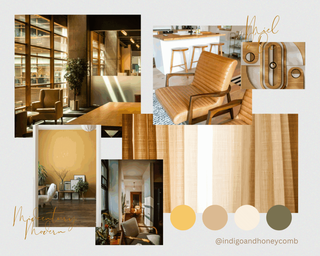
How to use it:
- Try Miel d’Or as an accent wall behind a low-profile sofa or as upholstery on a sculptural armchair.
- It’s striking in abstract art or paired with walnut, teak, and curved ceramics.
- Yellow pendant lights or lamp shades add a vintage punch.
Accents: Burnt orange, avocado green, matte black, brass, clean lines.
Bohemian
Style Mood: Eclectic • Earthy • Textured
The free-spirited layers of Bohemian design are grounded by rich tones and tactile materials—making Miel d’Or a seamless addition. Its golden warmth adds a mellow radiance that pairs well with globally inspired textiles and earthy hues.
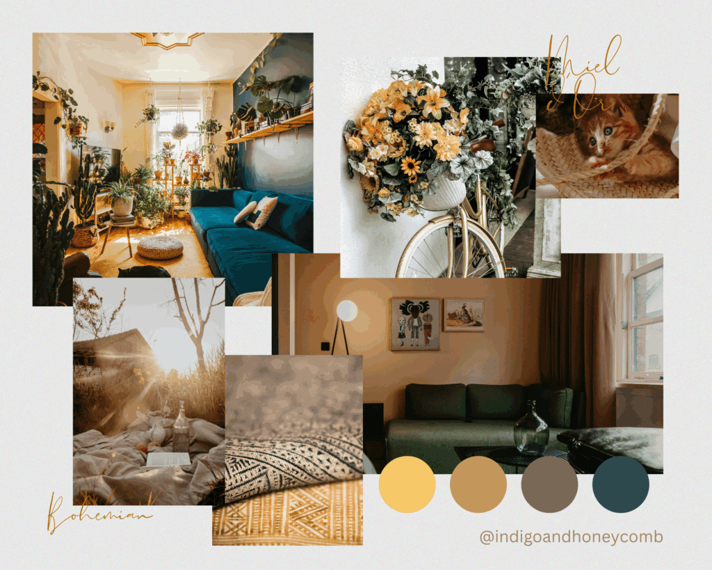
How to use it:
- Integrate Miel d’Or through Moroccan poufs, woven throws, or hand-dyed curtains.
- Works beautifully with kilim rugs, macramé, and cane furniture.
- A honey-yellow velvet or embroidered cushion can warm up layered bedding.
Accents: Clay, deep green, ochre, indigo, raw wood, fringe, vintage finds.
Scandinavian Warm Minimalism
Style Mood: Calm • Clean • Cozy
Scandinavian design continues to evolve beyond grayscale minimalism—embracing warmth, texture, and color. Miel d’Or brings that much-needed softness without disrupting the serene palette, making it perfect for this new “warm minimalism” movement.
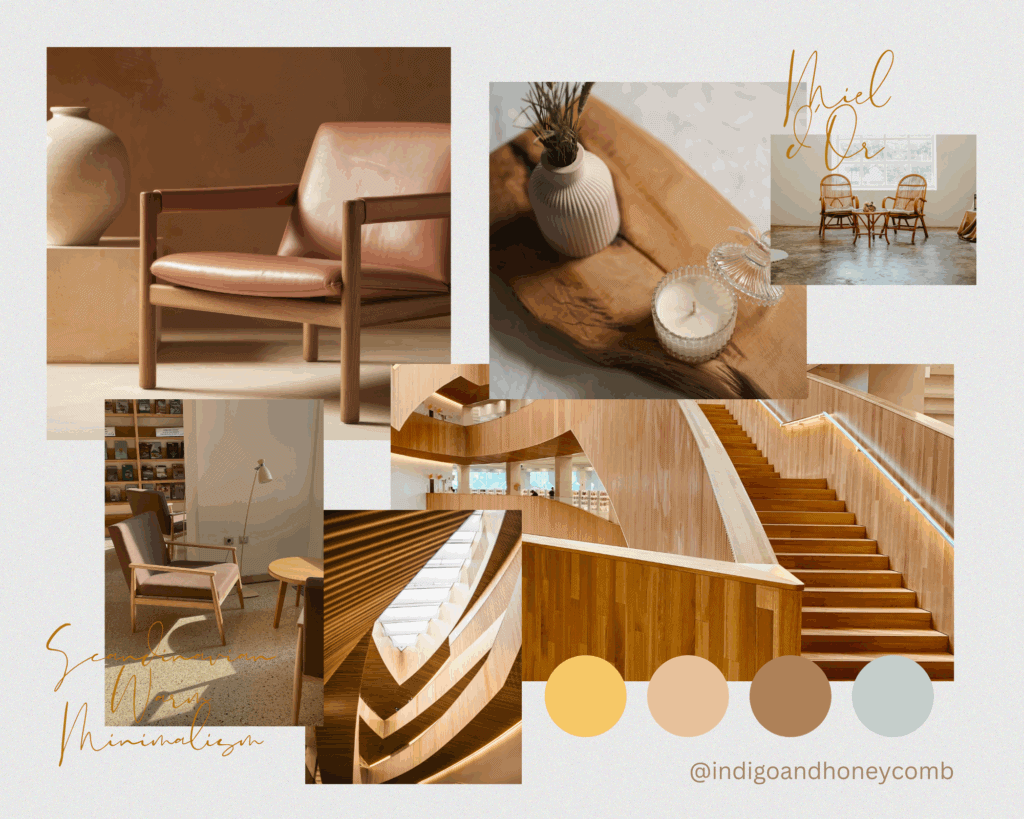
How to use it:
- Add Miel d’Or in subtle textiles: a knit throw on a white linen sofa, or pillows on a birchwood bench.
- Try it in painted wall arches, soft wool rugs, or ceramic planters.
- Let it stand out against soft neutrals like greige, oat, and dove gray.
Accents: Pale wood, soft white, warm gray, natural textiles, paper lantern lighting.
Contemporary Organic
Style Mood: Clean • Earthy • Elevated
This style blends sculptural furniture, earthy color palettes, and natural materials for a calming yet modern look. Miel d’Or fits in effortlessly—offering a sunlit touch that complements stone, clay, and natural light.
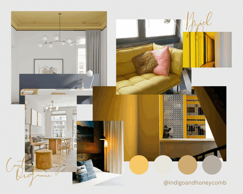
How to use it:
- Bring it into statement upholstery (like boucle or mohair), oversized pottery, or matte-finish wall paint.
- It’s ideal in a palette of creams, warm taupes, and soft greens.
- Also works well in minimalist dining rooms, open-concept kitchens, or serene bedrooms.
Accents: Travertine, warm black, linen, oversized greenery, organic curves, light wood.
Color Palettes Inspired by the Butter Yellow Color Trend and Miel d’Or
Warm, luminous, and grounding, Miel d’Or is the perfect anchor or accent in both bold and subtle color schemes. Whether you’re designing a living room, creating a spring wardrobe, or curating a brand moodboard, these palettes show off its full range of versatility.
Sun-Kissed Provençal
Miel d’Or • Soft Lavender • Chalk White • Olive Green • Burnished Bronze
Palette Mood: Rustic elegance, sun-drenched charm, French countryside escape.
This palette draws inspiration from golden fields of wheat, blooming lavender, and timeworn stone villas. Miel d’Or acts as the warm base, balanced by earthy greens and romantic purples.
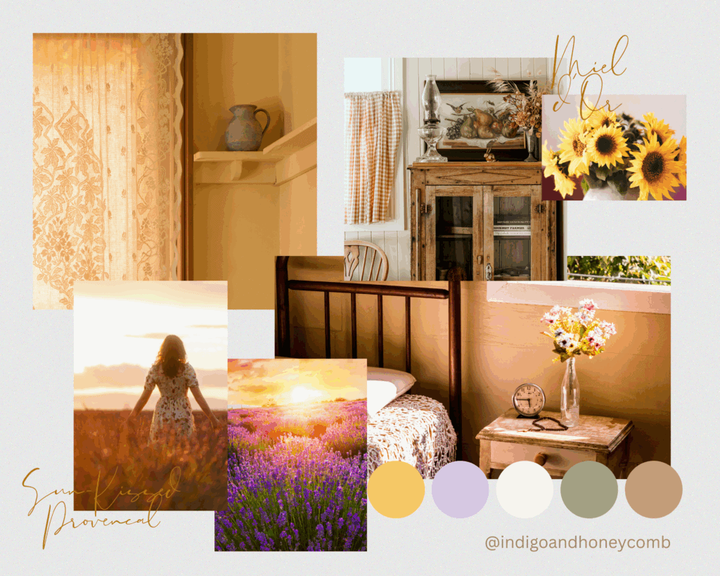
Use it for:
- French country kitchens with painted cabinets.
- Spring fashion lines with pastoral prints.
- Branding for wellness or artisanal food brands.
Design Pairing: Linen tablecloths, lavender bundles, wrought iron chairs, vintage wood.
Golden Hour Glow
Miel d’Or • Terracotta Clay • Desert Sand • Soft Peach • Warm White
Palette Mood: Sunset-inspired, grounded, serene.
A mellow desert palette that channels the magic hour just before dusk. The warmth of Miel d’Or shines next to sunbaked clay and sandy neutrals, creating a harmonious, modern organic aesthetic.
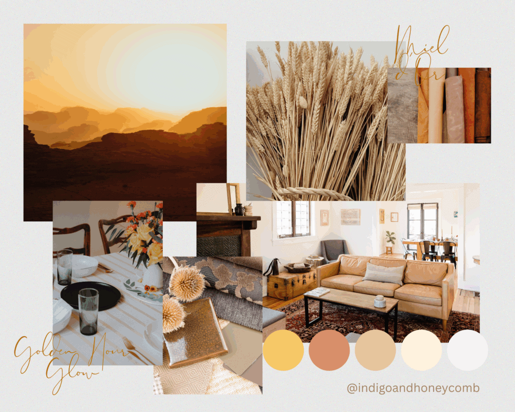
Use it for:
- Earth-toned interiors with a minimalist approach.
- Fashion campaigns focused on natural fibers and slow living.
- Pinterest graphics for lifestyle content with a glow-up aesthetic.
Design Pairing: Terracotta tiles, boucle textures, earthenware ceramics, palm fronds.
Retro Citrus Pop
Miel d’Or • Papaya Orange • Mint Green • Cloud White • Espresso Brown
Palette Mood: Playful, nostalgic, energetic.
Think vintage cafés, citrus groves, and groovy kitchens from the 1970s. Miel d’Or adds a creamy base that makes the brighter tones feel cohesive and elevated.
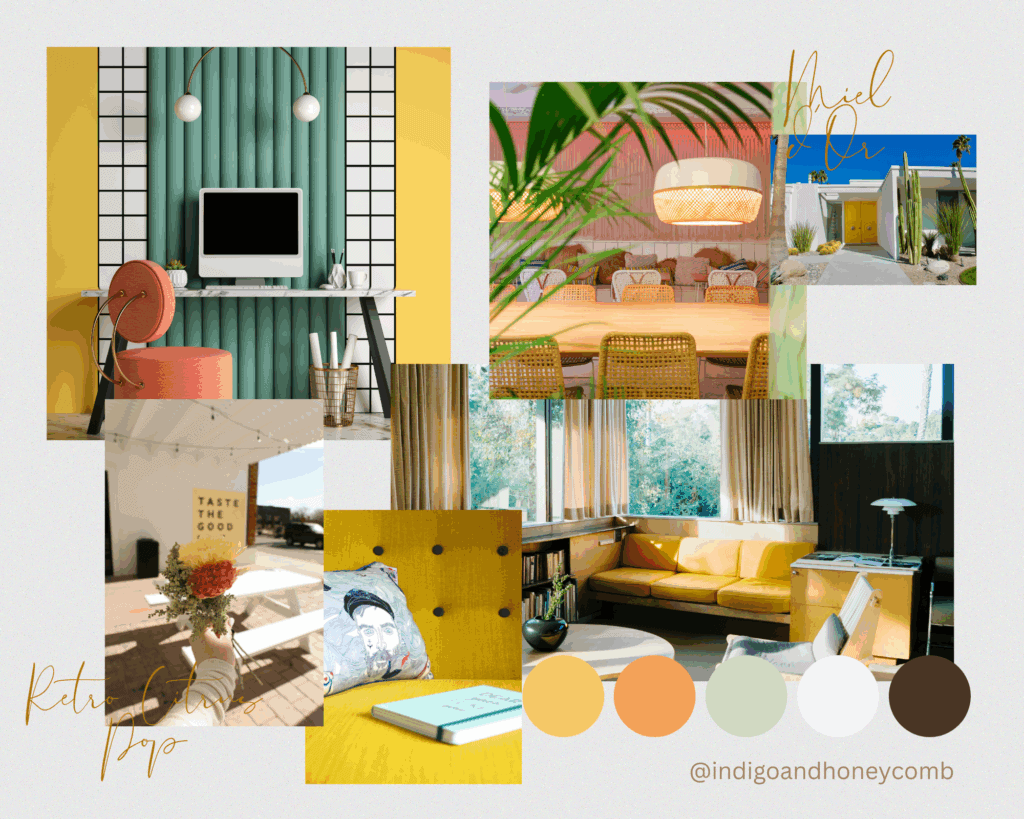
Use it for:
- Midcentury modern interiors with retro flair.
- Product packaging for fun, nostalgic treats.
- Youthful digital content or creative branding.
Design Pairing: Checkerboard tiles, chrome accents, terrazzo counters, sunny textiles.
Honeycomb & Hemlock
Miel d’Or • Deep Forest Green • Moss • Stone Gray • Warm Taupe
Palette Mood: Sophisticated, grounded, forested retreat.
Inspired by nature’s contrast—sunlight filtering through dark pine trees—this palette is equal parts cozy and dramatic. Miel d’Or provides a golden uplift to the earthy greens and cool-toned neutrals.
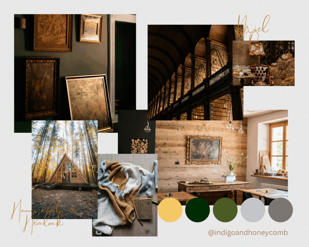
Use it for:
- Cabin-style homes, mountain getaways, or luxury outdoor brands.
- Moody interiors where light and warmth need balance.
- Botanical or apothecary-inspired design projects.
Design Pairing: Natural woodgrain, wool throws, stone textures, botanical prints.
Spring Atelier
Miel d’Or • Powder Blue • Blush Rose • Ivory • Dusty Plum
Palette Mood: Delicate, romantic, painterly.
This palette brings to mind a French artist’s studio in May—brushes dipped in soft pastels, golden morning light pouring in. Miel d’Or becomes the radiant heart of the palette, grounding the airy pastels with a touch of luxe.
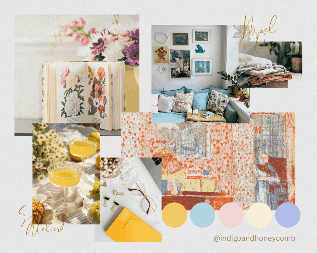
Use it for:
- Spring wedding color schemes.
- Feminine home offices, dressing rooms, or moodboards.
- Branding for florists, stationery, or artisan skincare.
Design Pairing: Gauzy curtains, vintage floral wallpaper, gold leaf accents, linen-bound books.
Final Thoughts
Miel d’Or isn’t just a color—it’s a feeling. It’s the warmth of sun on your skin, the sweetness of honey stirred into tea, the glow of an afternoon well spent. In a world leaning into softness, optimism, and sensory joy, Miel d’Or is a hue that speaks quietly but confidently. It brings life to neutrals, depth to brights, and heart to minimalist design. This golden shade will carry you through May with warmth, light, and timeless charm.