The March Color of the Month 2026 signals a dramatic shift in spring 2026 color trends. This year, designers are moving beyond traditional pastels and embracing a more immersive, moody direction, one led by deep botanical greens.
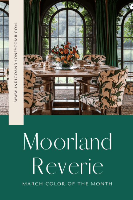
Introducing Moorland Reverie (#0F5E4F)! This saturated, dark green paint color captures the essence of the emerging moody spring color palette rooted in nature, layered with emotion, and influenced by the rise of the Brontë-core aesthetic, Georgian interiors, and Victorian dark romanticism.
Spring 2026 isn’t about softness. It’s about depth.

Spring 2026 Color Trends: The Rise of Moody Greens
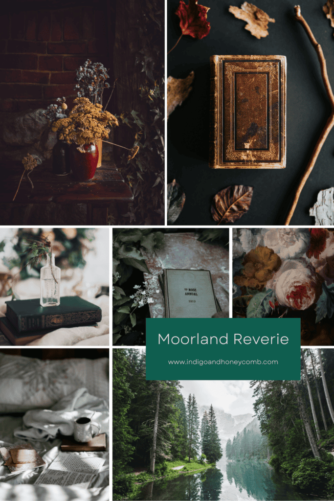
Cultural currents are shaping this seasonal pivot. The resurgence of “Brontë-core”, fueled in part by renewed fascination around Charlotte Brontë with the movie release of Wuthering Heights, has reintroduced a collective longing for windswept moors, stormy romance, and interiors lit by candlelight rather than sunshine.
Moorland Reverie feels pulled from that landscape: dense grasses bending beneath a gray sky, ivy creeping along stone walls, the quiet drama of nature unfiltered. Unlike the buoyant greens of spring’s past, this one carries shadow. It suggests emotion. It invites introspection.
Brontë-Core & Dark Romantic Interiors: Why Depth Feels Right Now
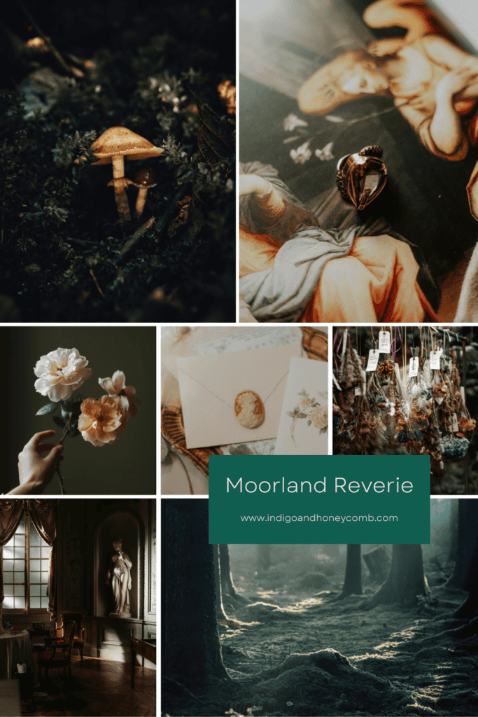
Alongside Brontë-core is the rise of the “poet aesthetic”. An embrace of tactile materials, worn books, inkwells, linen shirts, and rooms that feel curated over time rather than styled overnight.
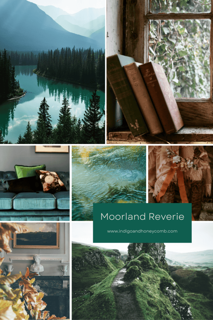
Moorland Reverie belongs in spaces that feel layered, storied, and intentionally collected. It pairs beautifully with warm ivory parchment tones that soften its depth, while inky charcoals heighten its drama and create striking contrast. Accents of oxidized brass introduce a timeworn glow, and oxblood leather adds richness and a subtle nod to Victorian romance. Grounded by weathered oak, the palette feels balanced and architectural, a thoughtful composition of texture and tone that enhances the green’s moody sophistication.
There’s a distinctly Victorian sensibility here. Not ornate for ornament’s sake, but deeply layered and immersive. The Victorian era understood that dark colors could be intimate rather than oppressive. In 2026, we’re rediscovering that truth.
Georgian Interior Color Trends: Heritage Greens Reimagined
At the same time, interest in Georgian interiors is accelerating. Clean symmetry, architectural millwork, paneling, and heritage palettes are returning, but with a modern lens.
In a Georgian-inspired space, Moorland Reverie feels stately and grounded. On paneled walls, it highlights craftsmanship. Against crisp trim, it becomes architectural. Paired with marble, unlacquered brass, and traditional upholstery, it balances heritage with contemporary restraint. It’s a green that understands proportion and permanence.
So why the shift away from pastel? After years of minimalism and airy palettes, there’s a collective desire for emotional depth. Consumers are gravitating toward colors that feel protective, cocooning, and storied. Greens, particularly deeper botanical tones, symbolize renewal without naiveté.
Moorland Reverie embodies growth with gravitas. A reminder that renewal doesn’t have to be bright to be powerful. It reflects nature with complexity, capturing the layered greens of forest canopies, moss-covered stone, and windswept moors rather than the simplicity of fresh-cut grass. There is romance here, but it is romance without fragility — grounded, enduring, and deeply atmospheric. This hue signals a more sophisticated spring, one that blooms in shadow before it blossoms in light, embracing depth as an essential part of transformation rather than something to escape.
How to Use a Deep Green Paint Color in 2026
- Statement Walls: In living rooms or studies where mood matters.
- Cabinetry: Especially paired with aged brass hardware.
- Front Doors: A refined alternative to navy or black.
- Layered Textiles: Velvet pillows, wool throws, or linen drapery in complementary deep greens.
This is not a fleeting trend color. It’s a tone that anchors.
Why Dark Botanical Green Defines the March Color of the Month 2026
Spring 2026 isn’t about brightness. It’s about atmosphere. Moorland Reverie (#0F5E4F) captures the moment where winter’s introspection meets spring’s promise. It feels literary. Architectural. Romantic. Grounded. And perhaps most importantly, it reminds us that renewal doesn’t always arrive in pastels. Sometimes, it emerges from the moors.


Leave a Reply