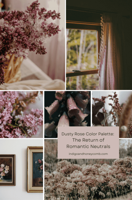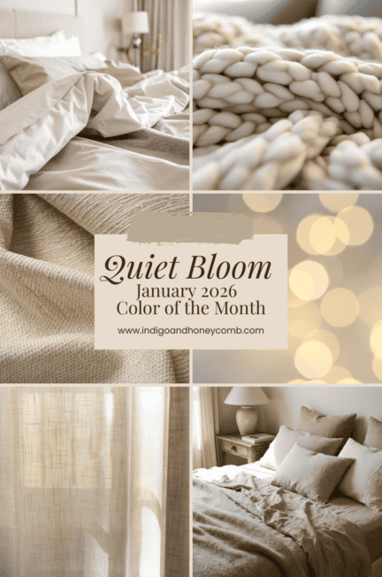
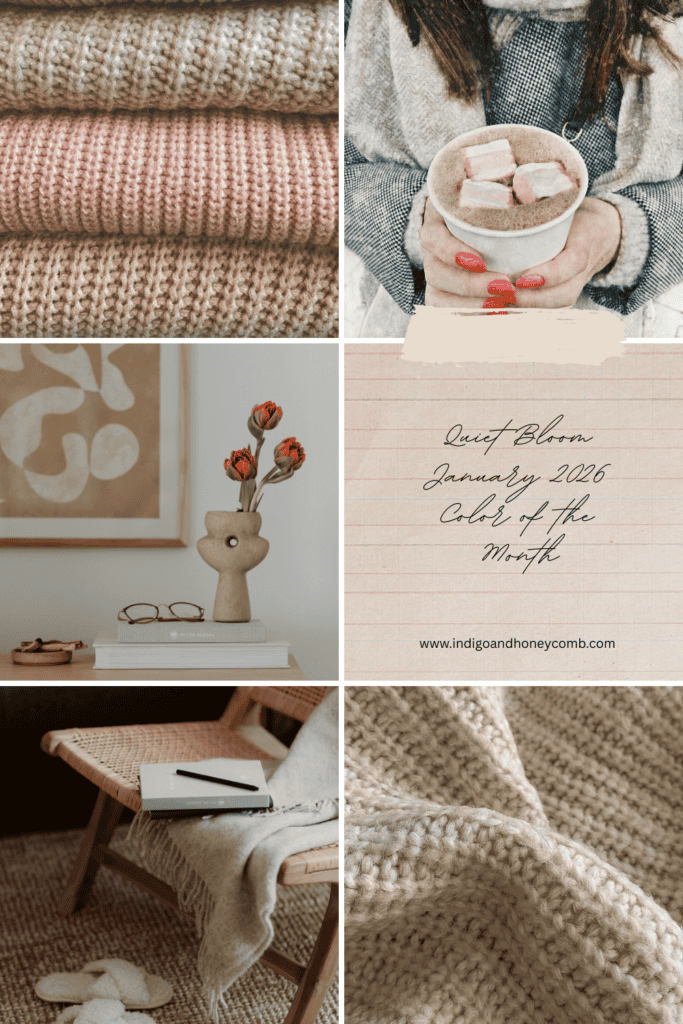
What Is Quiet Bloom?
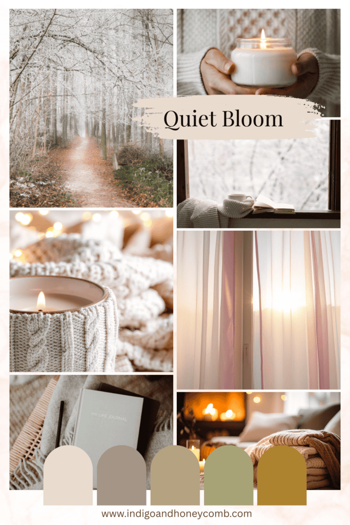
Quiet Bloom (#E8DCCE) is a warm, blush-leaning neutral with delicate peach and ivory undertones. Neither overtly pink nor strictly beige, it lives in the in-between; where softness meets restraint. This balance makes Quiet Bloom especially fitting as the choice for the January 2026 color of the month. A month defined by reflection, reset, and gentle forward momentum.
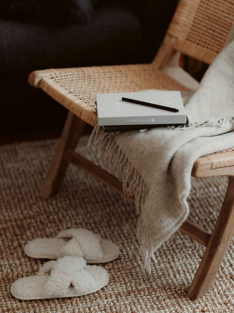
Unlike high-energy hues that demand attention, Quiet Bloom invites stillness. It’s the color of winter light filtering through sheer curtains, fresh linens layered on a bed, and the first hint of warmth returning after the holidays. Perfect for interior design trends 2026 and soft neutral color palettes, Quiet Bloom offers both style and comfort.

Why Quiet Bloom for January?
January sets the emotional tone for the year ahead. After the visual richness of December, many of us crave simplicity, clarity, and calm. Quiet Bloom supports this seasonal shift by offering:
- A sense of renewal without brightness overload
- Warmth that counters winter’s cool gray days
- Emotional softness that feels restorative, not sleepy
Quiet Bloom reflects the idea that growth doesn’t always arrive loudly. Sometimes, it unfolds gently, one thoughtful step at a time. Ideal for winter home decor ideas and January color inspiration.
The Emotional Story of Quiet Bloom
Color has the power to influence how we feel in a space, and Quiet Bloom carries a deeply comforting emotional message:
- Calm & reassurance – perfect for resetting after a busy season
- Optimism – subtle warmth hints at what’s to come
- Balance – a neutral that doesn’t feel flat or cold
It’s a color that encourages intention over urgency, making it ideal for 2026 design trends, homes, creative spaces, and brands entering a new chapter.
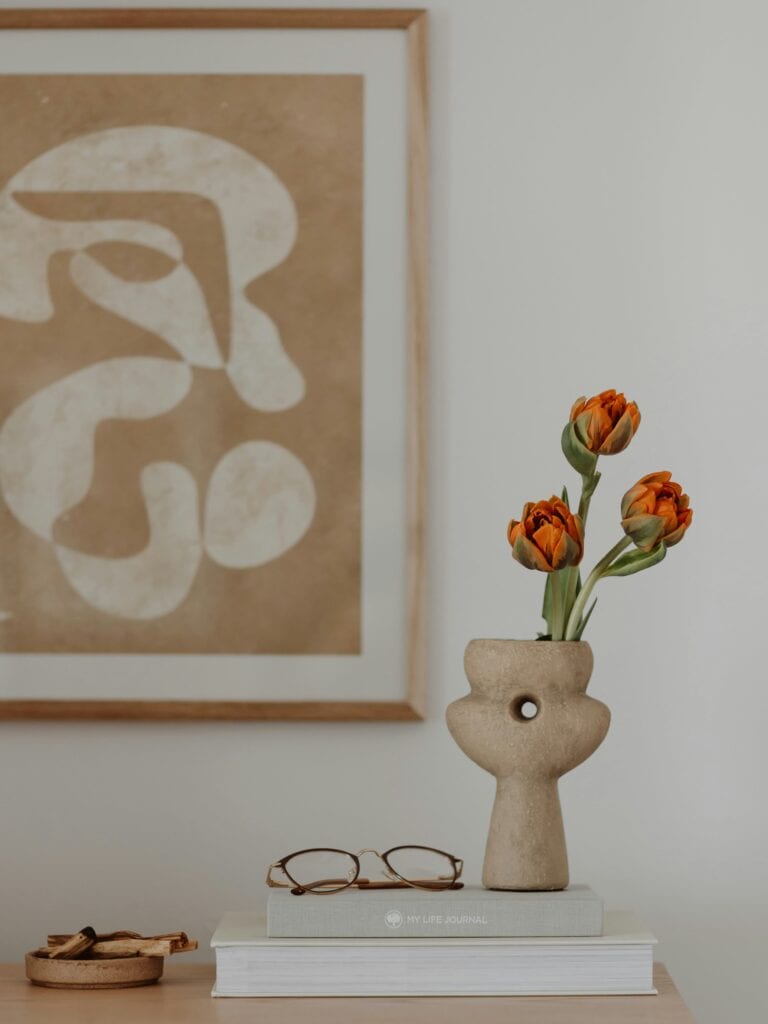
How to Use Quiet Bloom in Interiors
Quiet Bloom is incredibly versatile, especially when layered thoughtfully.
Walls
Use Quiet Bloom as a wall color in bedrooms, living rooms, or reading spaces where softness is key. It pairs beautifully with natural light and creates an enveloping, serene backdrop.
Textiles & Soft Furnishings
Incorporate Quiet Bloom through upholstery, drapery, bedding, or accent pillows to add warmth without overwhelming a neutral palette. Works beautifully with muted color schemes and soft winter palettes.
Material Pairings
- Light oak and warm woods
- Natural stone and plaster finishes
- Linen, wool, boucle, and soft cottons
Quiet Bloom Color Pairings
To enhance its winter-to-spring versatility, pair Quiet Bloom with:
- Soft White – for a clean, airy foundation
- Stone Gray – adds depth while maintaining calm
- Warm Taupe – reinforces its neutral warmth
- Muted Olive or Sage – introduces a subtle, nature-inspired contrast
- Antique Brass or Aged Gold – for gentle sophistication
These combinations keep the palette grounded, organic, and timeless. Great for color coordination in home interiors and 2026 seasonal palettes.
Quiet Bloom Beyond the Home
Quiet Bloom isn’t just for interiors. Its understated elegance makes it ideal for:
- Branding and packaging
- Seasonal marketing visuals
- Lifestyle photography backdrops
- Wellness and hospitality spaces
As a January color, it aligns beautifully with themes of mindful design, intentional color choices, and winter color storytelling.

A Quiet Start to the Year
Quiet Bloom reminds us that the beginning of the year doesn’t need to be bold to be meaningful. In winter’s stillness, there is space to reset, refine, and prepare for what’s next.
Moving into 2026, Quiet Bloom is a gentle foundation making it the ideal January 2026 color of the month. A color that supports clarity, comfort, and quiet growth.
Looking for more seasonal color inspiration? Explore our Winter Color Stories and discover palettes designed to bring calm and intention into the colder months.