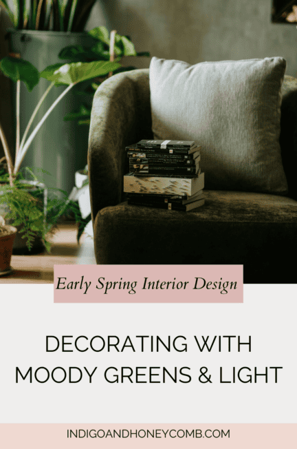
There’s a quiet moment between winter and spring that often gets overlooked. The air is lighter, the days are longer, but the world hasn’t fully bloomed yet. This is where early spring interior design lives. An in-between season defined by softness, shadow, and subtle transition.
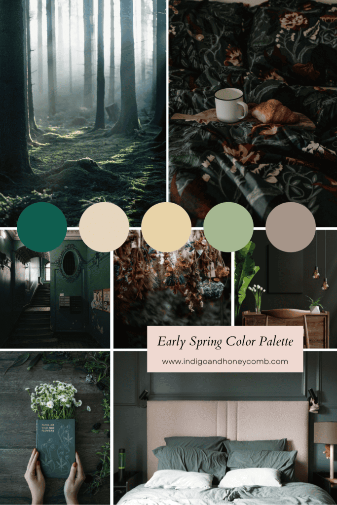
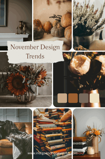
For 2026, this moment is especially relevant. As spring color trends shift away from pastels and toward deeper, more atmospheric tones, early spring interiors embrace moody spring decor, layered textures, and natural light that evolves throughout the day. At the center of this approach is a grounding hue like Moorland Reverie (#0F5E4F), a deep botanical green that reflects the landscape before it fully awakens.
What Defines Early Spring Interior Design?
Early spring interiors are not about instant brightness. They are about gradual transition. This design moment sits between seasons as winter’s depth is still present, while spring’s light is beginning to emerge.
Instead of replacing darker tones, early spring design softens them. Rooms feel lighter, but not airy; fresh, but not floral-heavy. The result is an environment that feels calm, grounded, and in tune with nature’s slower rhythm.
This philosophy builds directly on the deeper palettes explored in our Moorland Reverie Color of the Month story and the atmospheric mood of the Brontë-core trend, carrying both forward into a more livable, everyday setting.
The Role of Light in Early Spring Interiors
Light is the defining element of early spring interior design. As daylight extends, interiors begin to shift, not through color alone, but through how light interacts with materials. Morning light feels cooler and diffused, while late afternoon introduces a soft warmth that gently transforms deeper hues.
To work with this:
- Replace heavy blackout curtains with linen or sheer drapery
- Embrace natural shadow and contrast rather than over-lighting a room
- Use warm lamps and sconces to maintain intimacy in the evening
This balance creates a layered lighting experience. One that evolves throughout the day rather than remaining static.
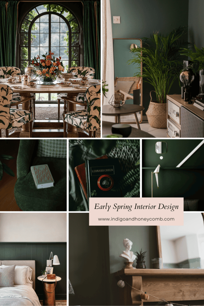
Color Palette: Moody Greens and Soft Neutrals
The early spring palette reflects the landscape before full bloom—subtle, grounded, and quietly complex. At the center is Moorland Reverie (#0F5E4F), a deep green that anchors the space with richness and depth. Around it, softer tones begin to emerge, creating a gentle sense of contrast and balance. Parchment ivory and warm linen introduce lightness, while pale olive and mushroom gray echo the muted hues of the early spring landscape. Grounded by weathered wood tones, the palette feels layered and natural. An effortless blend of depth and softness that reflects the season’s quiet transition.
This combination creates a moody green color palette that feels balanced rather than heavy. The contrast between dark and light is gentle, allowing the space to evolve naturally with the changing season.
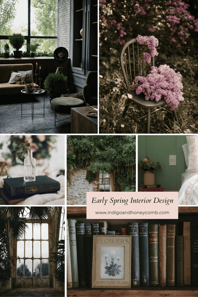
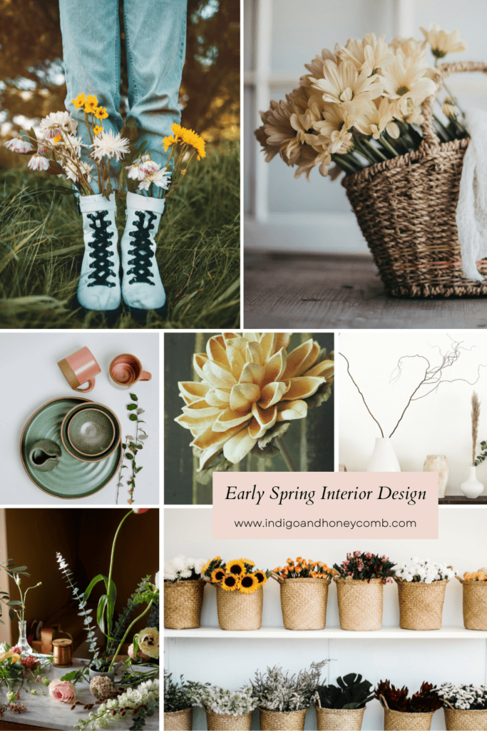
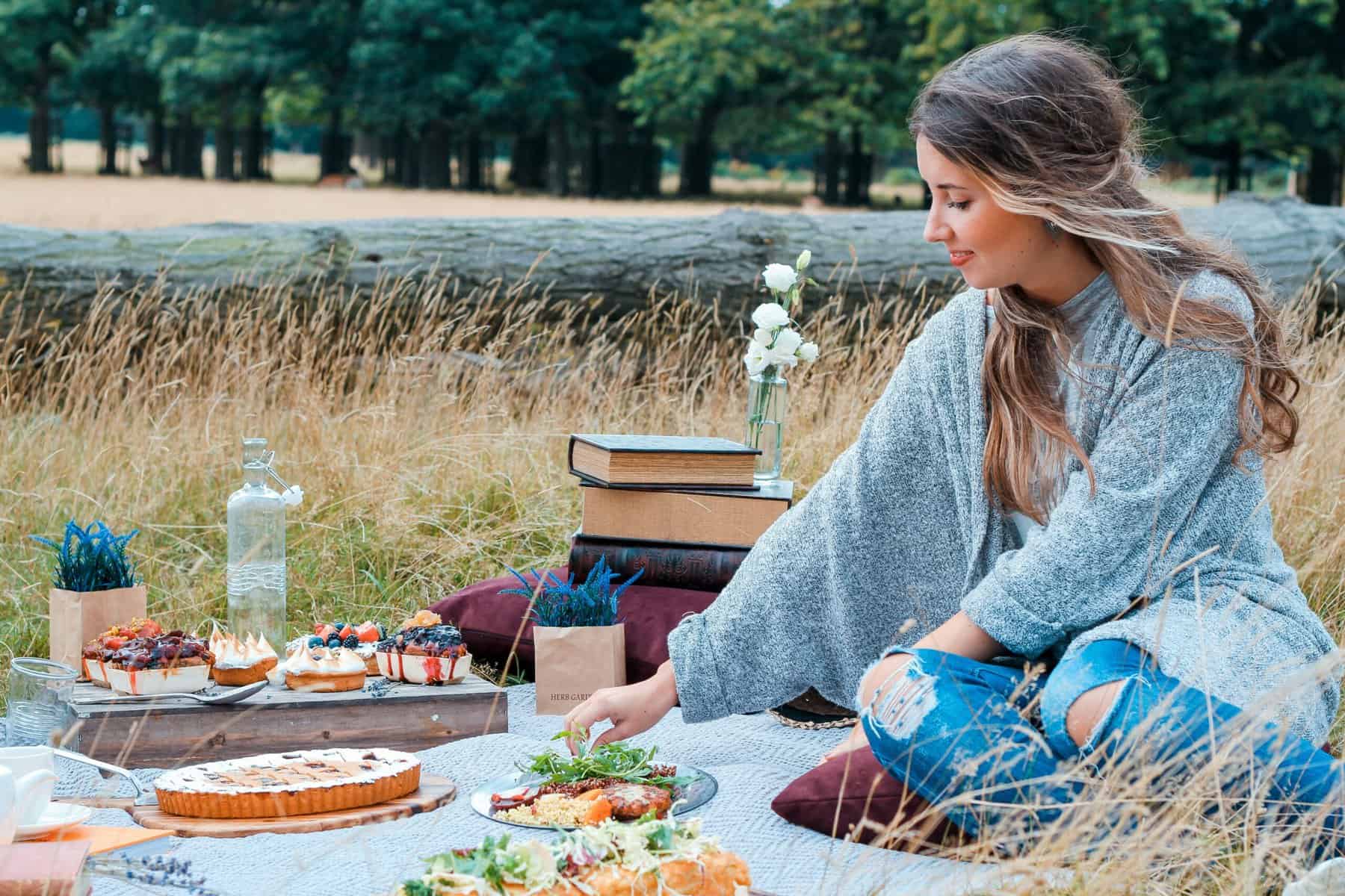
Styling with Branches, Florals, and Natural Elements
Early spring styling is less about abundance and more about restraint. Rather than filling a space with full floral arrangements, the focus shifts to simplicity and intention. Bare or budding branches, minimal greenery, and single-variety stems create a quieter, more refined look that reflects the landscape just beginning to awaken. These elements feel natural and unforced, capturing the subtle beauty of the season before it reaches full bloom.
Materials should feel equally organic, reinforcing this connection to nature. Ceramic vessels, hand-thrown pottery, woven baskets, and raw wood accents introduce texture and authenticity without overwhelming the space. Together, these elements create a grounded, tactile environment that feels both fresh and timeless. This approach aligns with green interior styling, where nature is introduced thoughtfully rather than decoratively.
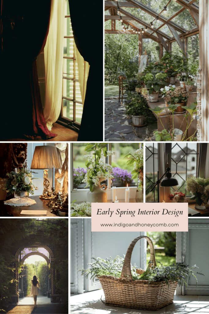
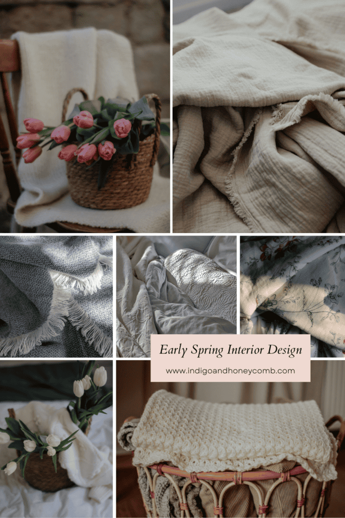
Creating Warmth Without Heavy Winter Layers
One of the biggest challenges in early spring interiors is maintaining warmth while letting go of winter heaviness. The solution lies in lighter layering. Shifting away from thick knits and dense fabrics toward materials that feel softer and more breathable. Linen throws, lightweight wool, cotton textures, and relaxed upholstery help create a sense of comfort without the visual weight of winter, allowing the space to feel more open as the season begins to change.
You still achieve a cozy, inviting atmosphere, but with a sense of air and movement that reflects the longer days and softer light of early spring. This is where moody spring decor truly shines. The palette remains rich and grounded, while the materials evolve to feel lighter and more effortless, creating a space that feels both refreshed and quietly sophisticated.
Final Thoughts
Early spring interior design invites a slower approach to seasonal change. It’s not about transforming your home overnight, but about allowing light, texture, and color to shift gradually.
By embracing moody greens, soft neutrals, and evolving natural light, you create a space that feels aligned with the season—calm, intentional, and quietly beautiful.
Spring doesn’t arrive all at once.
And your home doesn’t have to either.
Leave a Reply