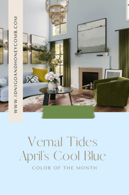
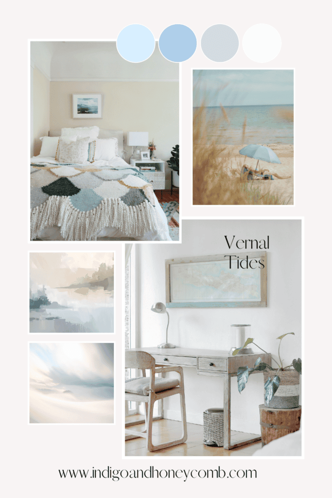
Exploring the Cool Blue Color Trend 2026 Through a Light, Airy Spring Hue
As the cool blue color trend 2026 begins to take hold across fashion and interiors, April introduces a hue that captures the essence of this seasonal shift. Vernal Tides (#D7EFFF) reflects the growing movement toward lighter, more atmospheric palettes, where cool-toned hues replace the visual weight of winter.
Rooted in the broader evolution of blue color trends 2026, Vernal Tides offers a softer interpretation of the ice blue color trend, balancing clarity with warmth. It signals a transition not just in season, but in mood toward calm, openness, and visual lightness. This transition from winter into spring also appears in emerging wild botanical color palettes, where nature begins to reassert itself in layered, organic forms.
The Inspiration: Where Winter Meets Spring
Vernal Tides draws its essence from the moment seasons overlap when winter’s final traces dissolve into spring’s first light. This is where the cool toned color trend feels most relevant: not stark or icy, but softened and diffused. This transition from winter into spring also appears in emerging wild botanical color palettes, where nature begins to reassert itself in layered, organic forms.
The hue reflects the soft blue cast of receding glaciers, the reflective stillness of coastal water, and the pale brightness of longer days. These influences align with the emerging glacier aesthetic colors movement, where translucency, minimalism, and light-reflective surfaces define the visual language.
At the same time, Vernal Tides connects to the renewed interest in cerulean blue, offering a more subdued, livable interpretation that translates seamlessly into interiors.
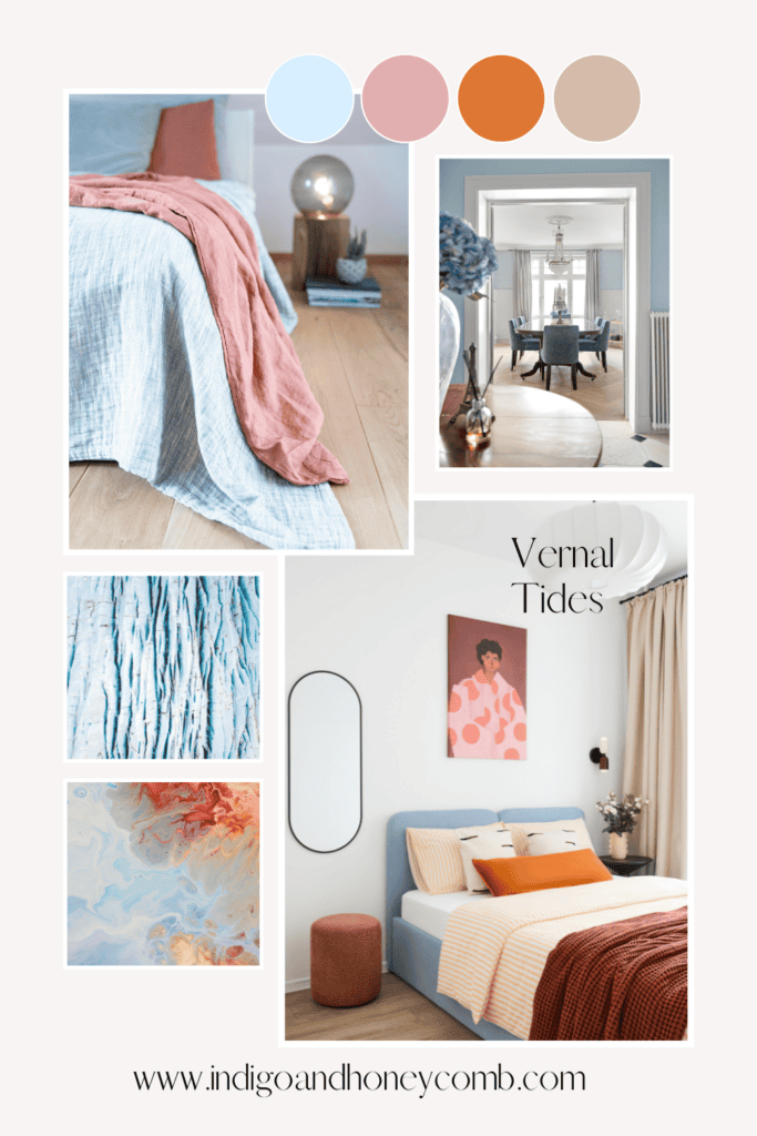
Color Pairings: Building the Vernal Tides Palette
To fully realize Vernal Tides, the palette should feel layered, breathable, and aligned with spring color trends 2026. Pairing this luminous blue with soft mineral neutrals like warm ivory, chalk white, and pale stone, creates a clean, elevated foundation. These tones enhance its clarity while supporting the shift toward airy spring color palettes that feel open and effortless.
Muted botanical greens introduce a natural counterbalance, reinforcing the transition into spring. Shades like eucalyptus and sage bring an organic softness that complements the fluid quality of Vernal Tides, while subtly connecting to light blue interior design approaches rooted in nature. This softened interpretation of blue also evolves into more expressive seasonal directions, including romantic interior color palettes for mid-spring, where color shifts from atmospheric to emotional.
Blush and petal tones add warmth and approachability, softening the coolness of the hue. These combinations reflect a more modern take on soft blue color inspiration, where contrast is gentle and tonal rather than bold.
Finally, deeper accents such as navy or charcoal can be layered in sparingly to ground the palette. This creates dimension while maintaining alignment with modern cool blue tones that prioritize subtlety over saturation.
5 Mid-Spring Color Palettes Highlighting Vernal Tides
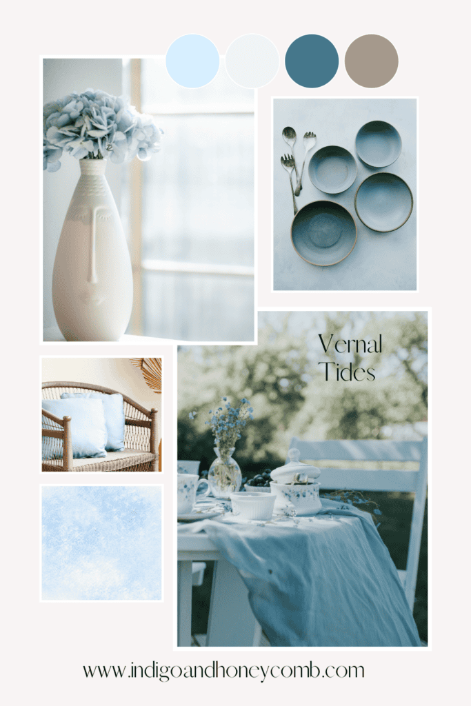
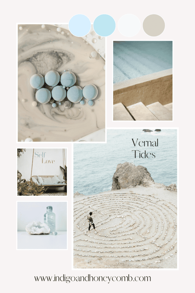
Glacial Light
- Vernal Tides (#D7EFFF)
- Frost White (#F6F9FB)
- Pale Silver (#DDE3E8)
- Soft Stone (#C9D2D9)
Mood: minimal, reflective, weightless
Use: tonal interiors, layered neutrals, modern coastal
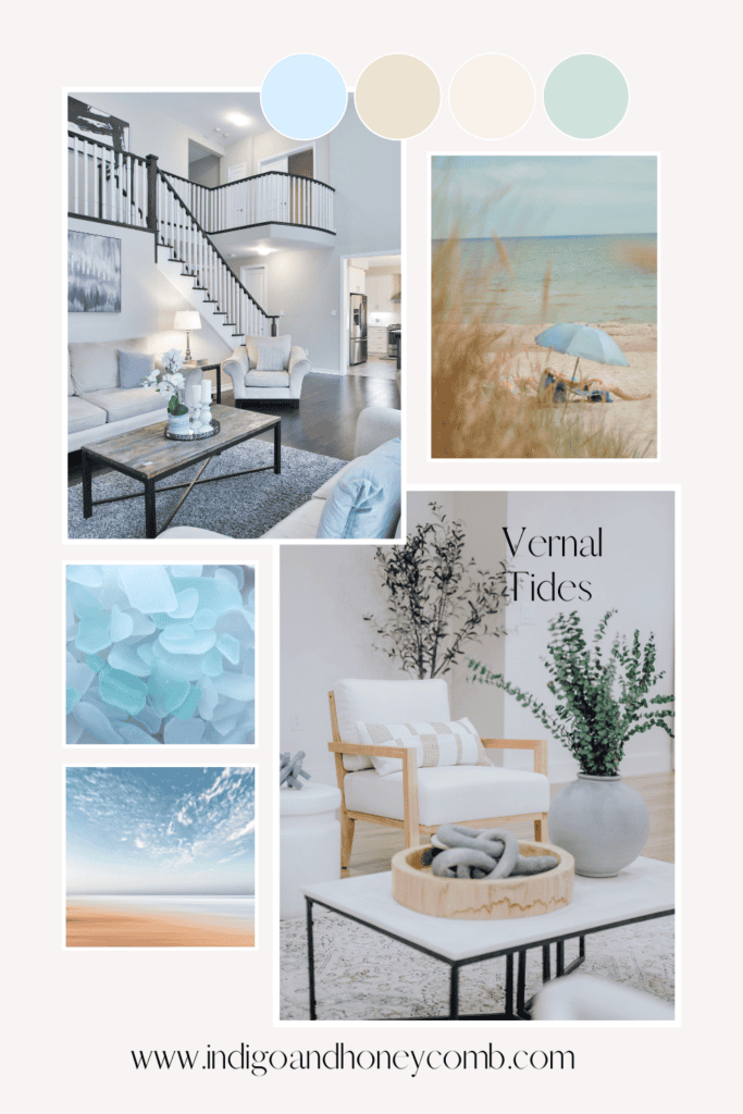
Coastal Morning
- Vernal Tides (#D7EFFF)
- Sand Drift (#EDE3D2)
- Washed Linen (#F7F2EA)
- Sea Glass Green (#CFE3DC)
Mood: quiet, organic, early light
Use: California casual, relaxed interiors
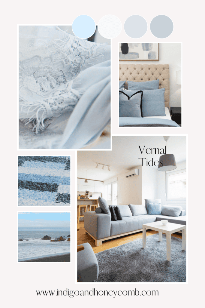
Cerulean Veil
- Vernal Tides (#D7EFFF)
- Muted Cerulean (#AFCFEA)
- Mist Gray (#D4DBE2)
- Cloud White (#FAFBFC)
Mood: airy, layered blue tones
Use: monochromatic palettes, serene bedrooms
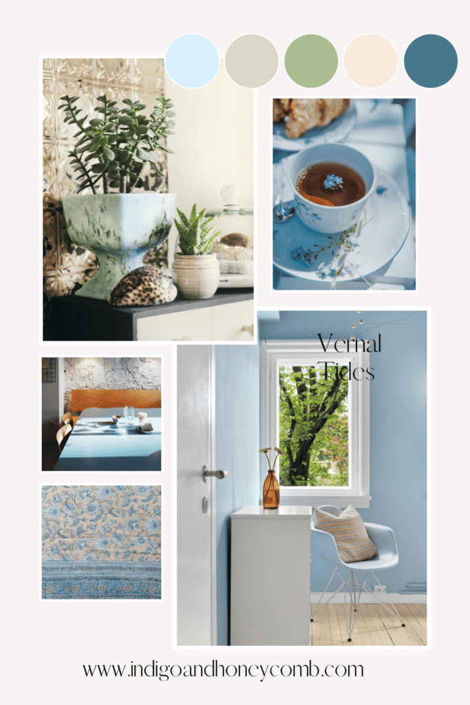
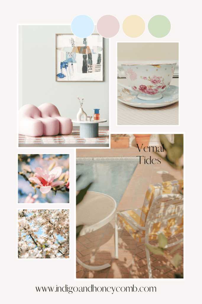
Bloom & Sky
- Vernal Tides (#D7EFFF)
- Soft Blush (#EAD6D6)
- Buttercream (#F4E7C5)
- Fresh Stem (#CFE0C3)
Mood: gentle contrast, spring awakening
Use: transitional seasonal styling
Glasswater
- Vernal Tides (#D7EFFF)
- Cool Aqua (#BFE7F2)
- Translucent White (#F2F8FA)
- Pale Driftwood (#D8D1C7)
Mood: fluid, luminous, modern
Use: spa-like interiors, bathrooms, open spaces
Design Insight
What makes Vernal Tides especially relevant right now is how it challenges a long-standing design instinct: the need for warmth to create comfort. In mid-spring 2026, comfort is no longer defined by warmth alone, but by lightness.
Cool tones, when softened and layered, can feel just as inviting, if not more so, because they create visual space. They allow interiors to breathe.
How to Use Vernal Tides in Design
As part of the evolving cool blue color trend 2026, Vernal Tides works best when treated as an atmospheric layer rather than a dominant statement.
Lean into translucency through materials like glass, linen, and light finishes to echo the softness of the ice blue color trend. Incorporate tone-on-tone blues to build depth without heaviness, and balance the palette with warm elements to maintain approachability.
Above all, allow the color space to breathe. This hue thrives in environments that embrace light, reinforcing the shift toward airy, light-filled interiors that define current spring color trends 2026.
The Mood of the Moment
As the season continues, color will deepen. Greens will become richer, florals more expressive, and palettes more layered. But mid-spring begins here in the quiet clarity of light, water, and air.
Vernal Tides is not a statement color.
It is a transition.
And in that transition, it defines the way we experience spring.
Vernal Tides reflects a broader movement within blue color trends 2026. One that prioritizes calm, clarity, and emotional ease. It embodies a quieter form of renewal, offering a visual pause between seasons. It is not a color that demands attention, but one that lingers. Softly shaping the atmosphere of a space, and capturing the essence of spring’s gradual arrival.